 "Who is the Leader - 404 / Blog No Longer Available" (whoistheleader2)
05/24/2020 at 13:06 • Filed to: question, Citroën, logo
 3
3
 29
29
 "Who is the Leader - 404 / Blog No Longer Available" (whoistheleader2)
05/24/2020 at 13:06 • Filed to: question, Citroën, logo |  3 3
|  29 29 |
It is a simple question but not one that is easily answered. The trouble is separating brand identity from the aesthetic merits of the actual logo and its integration.
I have come up with the following considerations as being vital to a good logo
recognizable
adaptable
unique/creative
history/meaning
For that reason I nominate the Citroen logo
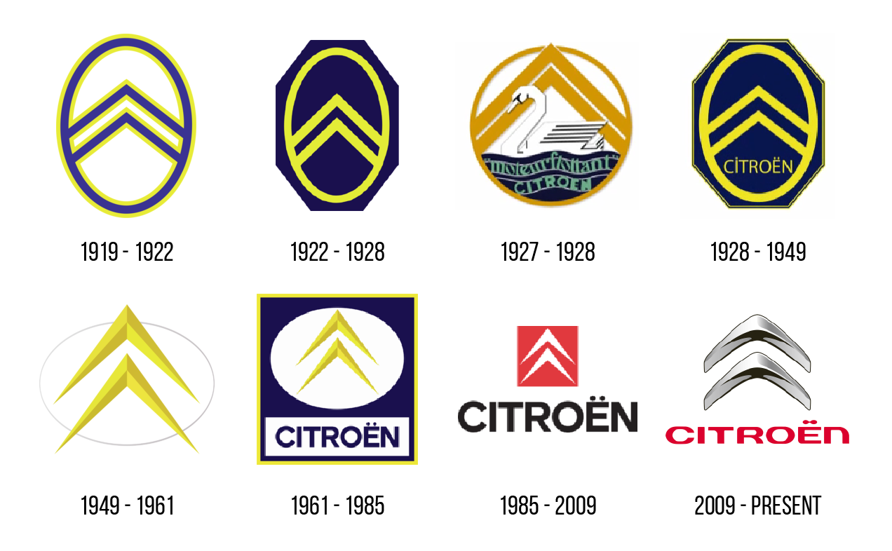
It has a great history; it is supposed to resemble herringbow or double helical gears after Andre Citroen acquired the patent for the invention. It has proved infinitely adaptable both to changing aesthetic fads (3d logos of the 2000s) and can be integrated in myriad ways for different cars and corporate styles.
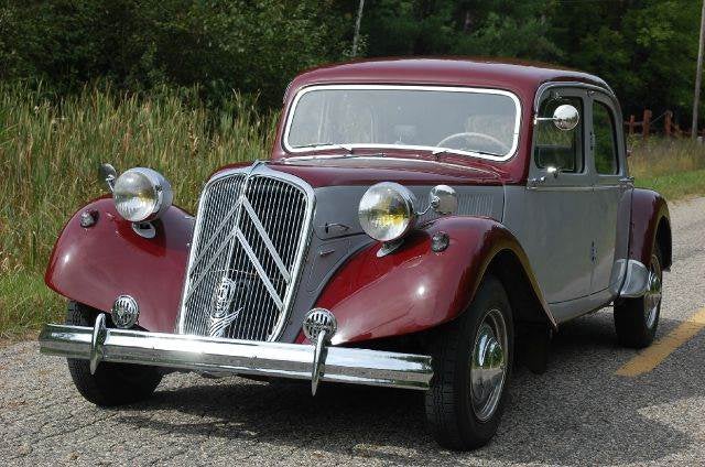
It can cover the whole grill, such as in the Traction Avant (Light 15 or whatever taxable hp was the real name):
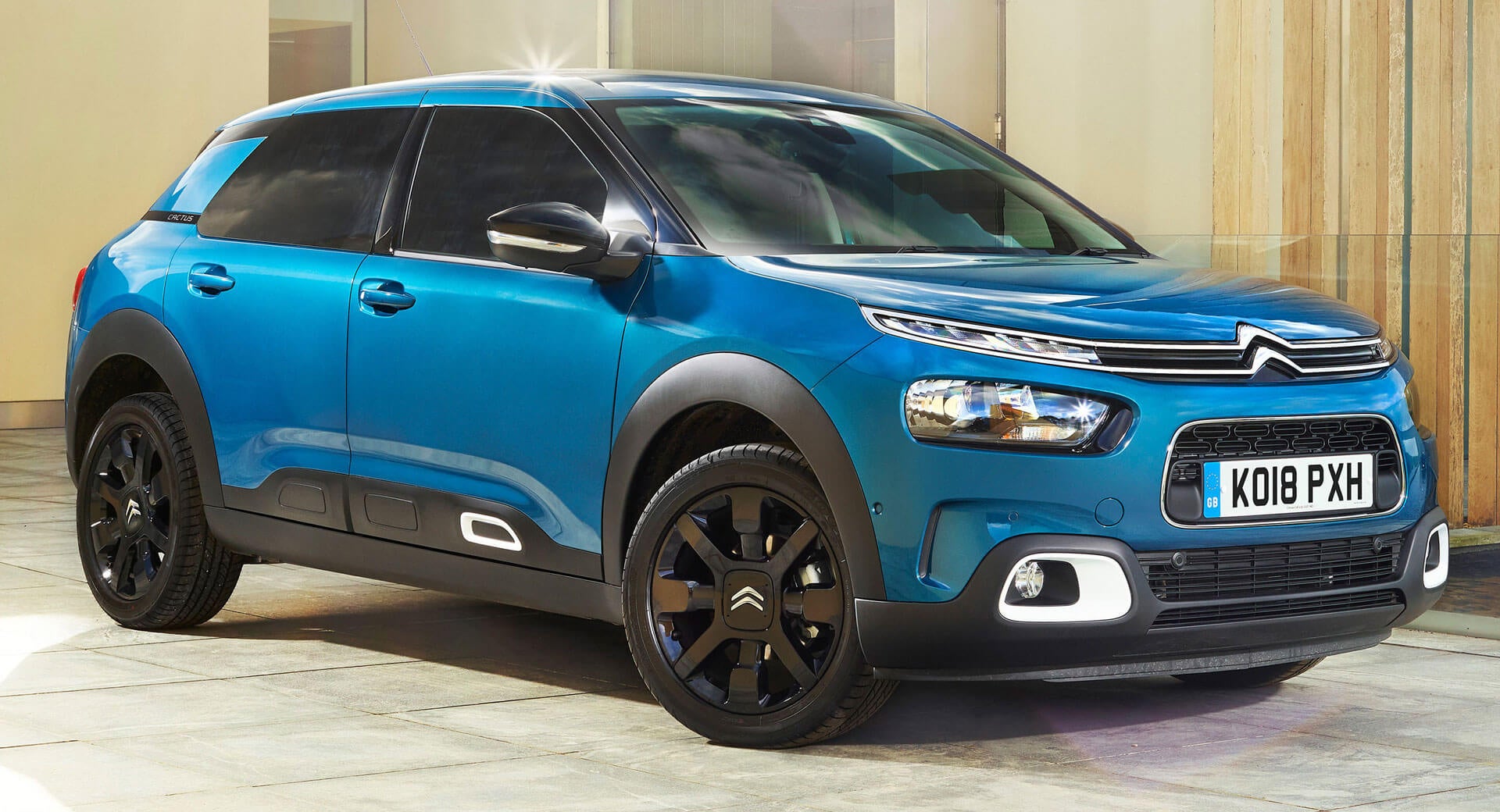
Modern Citroen use a different integration:
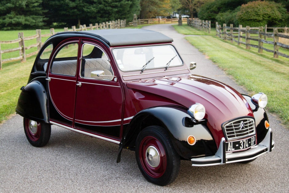
It can also just be stuck in the center of the grille like most logos:
For this reason, I crown Citroen the king of good automotive logos. What other companies deserve recognition?
 Urambo Tauro
> Who is the Leader - 404 / Blog No Longer Available
05/24/2020 at 13:13 |
|
Agreed, t h e golden arches are so iconic. I’m lovin’ it.
 Cash Rewards
> Who is the Leader - 404 / Blog No Longer Available
05/24/2020 at 13:18 |
|
You make a pretty good argument regarding its integration into designs. Couldn't do that with a Chevy bowtie or a Mercedes star
 Who is the Leader - 404 / Blog No Longer Available
> Urambo Tauro
05/24/2020 at 13:19 |
|
For two years the golden arches as you p ut it are above a swan. Secret ingredient?
 Otto-the-Croatian-'Whoops my Volvo is a sedan'
> Who is the Leader - 404 / Blog No Longer Available
05/24/2020 at 13:19 |
|
recognizable
adaptable
unique/creative
history/meaning
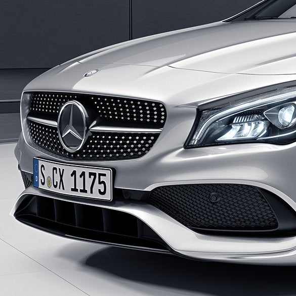
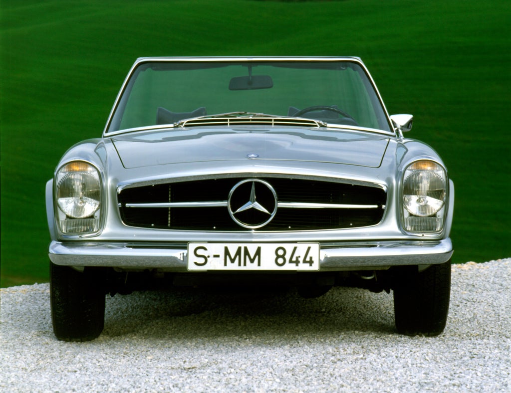
You can hardly get more recognizable than this one. History is long and rich, adaptability could be more creatively executed but it has more potential than they let it. At least it hides all the sensors well.
And
I bet it would pass the
memory test
with flying colors.
 ranwhenparked
> Otto-the-Croatian-'Whoops my Volvo is a sedan'
05/24/2020 at 13:24 |
|
A good logo is one that can be drawn forehand with one color, or printed in black and white, and still be recognizable, with all elements intact. Mercedes-Benz and Citroen both pass the test, some don’t. Looking at you Altria , WTF is that even supposed to be?
 KingT- 60% of the time, it works every time
> Who is the Leader - 404 / Blog No Longer Available
05/24/2020 at 13:26 |
|
Jaaaaaaaaaaaaaaaaaaaaaaaag
plus, it makes for a bitch in hood ornament. Sure others have Horse, Bulls etc. but a big cat is another league. Not all logos can make good hood ornaments .
 Who is the Leader - 404 / Blog No Longer Available
> Cash Rewards
05/24/2020 at 13:28 |
|
Chevy is perhaps one of the best that is just stuck on because it is simple and can be recolored and resized however you like while being very simple. Not quite integratable enough though.
 Who is the Leader - 404 / Blog No Longer Available
> KingT- 60% of the time, it works every time
05/24/2020 at 13:29 |
|
Good point. You can't make a Citroen hood ornament out of the normal logo.
 Who is the Leader - 404 / Blog No Longer Available
> Otto-the-Croatian-'Whoops my Volvo is a sedan'
05/24/2020 at 13:30 |
|
Good point. They have the roundel thingie for a good ornament as well and it is just about the most recognizable logos in history. I'm not sure it beats Citroen for the integration but you make a good point about it hiding sensors.
 JawzX2, Boost Addict. 1.6t, 2.7tt, 4.2t
> Who is the Leader - 404 / Blog No Longer Available
05/24/2020 at 13:31 |
|
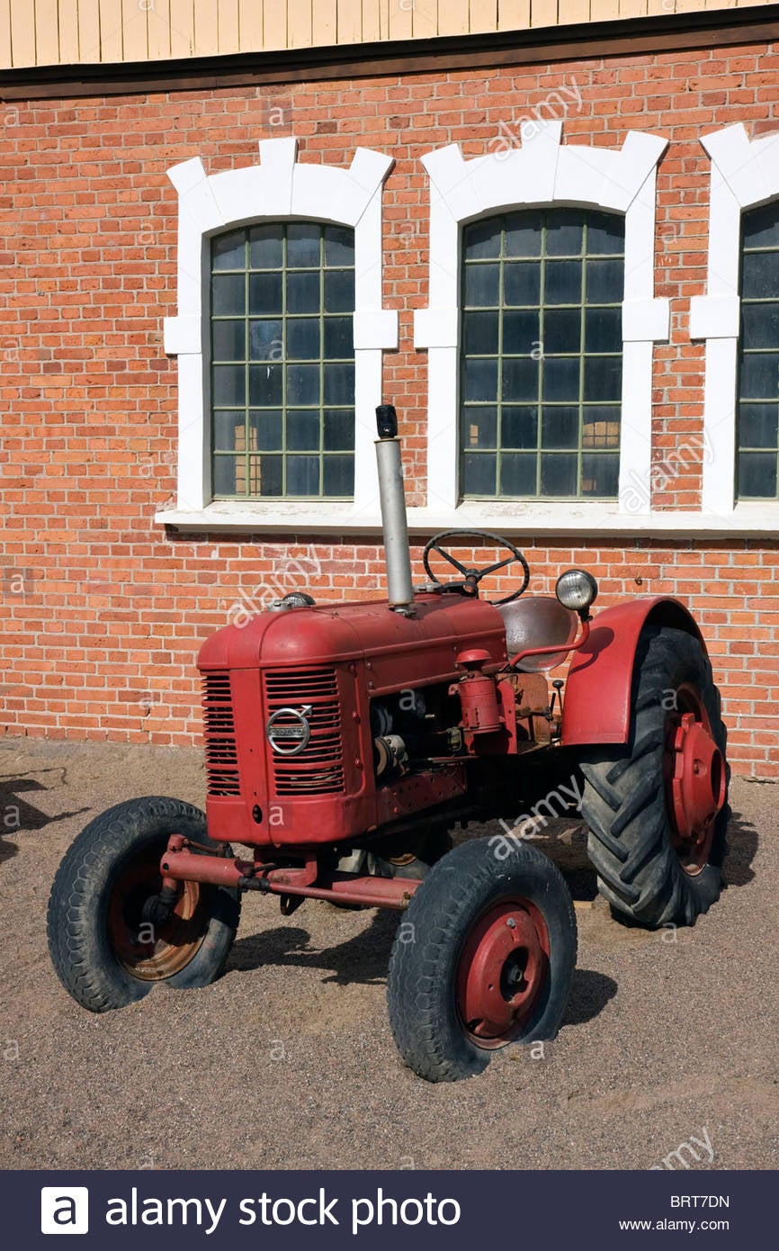
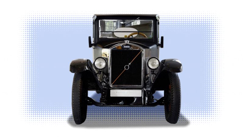
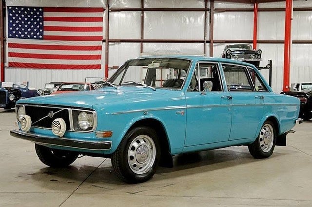
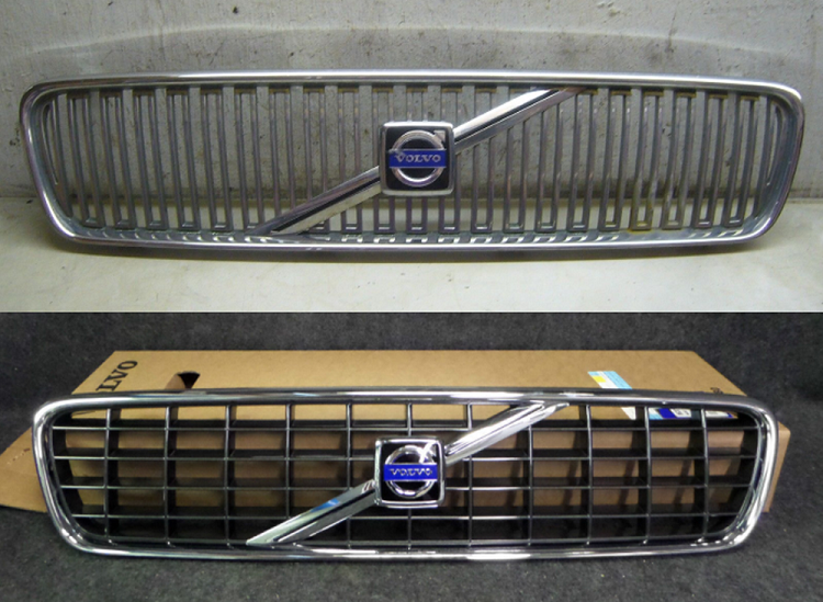
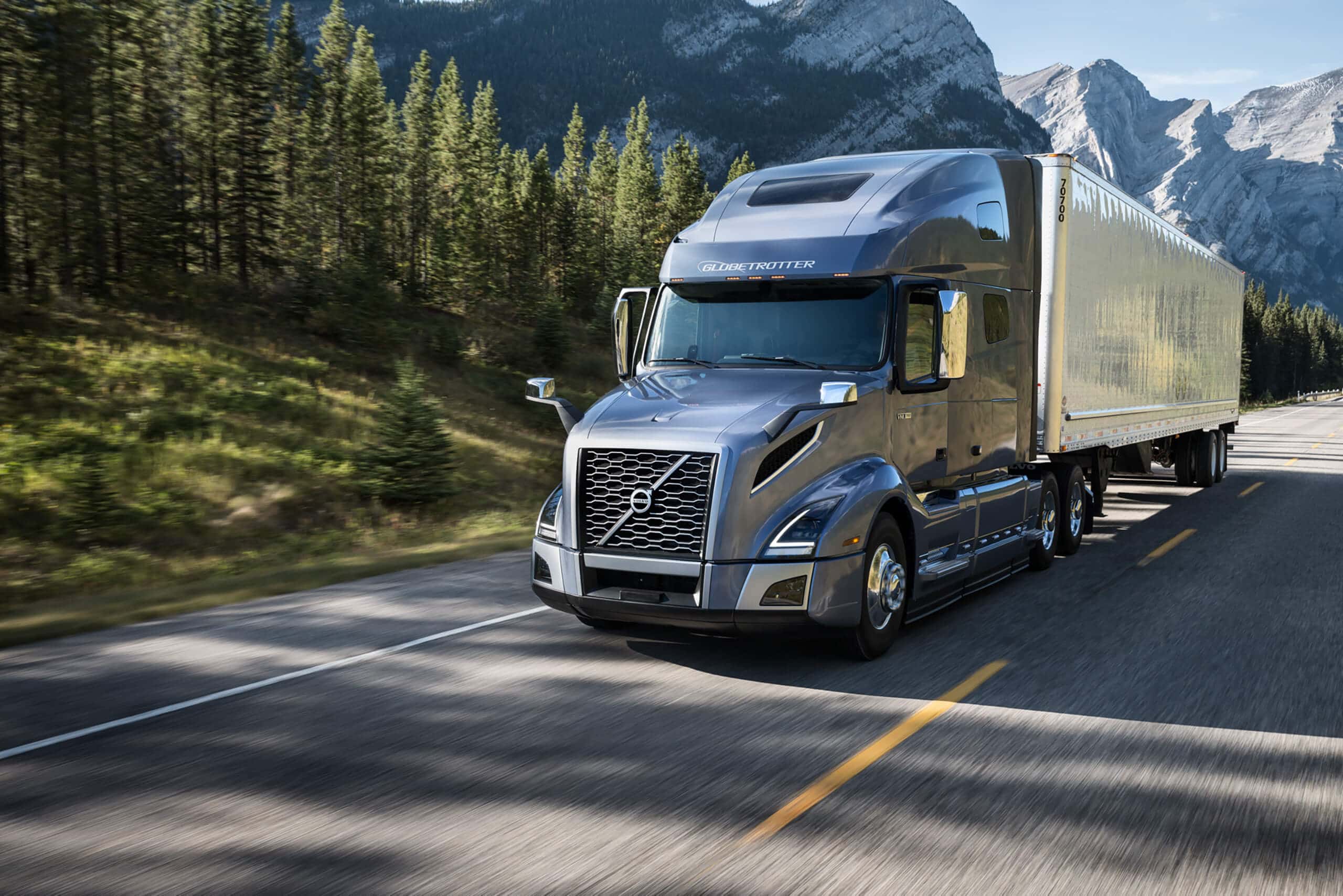
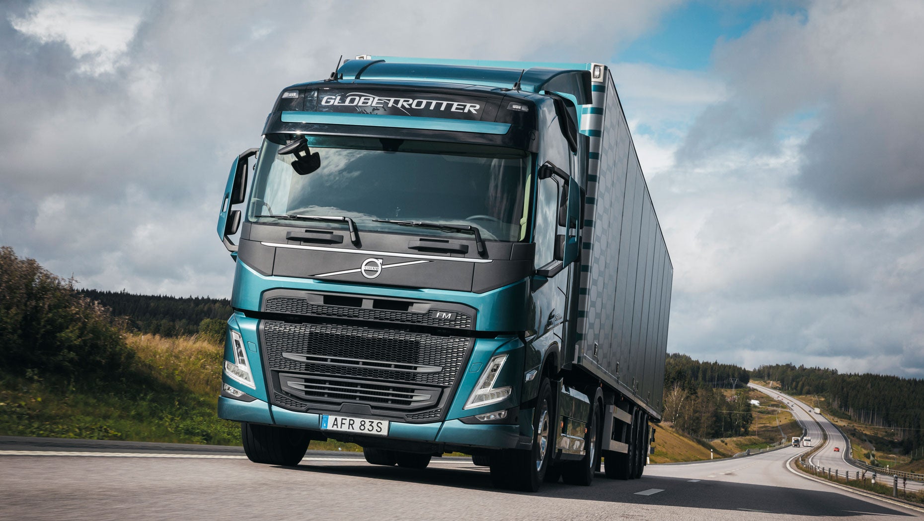
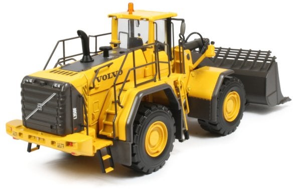
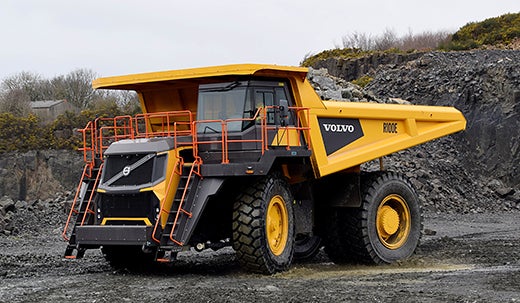
Volvo.
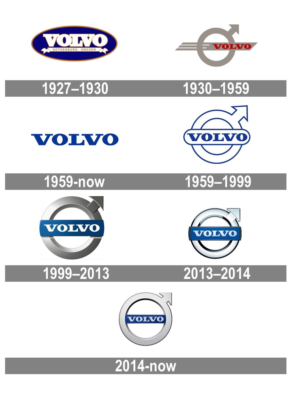
The name means ”I roll” in Latin, and the symbol for s actually meant as the alchemical symbol for iron (though there other common interpretations) , the combination of name and symbol evokes the ball bearings made by the Gothenburg SKF factory that eventually evolved into Volvo vehicles. Internally it refered to as the “iron mark” and reflects both the history and strength and durability of Volvo products. The silver and blue colors are representative of refinement and wisdom respectively. It looks good big or small, in any location, on any vehicle. The diagonal bar was originally a support to center the logo in the gille-less radiator support of the first Volvo cars, but it’s a perfect aesthetic tool as well, allowing the iron mark to be positioned and held with visual precision in any size or shape grill. The Iron Mark it self is primarily typographic and is easily adapted for any current style, though it’s simplicity means it’s only been changed a few times in the history of the company.

 SBA Thanks You For All The Fish
> Who is the Leader - 404 / Blog No Longer Available
05/24/2020 at 13:32 |
|
Tough to beat the elegance and simplicity here...
 Who is the Leader - 404 / Blog No Longer Available
> JawzX2, Boost Addict. 1.6t, 2.7tt, 4.2t
05/24/2020 at 13:47 |
|
Wait, you aren’t For Sweden.
You do bring up a good point. The crossbar on Volvo’s is more recognisable than the logo itself and can be stuck on pretty much anything. It also looks pretty good on grillel ess designs by adding interest. Great history too.
 Chinny Raccoon
> KingT- 60% of the time, it works every time
05/24/2020 at 13:54 |
|
Jaguar are kind of confusing by using two logos on the cars.
 Otto-the-Croatian-'Whoops my Volvo is a sedan'
> ranwhenparked
05/24/2020 at 14:04 |
|
lol I guess you could make the colors
grayscale and even more terrible.
 Jb boin
> Who is the Leader - 404 / Blog No Longer Available
05/24/2020 at 14:56 |
|
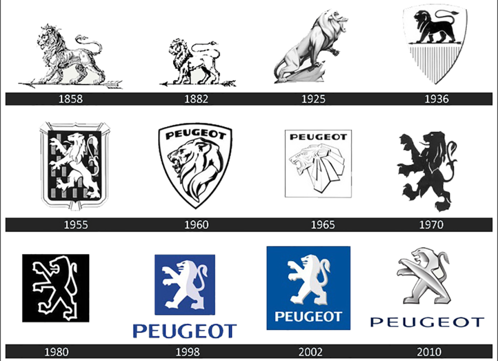
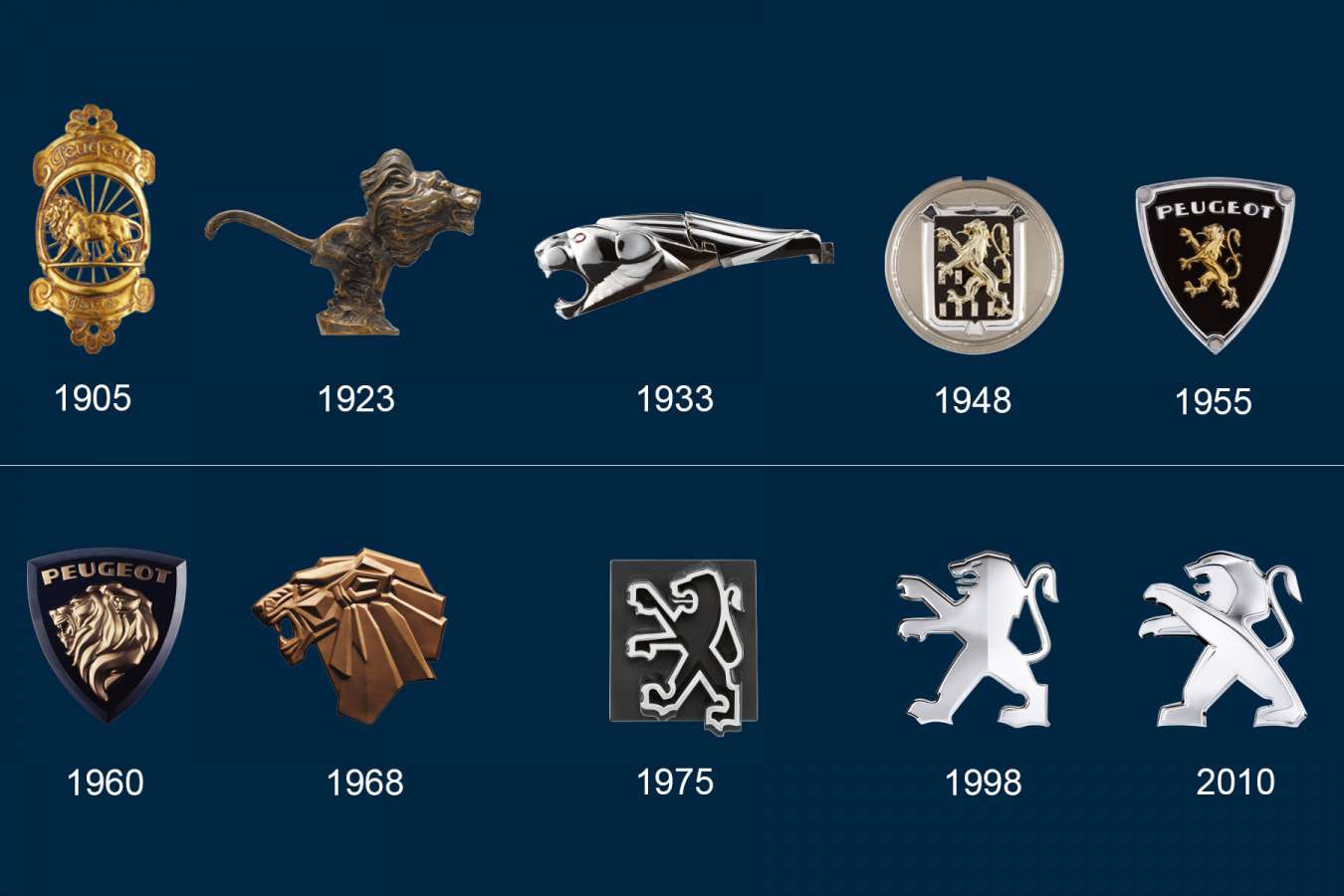
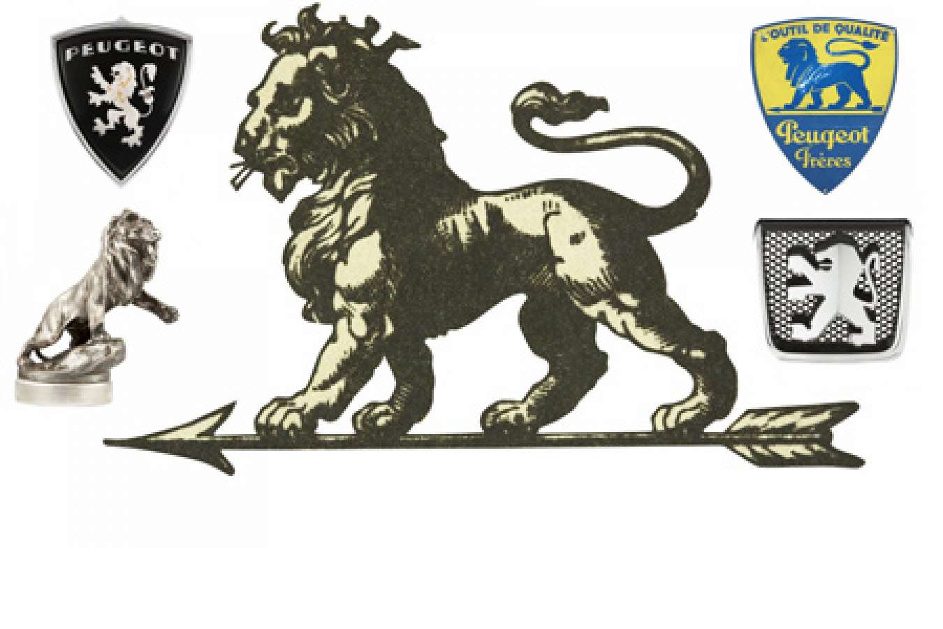
Not an answer to the topic but some of the historic Peugeot logos were very nice :
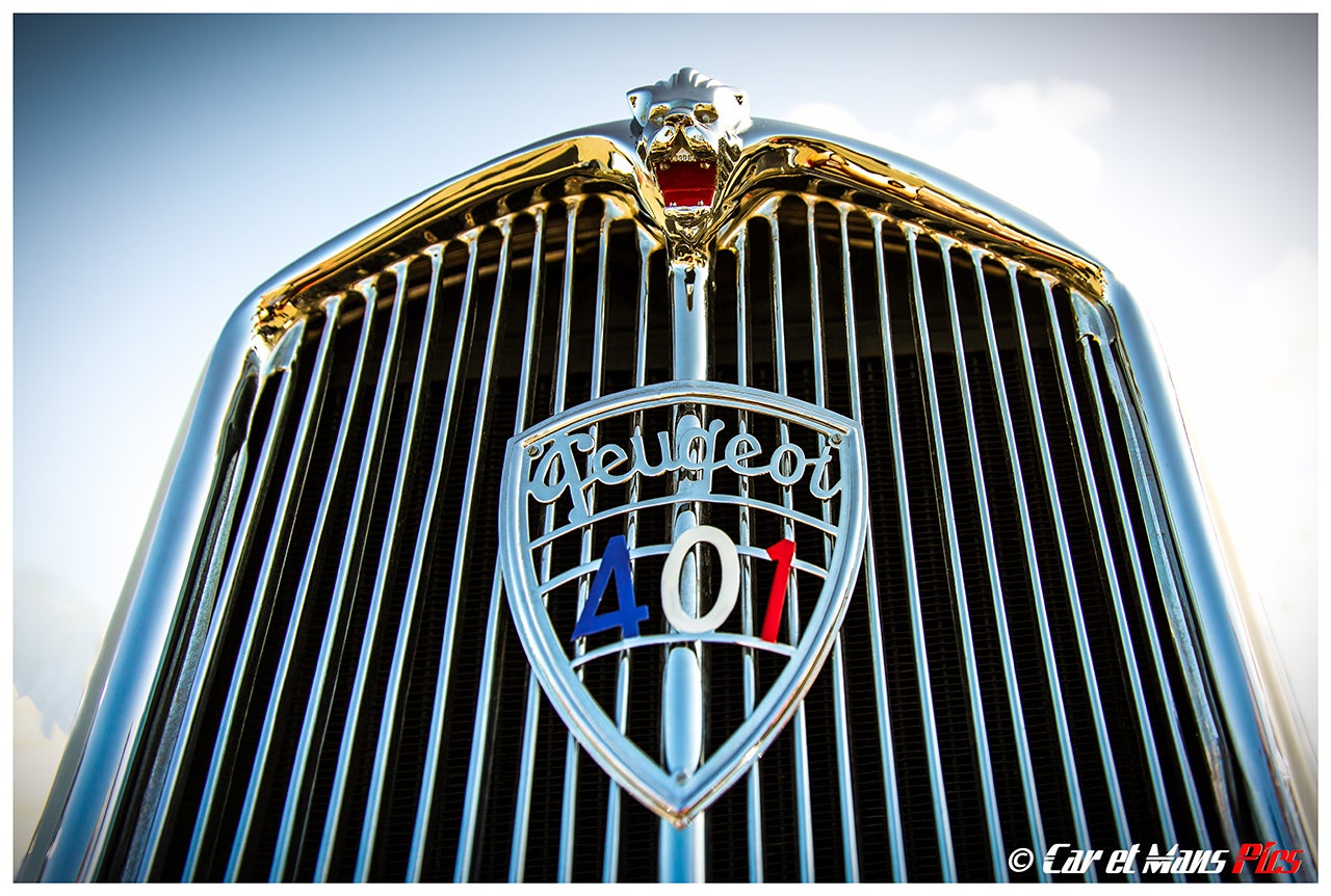
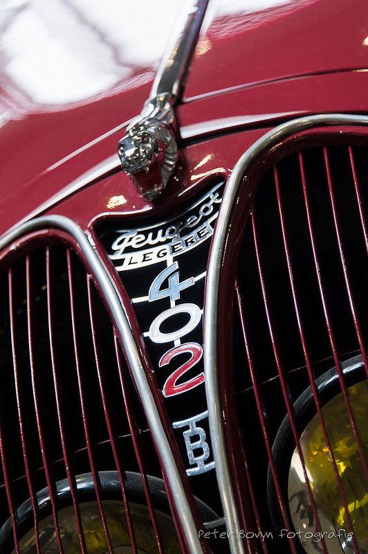
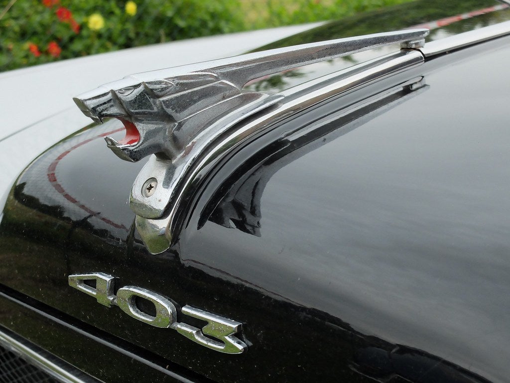
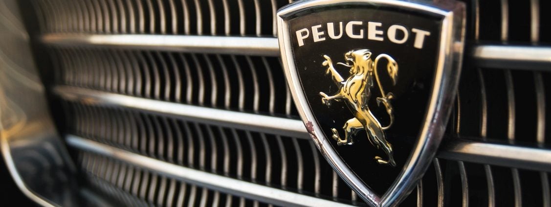
 fintail
> Who is the Leader - 404 / Blog No Longer Available
05/24/2020 at 15:45 |
|
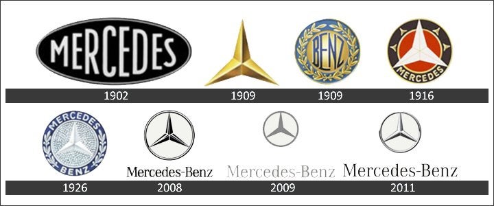
I have to second the MB nomination - I read somewhere that it is among the most recognized logos in history, known by people in distant lands who have never seen a MB before:
 Who is the Leader - 404 / Blog No Longer Available
> fintail
05/24/2020 at 15:51 |
|
I think Citroen is the most integratable and adaptable but Mercedes is the most recognizable. Both are simple enough to be easily remembered and have a long and meaningful history, so I think it is about a tie.
 phenotyp
> Who is the Leader - 404 / Blog No Longer Available
05/24/2020 at 15:52 |
|
Top 3, in no particular order:
Citroen, especially the ‘85-’09 block version
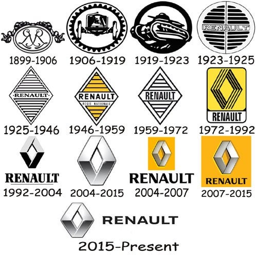
Renault, ‘72-
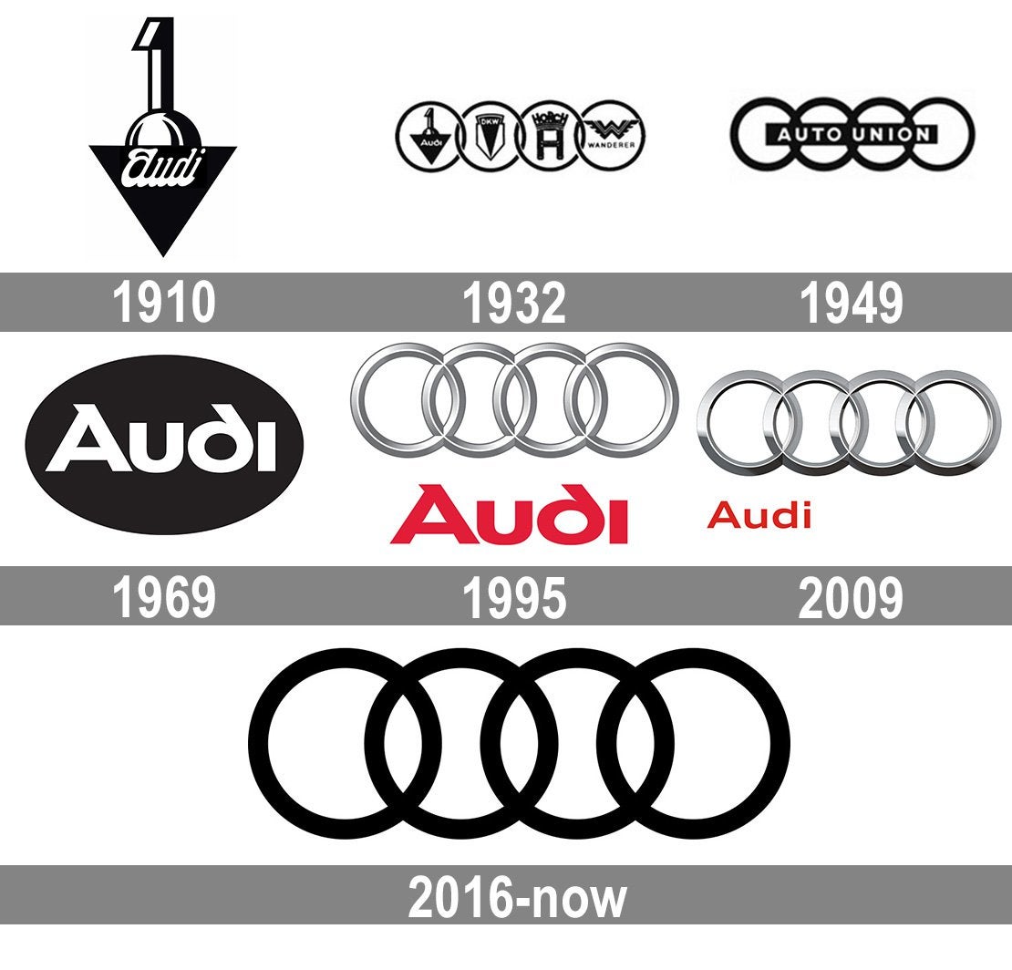
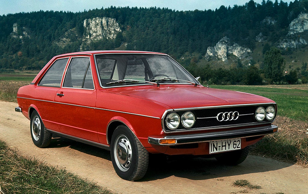
Audi (Auto Union-present):
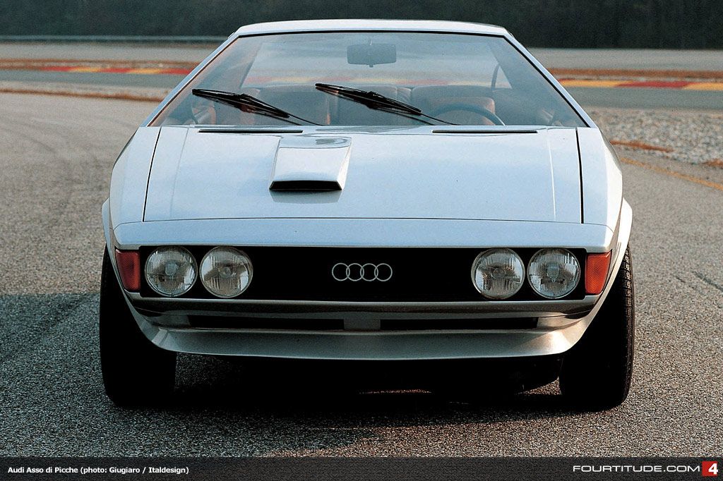
I especially love how the small, slim rings looked in the 70s.
 Who is the Leader - 404 / Blog No Longer Available
> phenotyp
05/24/2020 at 16:01 |
|
I recently encountered a 70s Audi and thought the rings did look nice with the low profile chrome. I like these suggestions a lot and both are capable of being adapted and simplified or expanded greatly (from 2d to the 2000s 3d drawings) but I think only Citroen’s logo can be so easily integrated into the grille in so many different ways. That and Volvo. Though Audi’s logo can be integrated with that crossbar in an attractive manner.
 phenotyp
> Who is the Leader - 404 / Blog No Longer Available
05/24/2020 at 16:56 |
|
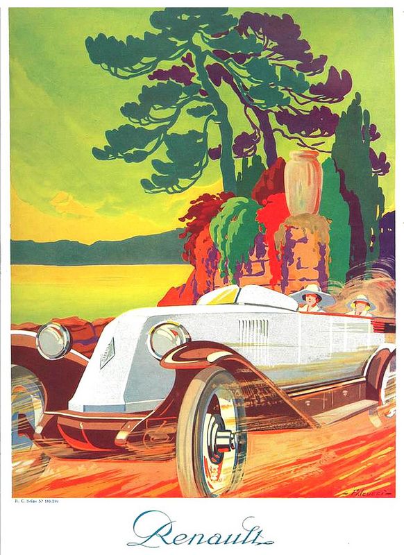
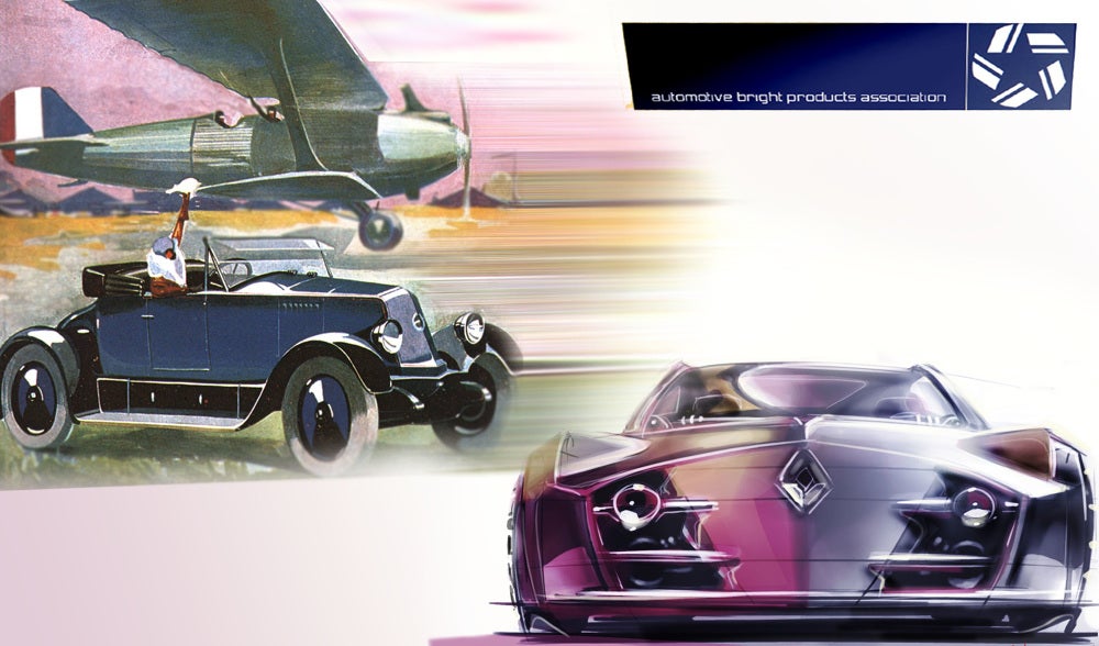
Old Renault ads are so sweet. I used one for this ABPA project back in 2002:
 Who is the Leader - 404 / Blog No Longer Available
> phenotyp
05/24/2020 at 17:15 |
|
Those images really convey a feeling of motion and excitement effectively. I like that somewhat abstract style that exaggerates the proportions of the car.
 not for canada - australian in disguise
> Who is the Leader - 404 / Blog No Longer Available
05/24/2020 at 17:21 |
|
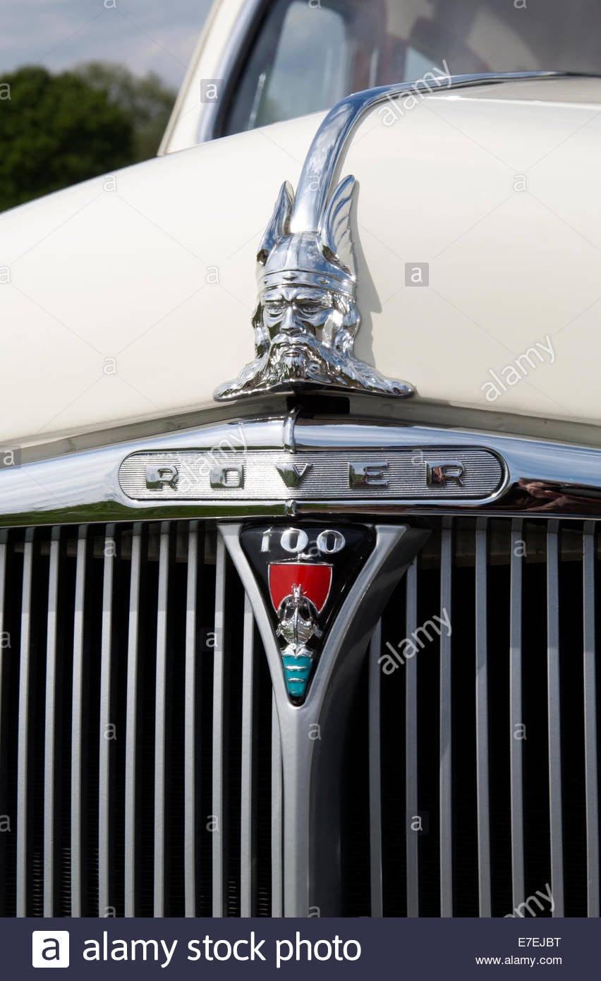
I’ve always loved Rover’s longship logo. It would be a lot more appropriate on something a bit more Nordic, but hey, maybe Rover was founded exclusively descended from the Saxons.
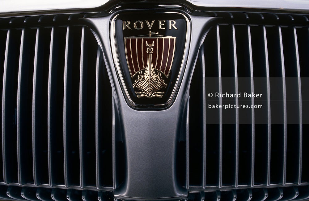
Especially cool when it was combined with the viking hood ornament.
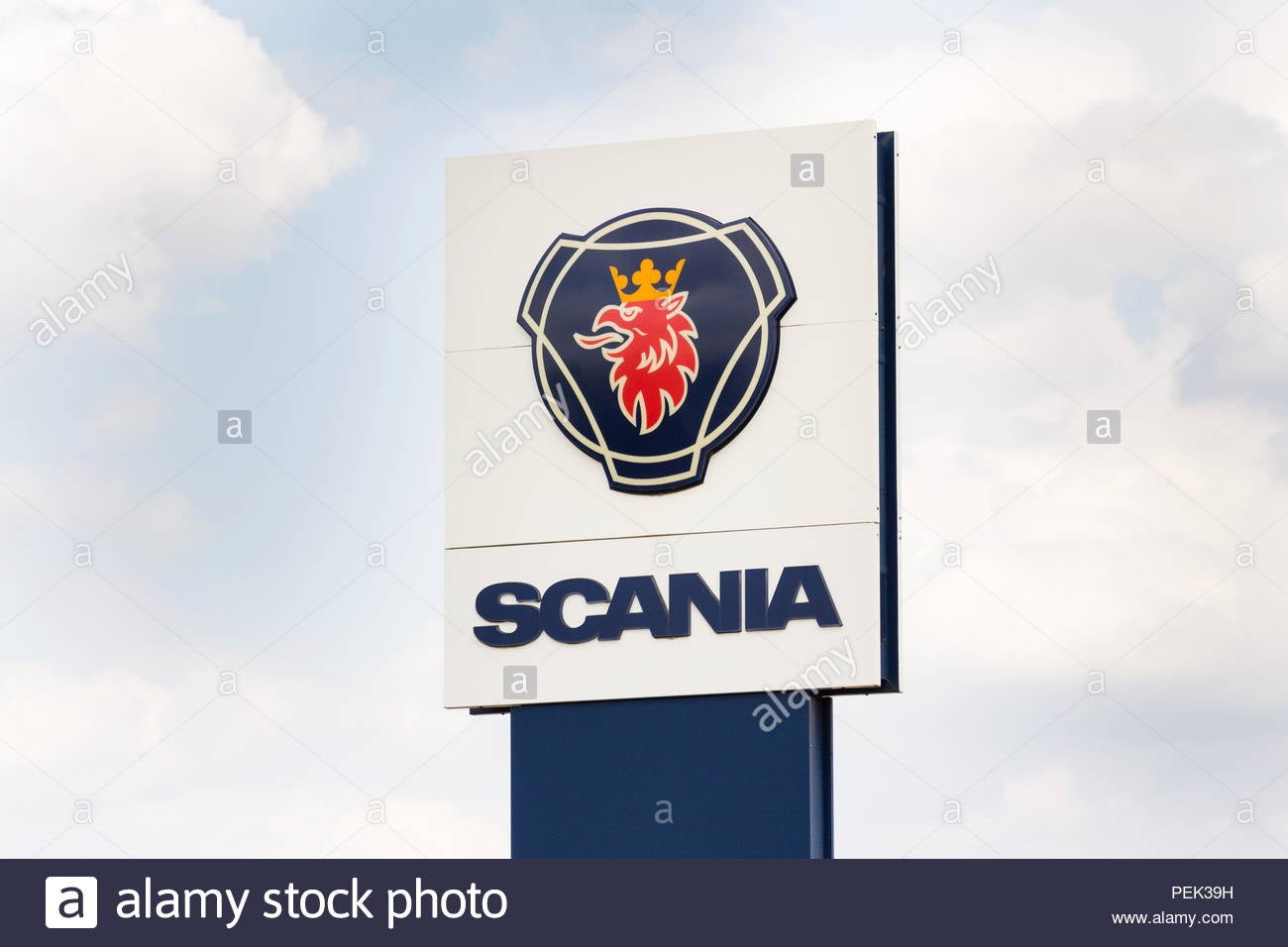
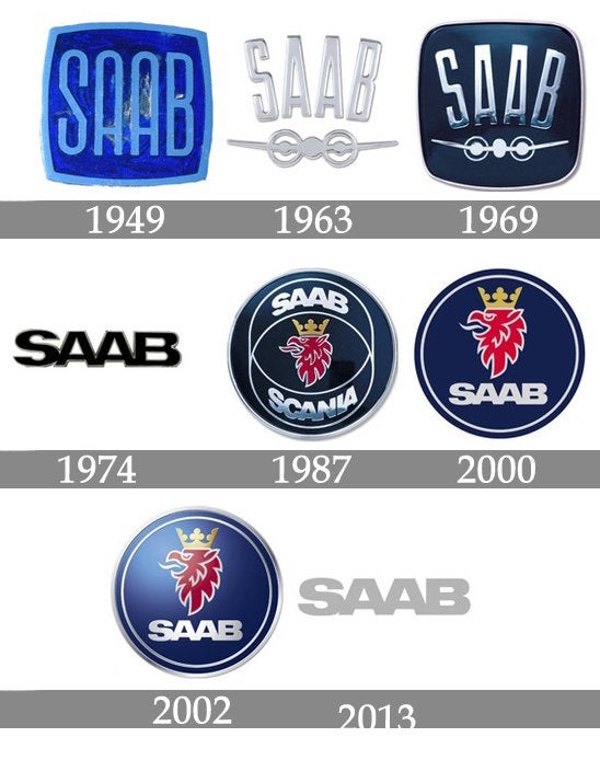
Scania (and later Saab’s) griffin logo is also absolutely iconic and I’ve always loved the colour scheme. Combined, since after the Saab-Scania merger they basically used the same logo with only some minor differences.
 Who is the Leader - 404 / Blog No Longer Available
> not for canada - australian in disguise
05/24/2020 at 17:25 |
|
I also love Saab’s logo (and Volvo’s) but I never knew it was shared with Scania. Great colors too.
I never knew Roger had such a crazy logo. Whatever gave them the idea that their cars had anything Norse about them at all. But the front of the ship on the front of a car is pretty funny and cool at the same time.
 phenotyp
> phenotyp
05/24/2020 at 17:37 |
|
.
 phenotyp
> Who is the Leader - 404 / Blog No Longer Available
05/24/2020 at 17:37 |
|
Really emphasized the romance of the 1920s, big, fast cars, and a whole new motorized world.
 Who is the Leader - 404 / Blog No Longer Available
> phenotyp
05/24/2020 at 18:51 |
|
Yes, a whole new horizon of fast rapid and beautiful transport along freeways in the sky. Of course we know how it really turned out but the car industry will never be that optimistic again. Even with self driving cars there is too much from reality.
 pip bip - choose Corrour
> Who is the Leader - 404 / Blog No Longer Available
05/25/2020 at 05:42 |
|
 pip bip - choose Corrour
> not for canada - australian in disguise
05/25/2020 at 05:43 |
|
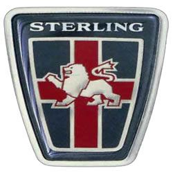
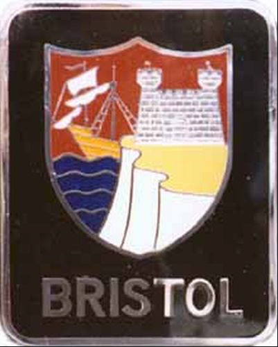
best Rover logo
 Who is the Leader - 404 / Blog No Longer Available
> pip bip - choose Corrour
05/25/2020 at 11:56 |
|
Never heard of that one. Pretty cool though.