"Wheelerguy" (wheelerguy)
08/11/2018 at 09:30 Ľ Filed to: Fonts
 1
1
 10
10|
"Wheelerguy" (wheelerguy)
08/11/2018 at 09:30 Ľ Filed to: Fonts | 1
| 10 |
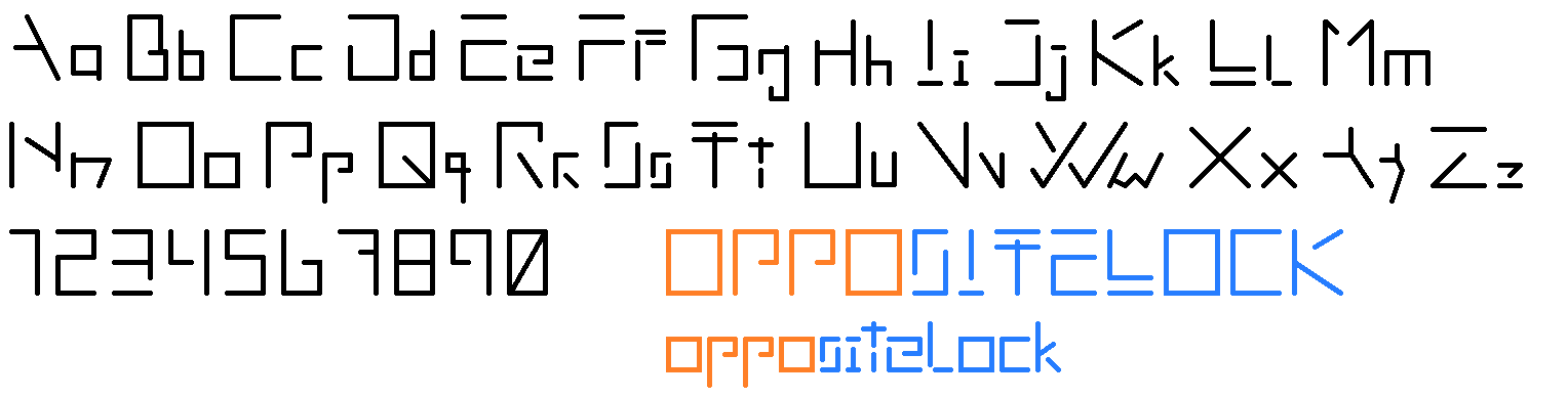
Admittedly, still not the ideal, but I reckon it can work. Ss
, Tt
, and y are problem spots.
 TheRealBicycleBuck
> Wheelerguy
TheRealBicycleBuck
> Wheelerguy
08/11/2018 at 09:34 |
|
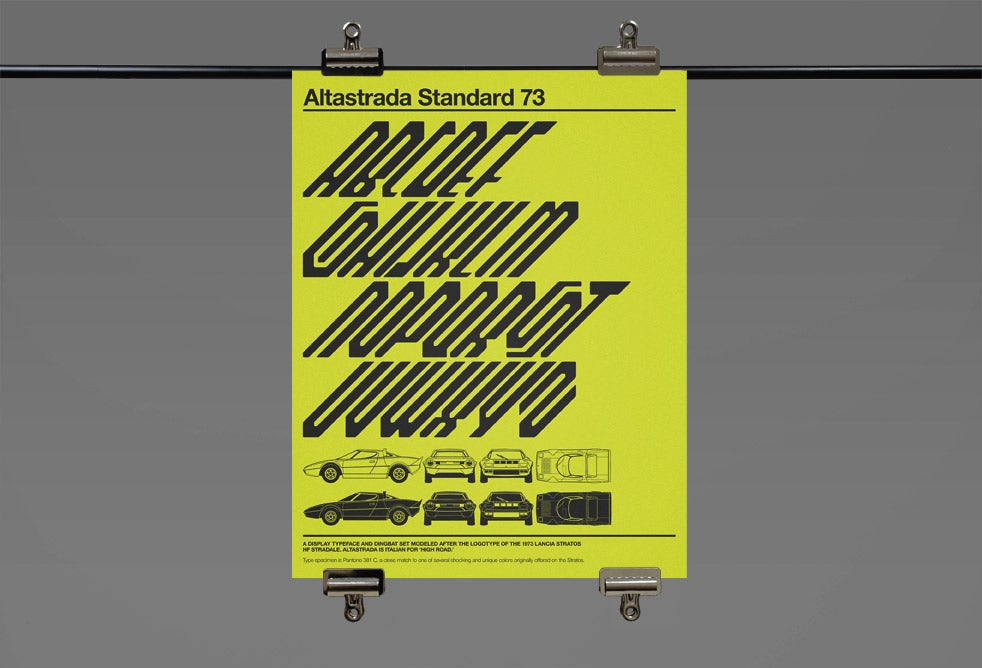
Looks like aliens are about to take over.á
 farscythe - makin da cawfee!
> Wheelerguy
farscythe - makin da cawfee!
> Wheelerguy
08/11/2018 at 09:38 |
|
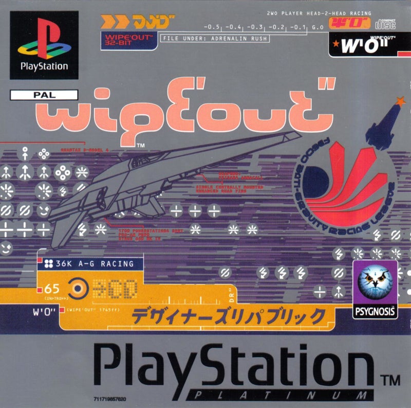
minded me of
for some reason
|
Wheelerguy
> TheRealBicycleBuck
08/11/2018 at 09:40 |
|
No aliens, only Ciat-Fhrysler Group.
 Nom De Plume
> Wheelerguy
Nom De Plume
> Wheelerguy
08/11/2018 at 09:46 |
|
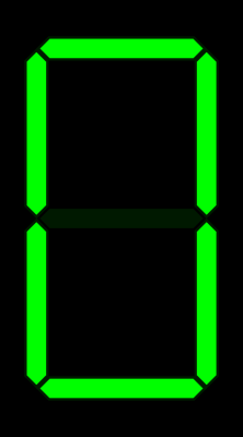
Would work better as a digital sign board gif. The type where it quickly flashes through all the upper and lower case line combinations randomly before displaying the right ones to make a letter. Arrival/Departure boards used to work this way.
Sorta like this only faster.
|
Wheelerguy
> Nom De Plume
08/11/2018 at 09:53 |
|
Iĺm not yet that deep in the tech tree, but Iĺll take note of this next time.
A lot of the letters are entirely still n ot uniform in size (the square ones are, more or less) so it would take extra tweaking to match every angle to a space.
|
Nom De Plume
> Wheelerguy
08/11/2018 at 10:53 |
|
Are you trying to create a custom font set?
The example I should have used was closer to the alien from Predatorĺs watch with atypical characters.
|
Wheelerguy
> Nom De Plume
08/11/2018 at 11:00 |
|
Mmm, I see.
Itĺs just some font I thought of on the fly. Could be useful for some ideas. That example is out of my reach yet, but possible.
 LongbowMkII
> Wheelerguy
LongbowMkII
> Wheelerguy
08/11/2018 at 11:19 |
|
For the uppercase S you could do a curl in like on your P
|
Wheelerguy
> LongbowMkII
08/11/2018 at 12:30 |
|
...
No wonder I can't seem to get the negative space right. Thanks!á
 Die-Trying
> Wheelerguy
Die-Trying
> Wheelerguy
08/11/2018 at 19:42 |
|