 "Arch Duke Maxyenko, Shit Talk Extraordinaire" (arch-duke-maxyenko)
02/01/2016 at 22:54 • Filed to: shoop
 11
11
 6
6|
"Arch Duke Maxyenko, Shit Talk Extraordinaire" (arch-duke-maxyenko)
02/01/2016 at 22:54 • Filed to: shoop | 11
| 6 |
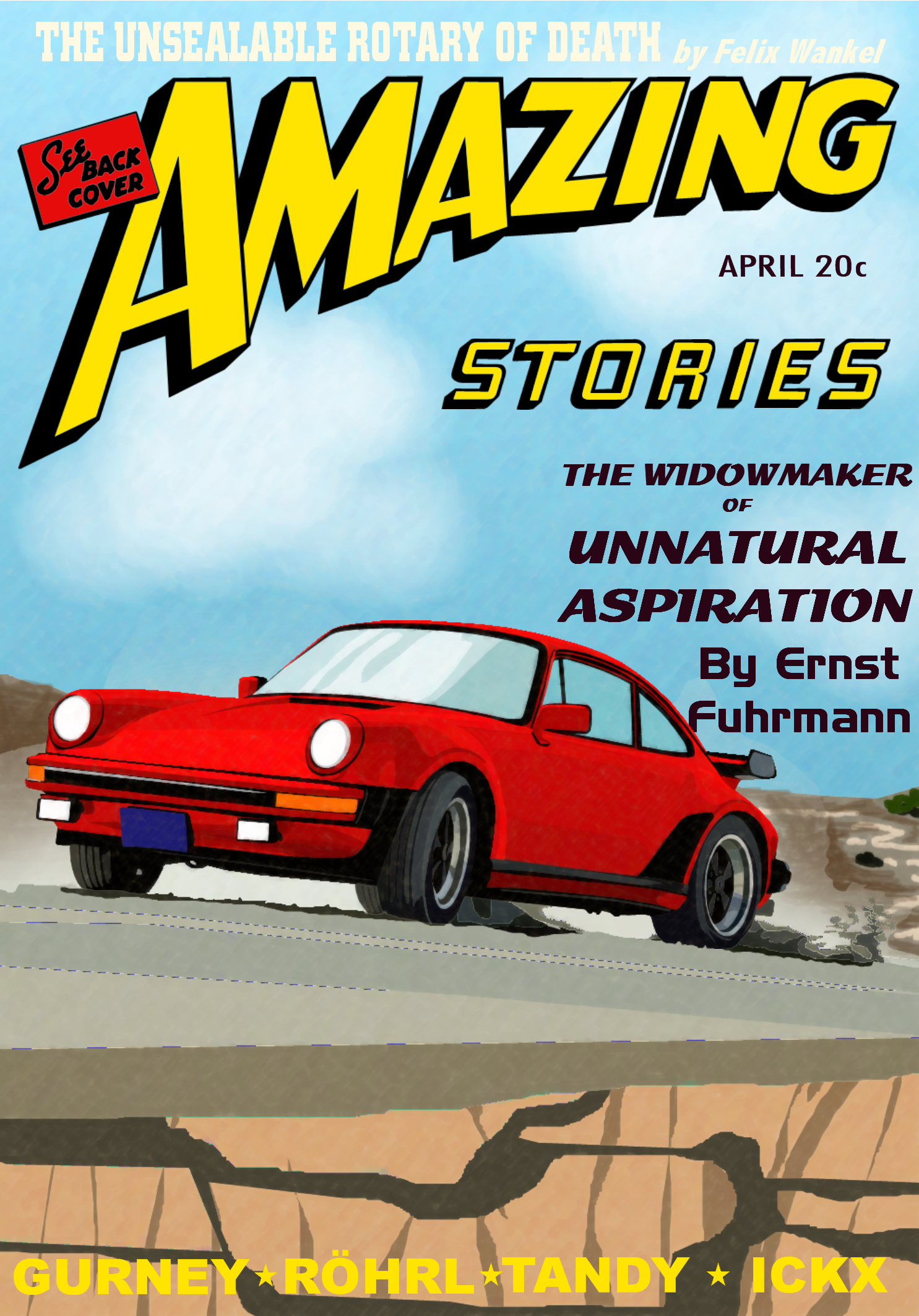
Thoughts, besides the graphical errors caused by the shear awesomeness that digital image suite couldn’t handle?
 Blondude
> Arch Duke Maxyenko, Shit Talk Extraordinaire
Blondude
> Arch Duke Maxyenko, Shit Talk Extraordinaire
02/01/2016 at 22:57 |
|
The font used for The Widowmaker of Unnatural Aspiration seems a little weird for whatever reason.
Otherwise, 10/10 would pay 20˘ for.
 Daily Drives a Dragon - One Last Lap
> Arch Duke Maxyenko, Shit Talk Extraordinaire
Daily Drives a Dragon - One Last Lap
> Arch Duke Maxyenko, Shit Talk Extraordinaire
02/01/2016 at 22:58 |
|
This could so be a Seat Safety Switch story.
 Hot Takes Salesman
> Arch Duke Maxyenko, Shit Talk Extraordinaire
Hot Takes Salesman
> Arch Duke Maxyenko, Shit Talk Extraordinaire
02/01/2016 at 23:07 |
|
Okay that's pretty fuckin brilliant
 phenotyp
> Arch Duke Maxyenko, Shit Talk Extraordinaire
phenotyp
> Arch Duke Maxyenko, Shit Talk Extraordinaire
02/01/2016 at 23:18 |
|
Star for the idea and effort.
Thoughts: keming.
 RallyWrench
> Arch Duke Maxyenko, Shit Talk Extraordinaire
RallyWrench
> Arch Duke Maxyenko, Shit Talk Extraordinaire
02/02/2016 at 00:22 |
|
Dig it. A little hard to read the top and bottom lines of text, but I'd read that publication.
 Andrew P. Collins
> Arch Duke Maxyenko, Shit Talk Extraordinaire
Andrew P. Collins
> Arch Duke Maxyenko, Shit Talk Extraordinaire
02/02/2016 at 00:49 |
|
Cool illustration. Might tweak the positioning of the letters but I dig the general style.