 "someassemblyrequired" (someassemblyrequired)
01/25/2016 at 23:56 • Filed to: planelopnik, eskimo, theonlywaytofly
 2
2
 5
5|
"someassemblyrequired" (someassemblyrequired)
01/25/2016 at 23:56 • Filed to: planelopnik, eskimo, theonlywaytofly | 2
| 5 |
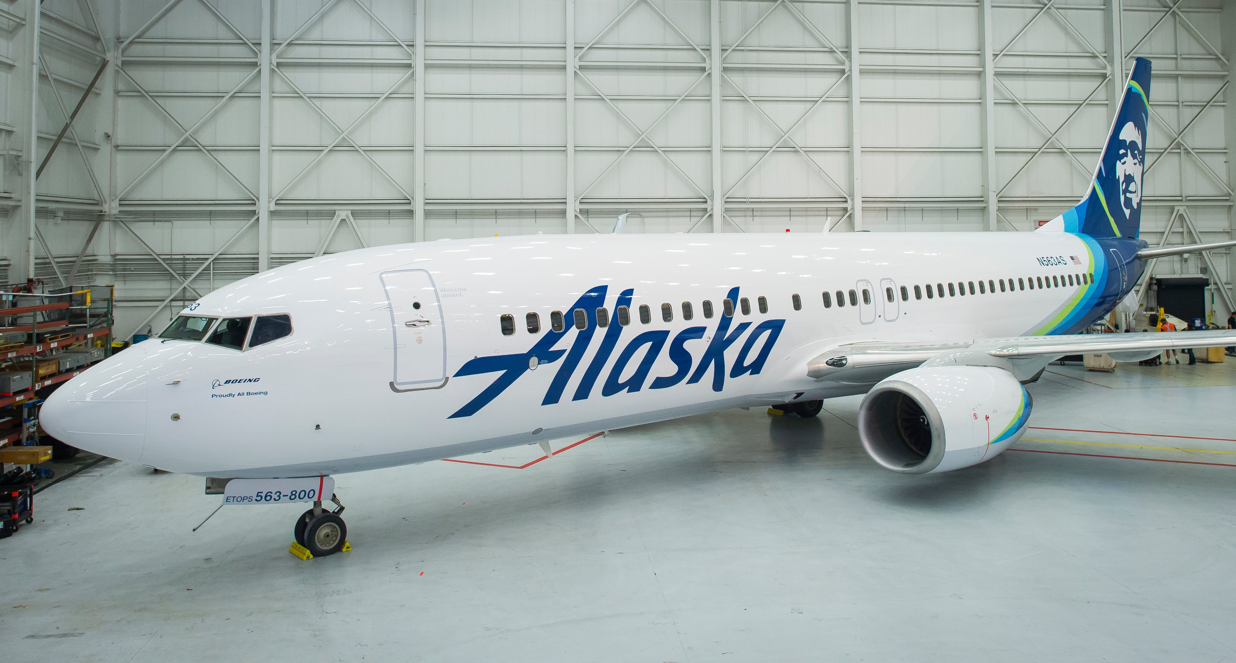
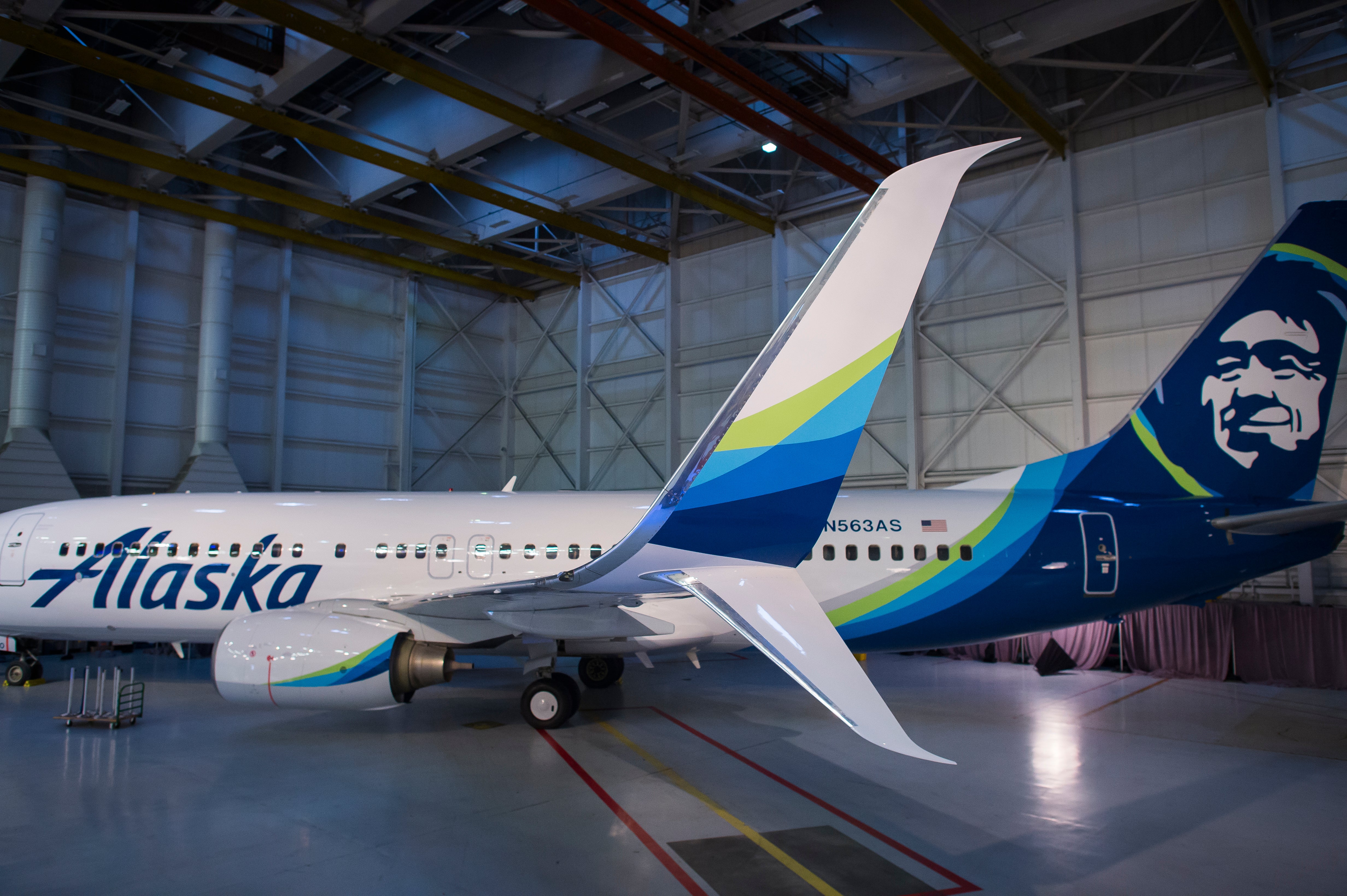
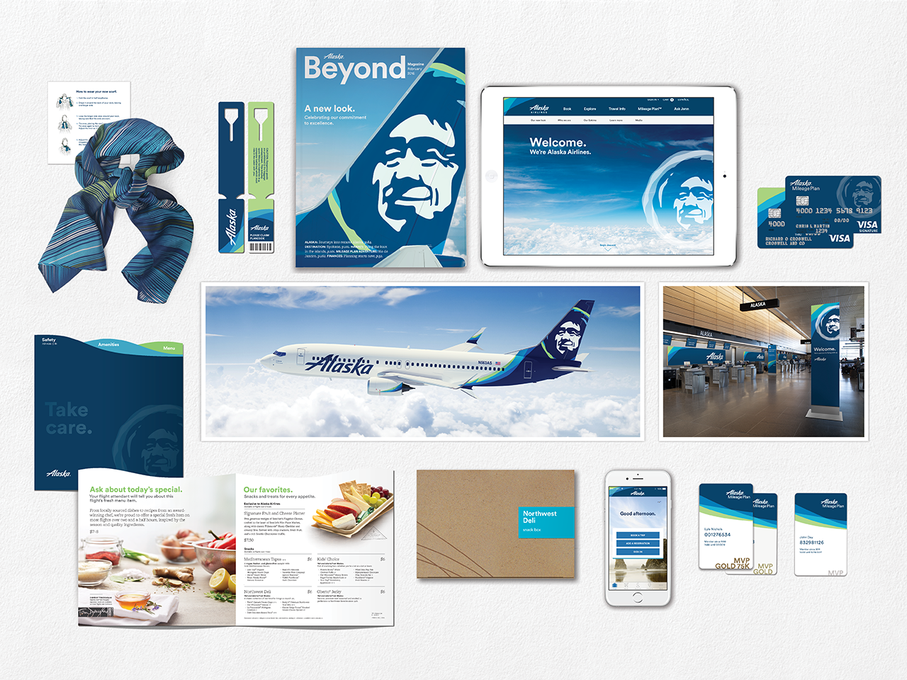
Alaska Airlines updated its standard paint scheme and logos for the first time since 1991. I like the updated font, not so certain about the green/blue swoosh/aura thing though.
 lone_liberal
> someassemblyrequired
lone_liberal
> someassemblyrequired
01/26/2016 at 00:47 |
|
I don’t much care for the green but the rest is fine. Hell, as long as they keep the face on the tail I’ll be good with it.
 PetarVN, GLI Guy, now with stupid power
> someassemblyrequired
PetarVN, GLI Guy, now with stupid power
> someassemblyrequired
01/26/2016 at 01:13 |
|
I’ve flown Alaska Airlines about 10 times now, and I’ve never had a bad experience with anything, save for one long delay; but you can hardly blame them for it.
Really good airline 10/10 would recommend
|
someassemblyrequired
> lone_liberal
01/26/2016 at 01:24 |
|
Yeah the last couple of liveries have had a twinge of green in them but this one is a bit more umm vibrant. But yes I think there would have been a riot if the Eskimo disappeared (unless it was a return to the Totem/Eskimo/Orthodox Church/Miner tails).
|
someassemblyrequired
> PetarVN, GLI Guy, now with stupid power
01/26/2016 at 01:28 |
|
Yes the Benevolent Eskimo runs a good airline. Have flown them hundreds of times and used to be MVP Gold back in the day. Best North American airline by far.
|
lone_liberal
> someassemblyrequired
01/26/2016 at 01:43 |
|
It kind of looks like Seahawks green, which is understandable but over done lately.