 "MLGCarGuy" (thejdmguy)
08/26/2015 at 15:17 • Filed to: None
 1
1
 17
17|
"MLGCarGuy" (thejdmguy)
08/26/2015 at 15:17 • Filed to: None | 1
| 17 |
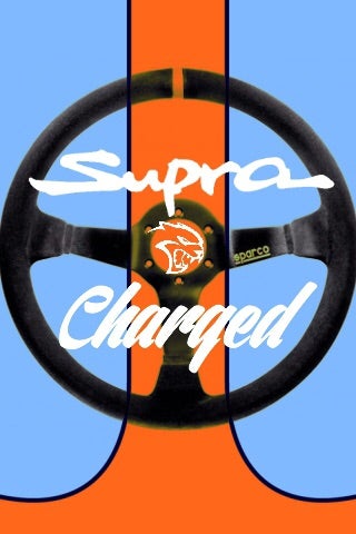
What do you think?
How it looks now. (also please give this account a follow is possible, thanks)
Shoutout to Nibby, jbh, and HammerheadFistpunch for ideas/commenting on my logo post.
 HammerheadFistpunch
> MLGCarGuy
HammerheadFistpunch
> MLGCarGuy
08/26/2015 at 15:21 |
|
Its your logo, and your deal so take my advice with a grain of salt (and my logo submission as well) but for avatars, logos and graphics, go super simple and avoid the temptation to include too much fine detail. If it were me I would first ditch the hellcat, and then stylize the wheel to remove the brand.
 hsv
> MLGCarGuy
hsv
> MLGCarGuy
08/26/2015 at 15:21 |
|
Looks cool. Improvements, I’d drop the Gulf and choose some classic Supra liveries (inb4 Castrol). You could have a field day finding the obscure ones. ;)
 MontegoMan562 is a Capri RS Owner
> MLGCarGuy
MontegoMan562 is a Capri RS Owner
> MLGCarGuy
08/26/2015 at 15:21 |
|
I don’t have an instagram account, but I like the logo.
 luvMeSome142 & some Lincoln!
> HammerheadFistpunch
luvMeSome142 & some Lincoln!
> HammerheadFistpunch
08/26/2015 at 15:24 |
|
seconded
|
MLGCarGuy
> HammerheadFistpunch
08/26/2015 at 15:24 |
|
Good advice. Will try.
|
MLGCarGuy
> MontegoMan562 is a Capri RS Owner
08/26/2015 at 15:24 |
|
Thanks.
 Shark-Attack
> MLGCarGuy
Shark-Attack
> MLGCarGuy
08/26/2015 at 15:26 |
|
Ditch the sparco for a nardi.
/biased
 Baeromez
> MLGCarGuy
Baeromez
> MLGCarGuy
08/26/2015 at 15:28 |
|
It’s way, way, way too busy. Plus you’re basically stealing 4 or 5 well known brands and just mashing them together.
 Hot Takes Salesman
> MLGCarGuy
Hot Takes Salesman
> MLGCarGuy
08/26/2015 at 15:30 |
|
I followed it, why the hell not
|
MLGCarGuy
> Shark-Attack
08/26/2015 at 15:35 |
|
I’ll try.
|
MLGCarGuy
> Baeromez
08/26/2015 at 15:35 |
|
Ok. I’ll try to simplify it.
|
MLGCarGuy
> HammerheadFistpunch
08/26/2015 at 15:52 |
|
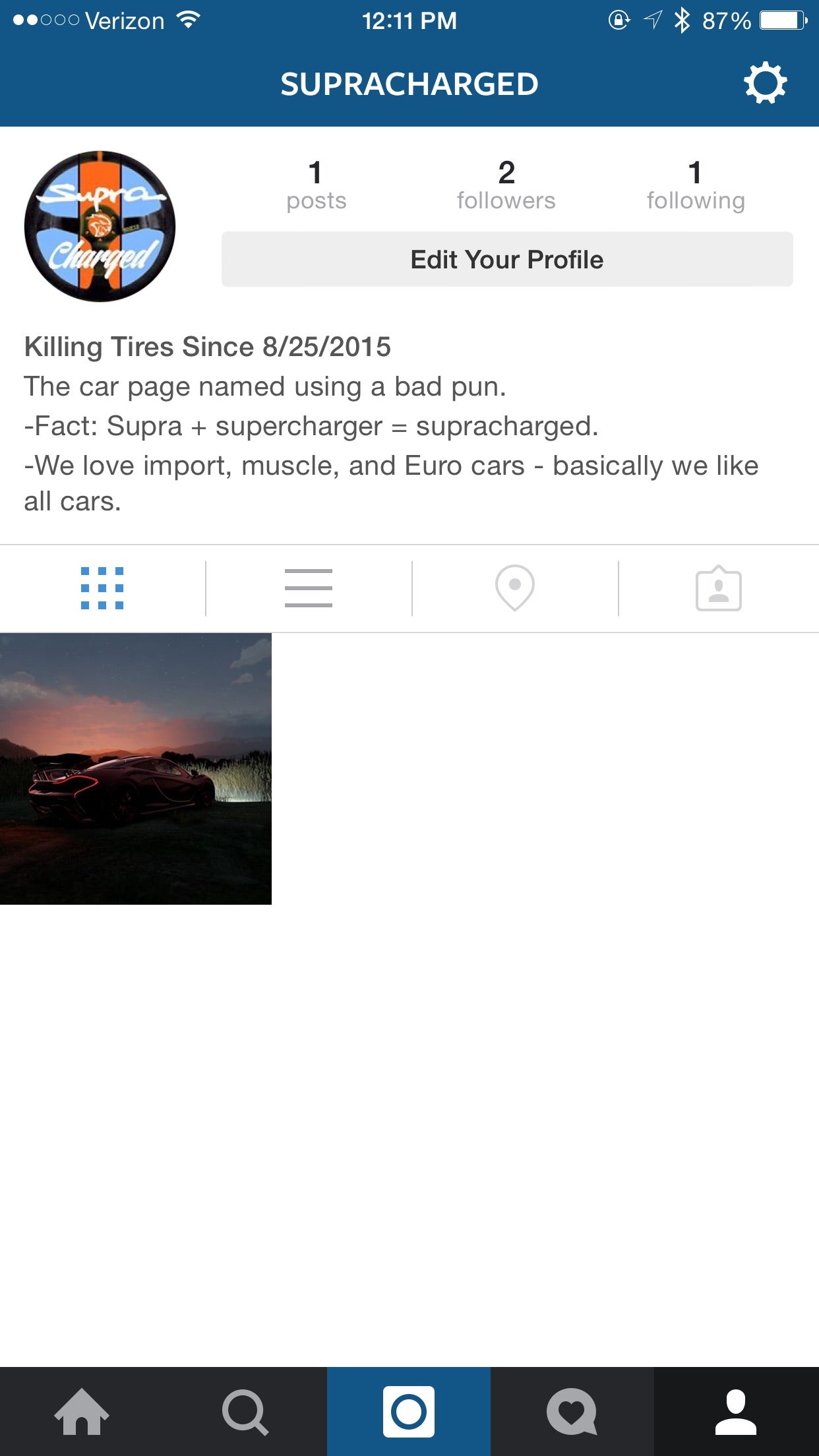
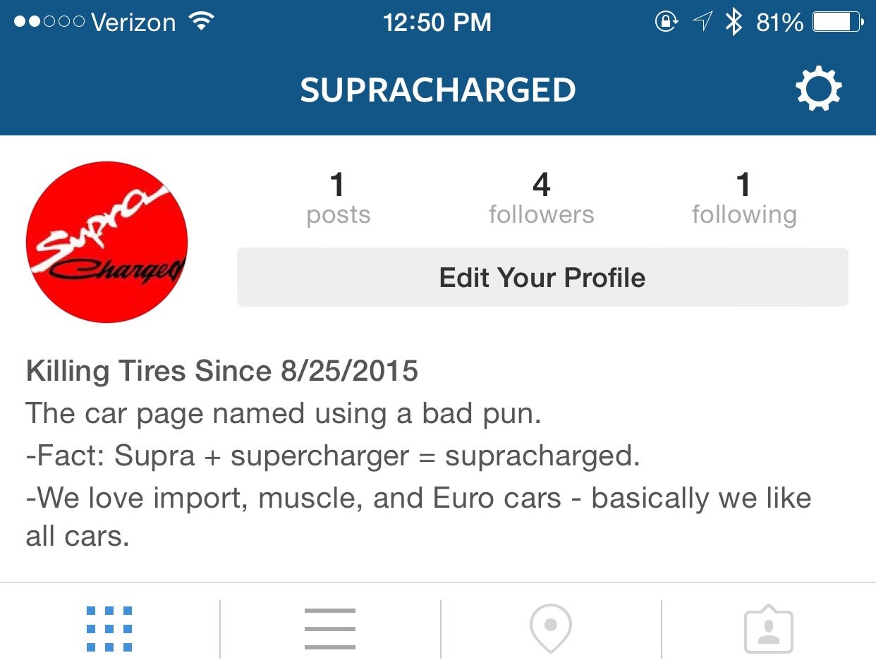
I gave up cause I couldn’t find a good pic of the livery I liked. I’m using your logo and it’s much easier to read. Thanks so much.
|
HammerheadFistpunch
> MLGCarGuy
08/26/2015 at 15:53 |
|
HA! I probably would have put a little more effort into it if I knew. Oh well, I’m actually pretty happy the way it came out given the time.
 SnapUndersteer, Italian Spiderman
> MLGCarGuy
SnapUndersteer, Italian Spiderman
> MLGCarGuy
08/26/2015 at 16:07 |
|
There was an attempt!
|
SnapUndersteer, Italian Spiderman
> hsv
08/26/2015 at 16:07 |
|
Forget Castrol, acquire Tom's
|
MLGCarGuy
> SnapUndersteer, Italian Spiderman
08/26/2015 at 16:07 |
|
Which failed miserably.
|
hsv
> SnapUndersteer, Italian Spiderman
08/26/2015 at 16:10 |
|
The Ryowa House Pacific livery would be a nice one to do. Three nice, basic colours to work with. Visually interesting design.