 "Anon" (tjsielsistneb)
07/07/2015 at 01:06 • Filed to: None
 1
1
 2
2|
"Anon" (tjsielsistneb)
07/07/2015 at 01:06 • Filed to: None | 1
| 2 |
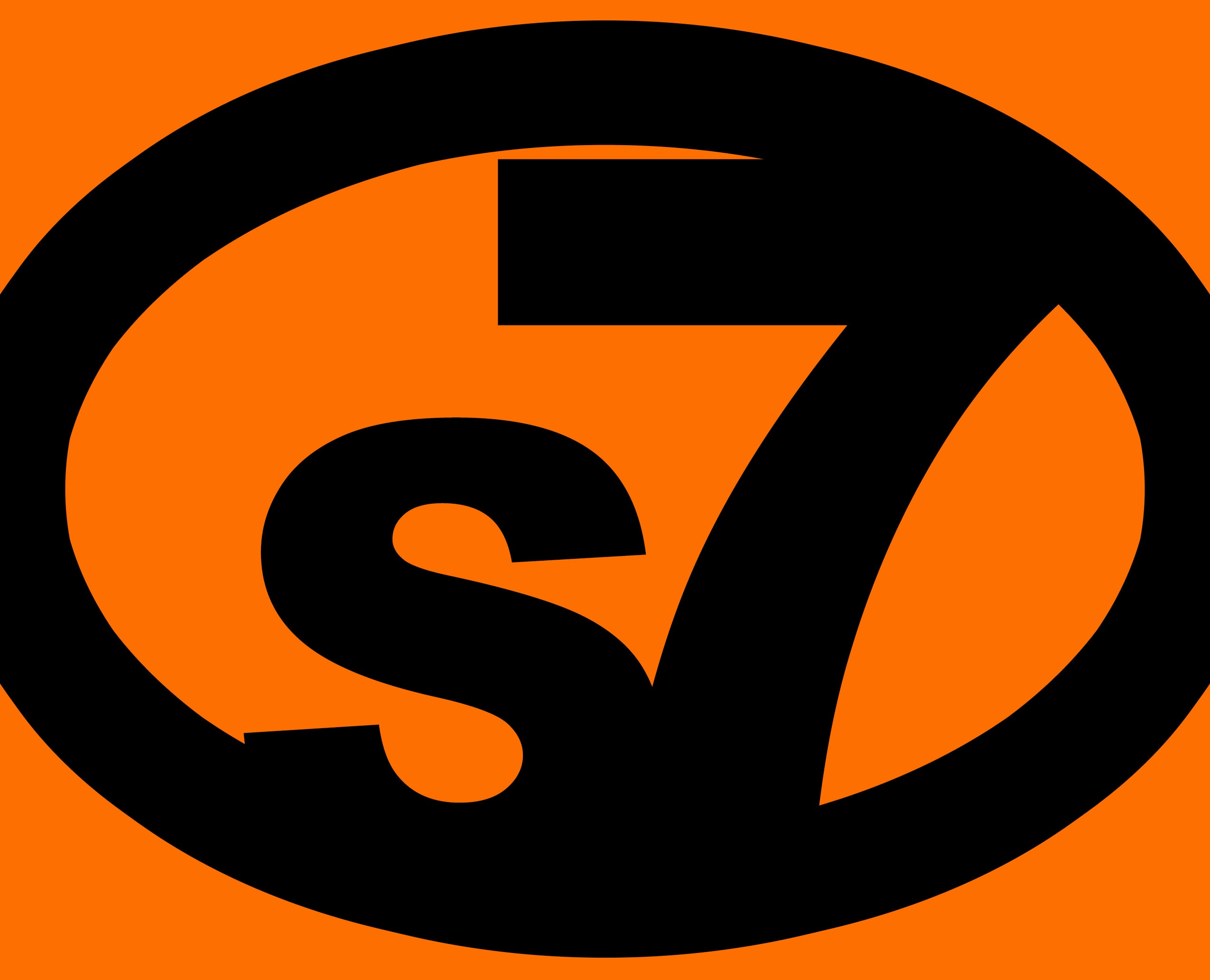
I’m wanting to start writing on Anonkun which is a live streaming writing website where people watching get to decide what happens next. Well I have to have an image for my story. I want to have a story about two people who work together as Liaisons/negotiators for a private army called Section Seven Industries. So I thought I would put a logo for Section Seven as my image. What do y’all think? I tried to go for a minimalist look.
 davesaddiction @ opposite-lock.com
> Anon
davesaddiction @ opposite-lock.com
> Anon
07/07/2015 at 10:05 |
|
Not bad, but why not a circle instead of an oval?
|
davesaddiction @ opposite-lock.com
> Anon
07/07/2015 at 10:06 |
|
Too tight above the 7, needs a little more space. A good trick is to look at a logo at a very, very small size (zoom way out in your graphics program) to see how legible and recognizable elements are.