 "Luke's Dad Sold His 2000TL To Get a Sienna" (lukielauxd)
07/05/2015 at 15:11 • Filed to: off topic
 1
1
 12
12|
"Luke's Dad Sold His 2000TL To Get a Sienna" (lukielauxd)
07/05/2015 at 15:11 • Filed to: off topic | 1
| 12 |
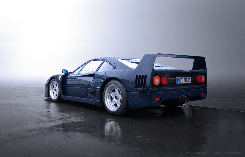
Hello everyone on here, several of which are professionals. Here’s a blue F40 for tribute. It is once again resume/internship season at my school and I need some help with a decision.
I’m currently a Petroleum Engineering student at the University of Tulsa and for the past two years, I haven’t been able to get an internship, part of it is it’s near impossible to get it during my first year and my second year I had a terrible GPA. But I heard by the third year, (EVENTHOUGH MY GPA GOT WORSE) I have a bigger chance getting an internship. Part of the reason I think is I’ve only been adding to my resume and now it looks small and cramped and I thought it was time for a refresh.
Here’s the question, is it better to have one of those normal looking Times New Roman/Arial resumes or to have those new fancy schmancy Graphic Designer designed resumes if I’m applying to an oil company. Would they appreciate the extra work I put to making a nicer and colorful resume or would it just bother them when it came to uploading it and reading it on their application sites?
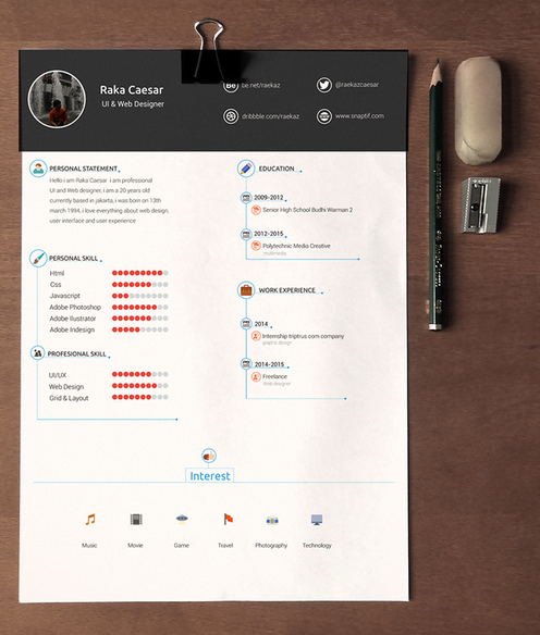
Here’s an example of what I would make if I made one (AND BY THAT I MEAN COPY SOMEONE ELSE’S FROM THIS WEBSITE CALLED BEHANCE)
Thanks in advance!
 Steve in Manhattan
> Luke's Dad Sold His 2000TL To Get a Sienna
Steve in Manhattan
> Luke's Dad Sold His 2000TL To Get a Sienna
07/05/2015 at 15:16 |
|
I’ve reviewed a few resumes in my time. The idea is to make it readable - lots of space instead of giant block paragraphs - and make it easy for the reader to find what they want. It is rare that anyone reads your entire resume. Hope that helps.
 Autoeccentric
> Luke's Dad Sold His 2000TL To Get a Sienna
Autoeccentric
> Luke's Dad Sold His 2000TL To Get a Sienna
07/05/2015 at 15:24 |
|
Steve In Manhatton’s advice is spot on. A nice graphicky designy colour orgasm vomit super experience turbo CV is all well and good when you’re actually applying for somewhere that likes, or even makes that kind of thing, for the rest of the world, jus’ chill.
 JGrabowMSt
> Luke's Dad Sold His 2000TL To Get a Sienna
JGrabowMSt
> Luke's Dad Sold His 2000TL To Get a Sienna
07/05/2015 at 15:26 |
|
I personally use a non-traditional, but mostly text resume. Those graphic design ones? Theyre great for artists and graphic designers, but thats not your area of study.
I typically use a Google Doc template, and even made my girlfriends resume, and they look top notch. To be honest, do not make a graphic one. Feel free to try out Google Docs, and if you want help, shoot me an email [username]@gmail and Ill gladly help you out. For the industry youre working in, you certainly need to stick to something a bit more traditional, as the people reviewing it need to remember yours, but not the wrong way. A ton of graphics and whatnot will likely cause the reviewer to not take it seriously.
 dogisbadob
> Luke's Dad Sold His 2000TL To Get a Sienna
dogisbadob
> Luke's Dad Sold His 2000TL To Get a Sienna
07/05/2015 at 15:29 |
|
Font doesn’t matter since they’re screened out by software scanning anyway.
 SteveLehto
> Luke's Dad Sold His 2000TL To Get a Sienna
SteveLehto
> Luke's Dad Sold His 2000TL To Get a Sienna
07/05/2015 at 15:43 |
|
Content is king; clarity is your friend.
Stick with normal fonts (TNR etc) and focus on what it says. I agree with Steve in Manhattan. More is not better. I know there is a school of thought I tend to agree with. Make it one page (unless you are in a rare field where multi-page CVs are the norm) and the thinking is you put the best page of stuff you have on it.
I have accomplished a lot in the last 25 years (I am probably older than you) and I wouldn’t put more than a page of stuff out there. The thinking is that the page is the best one-page representation of yourself.
 Trunk Impaired 318
> Luke's Dad Sold His 2000TL To Get a Sienna
Trunk Impaired 318
> Luke's Dad Sold His 2000TL To Get a Sienna
07/05/2015 at 16:08 |
|
From most people I know who deal with hiring and such, dont include your GPA unless its asked for specifically
 GhostZ
> Luke's Dad Sold His 2000TL To Get a Sienna
GhostZ
> Luke's Dad Sold His 2000TL To Get a Sienna
07/05/2015 at 16:23 |
|
Create a portfolio of research you’ve done and papers you’ve written to showcase on the back of the resume.
 Funktheduck
> Luke's Dad Sold His 2000TL To Get a Sienna
Funktheduck
> Luke's Dad Sold His 2000TL To Get a Sienna
07/05/2015 at 16:38 |
|
I agree with the others: don’t use a graphic type resume unless you’re going into that type of field. Keep it simple and clean showcasing your best work on one page (once again unless your field the norm is multiple pages). Don’t include GPA unless asked.
I don’t know how much time you have for prep but it may be worth a shot to try to contact someone in HR and see what they look for.
I've been told in the past don't bother listing skills like word or excel because stuff like that is expected these days
 Ryan A.
> Luke's Dad Sold His 2000TL To Get a Sienna
Ryan A.
> Luke's Dad Sold His 2000TL To Get a Sienna
07/05/2015 at 16:44 |
|
I agree with the others here who have suggested against over-designing. Sometimes it can give off the impression that it’s compensating.
I’ll be happy to look your resume over and provide feedback. Kinja doesn’t do direct/private messages, does it?
 AthomSfere
> Trunk Impaired 318
AthomSfere
> Trunk Impaired 318
07/05/2015 at 18:22 |
|
It probably is for an internship...
But agreed, never put your GPA on unless its A) Required or B) Incredibly good (3.8 - 4.0). Also, if its over 4.0, your GPA is useless because your school inflated its scale, and leave it off anyway.
 Patrick Glace
> Luke's Dad Sold His 2000TL To Get a Sienna
Patrick Glace
> Luke's Dad Sold His 2000TL To Get a Sienna
07/05/2015 at 19:06 |
|
I will agree with most — simple is best. I like to avoid templates, as they are usually a bit corny and font choice is often questionable. Don’t just list your job duties, try to incorporate achievements and measurable results — even if it is basic stuff. Triple check for spelling errors, read it backwards if need be.
 pip bip - choose Corrour
> Luke's Dad Sold His 2000TL To Get a Sienna
pip bip - choose Corrour
> Luke's Dad Sold His 2000TL To Get a Sienna
07/06/2015 at 05:29 |
|
10/10 would hoon.