"That Bastard Kurtis - An Attempt to Standardize My Username Across Platforms" (thatbastardkurtis5)
05/12/2015 at 22:20 • Filed to: None
 4
4
 35
35|
"That Bastard Kurtis - An Attempt to Standardize My Username Across Platforms" (thatbastardkurtis5)
05/12/2015 at 22:20 • Filed to: None | 4
| 35 |
I had been thinking about this lately for some reason. Car company logos are always interesting to me, especially the ones that tell a little bit of a story about the company itself.
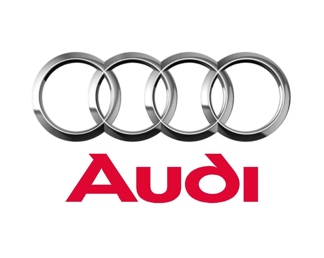
Audi’s logo, for example, represents the four brands that originally formed Auto Union: Audi, Horch, DKW, and Wanderer.
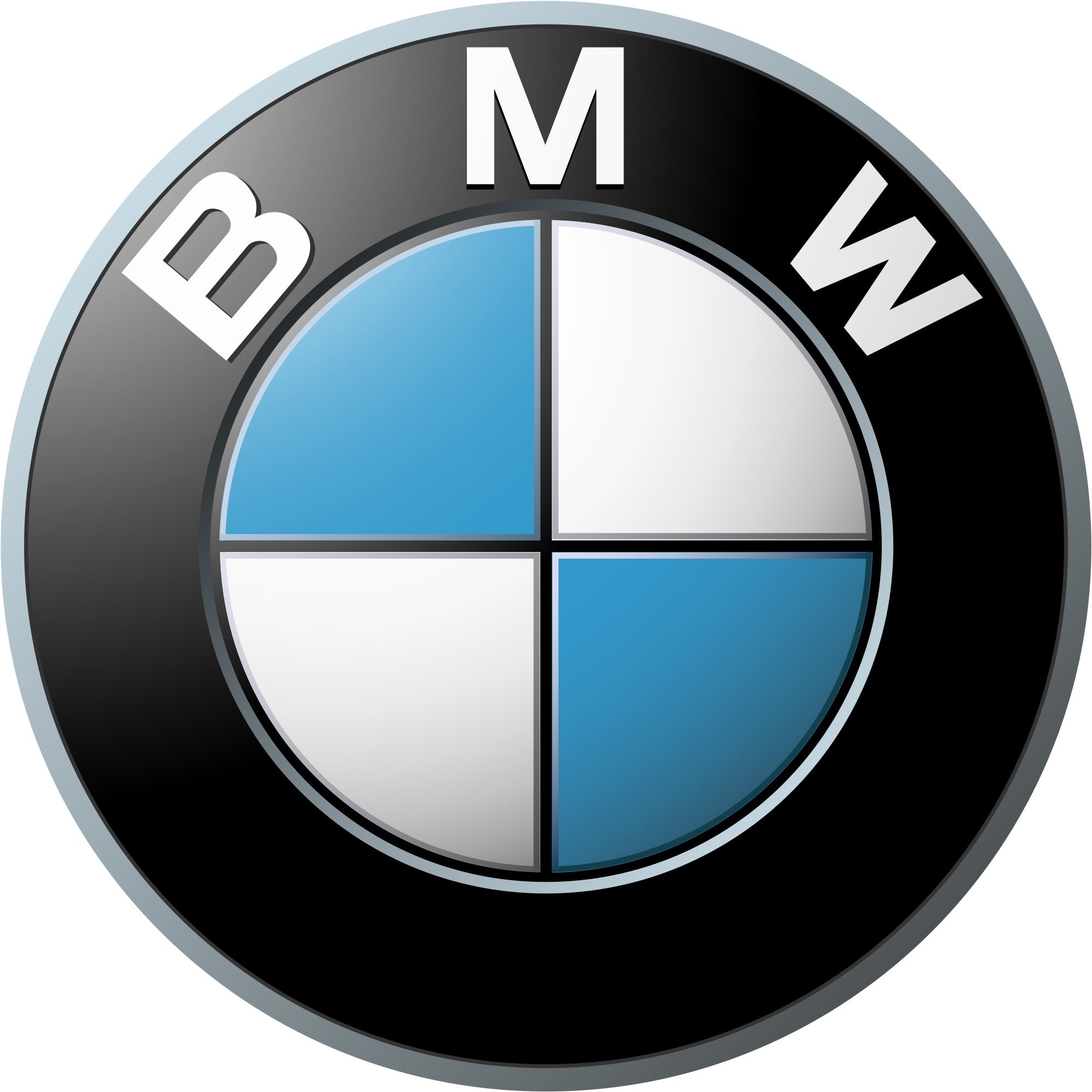
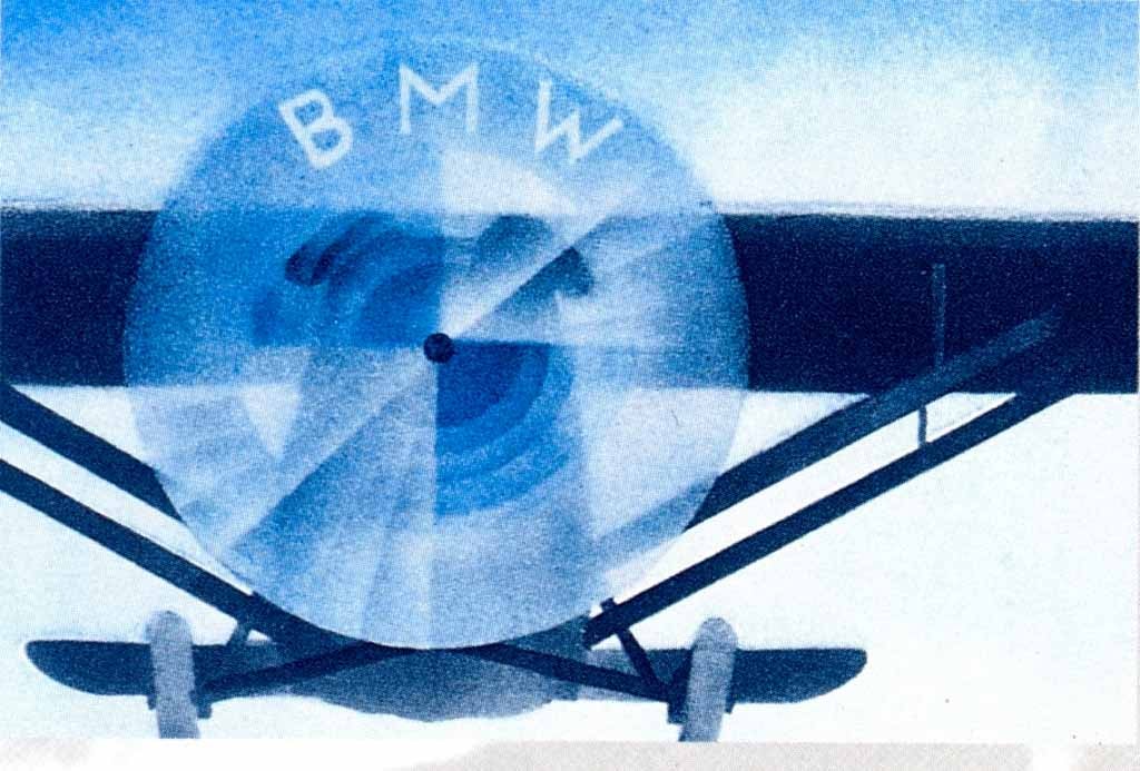
BMW has a well known, and often misinterpreted logo. The blue and white is often thought to symbolize a spinning propellor, since BMW was in the business of airplane engines, but is actually for the colors of the Bavarian flag.
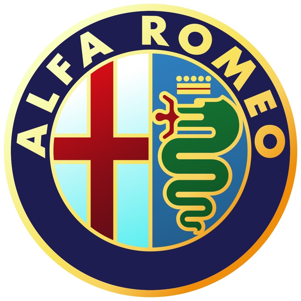
But my choice for best logo is actually Alfa Romeo. The left side is the symbol of the city of Milan, the right side is the symbol of the Visconti family, a very powerful family from Milan. And that symbol is a snake dragon with a crown eating somebody. I don’t know what else I can say about it.
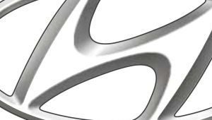
As for the worst logo? Well, here it is.
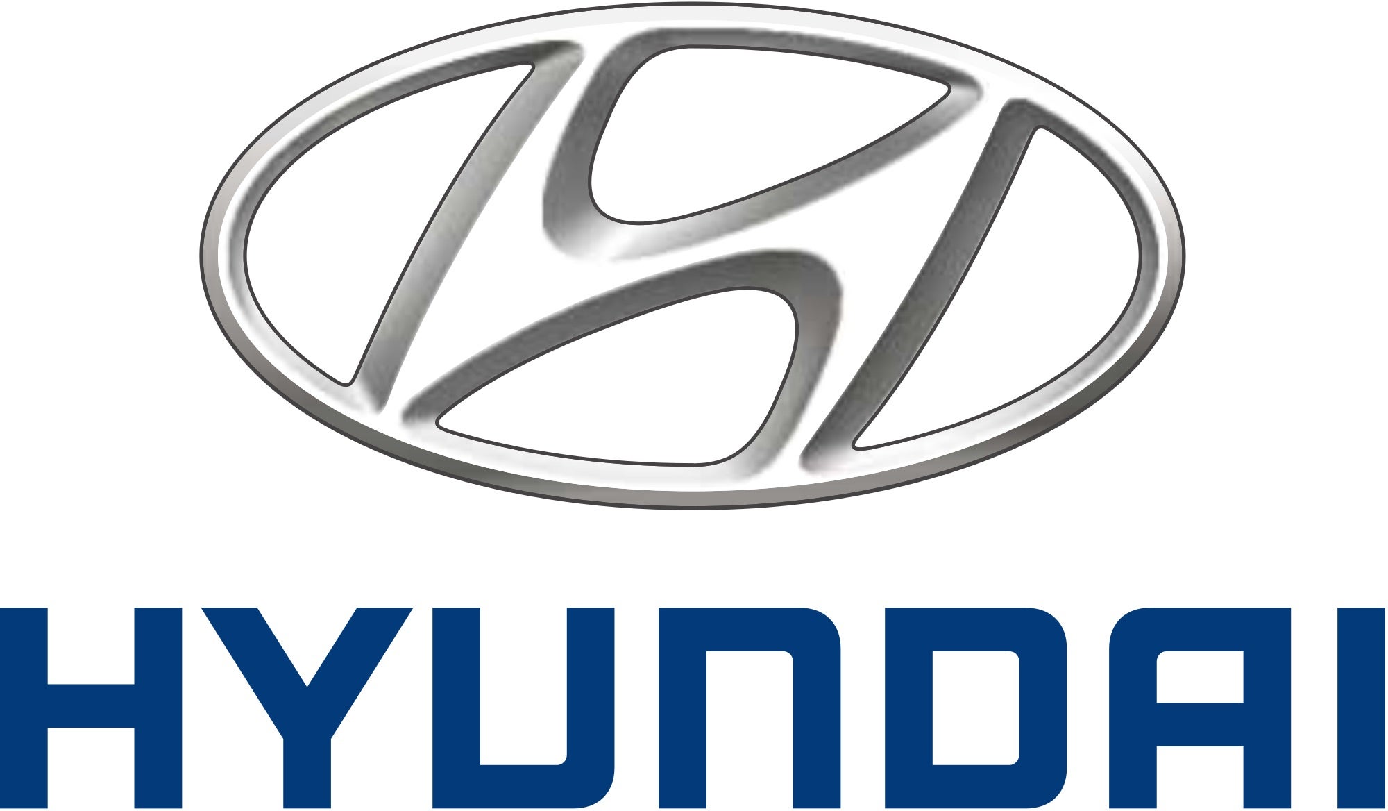
Theres a big problem with Hyundai’s logo, and I’m going to let Hyundai show you themself. Here’s a picture of an Equus:

And here’s a 2015 Genesis:
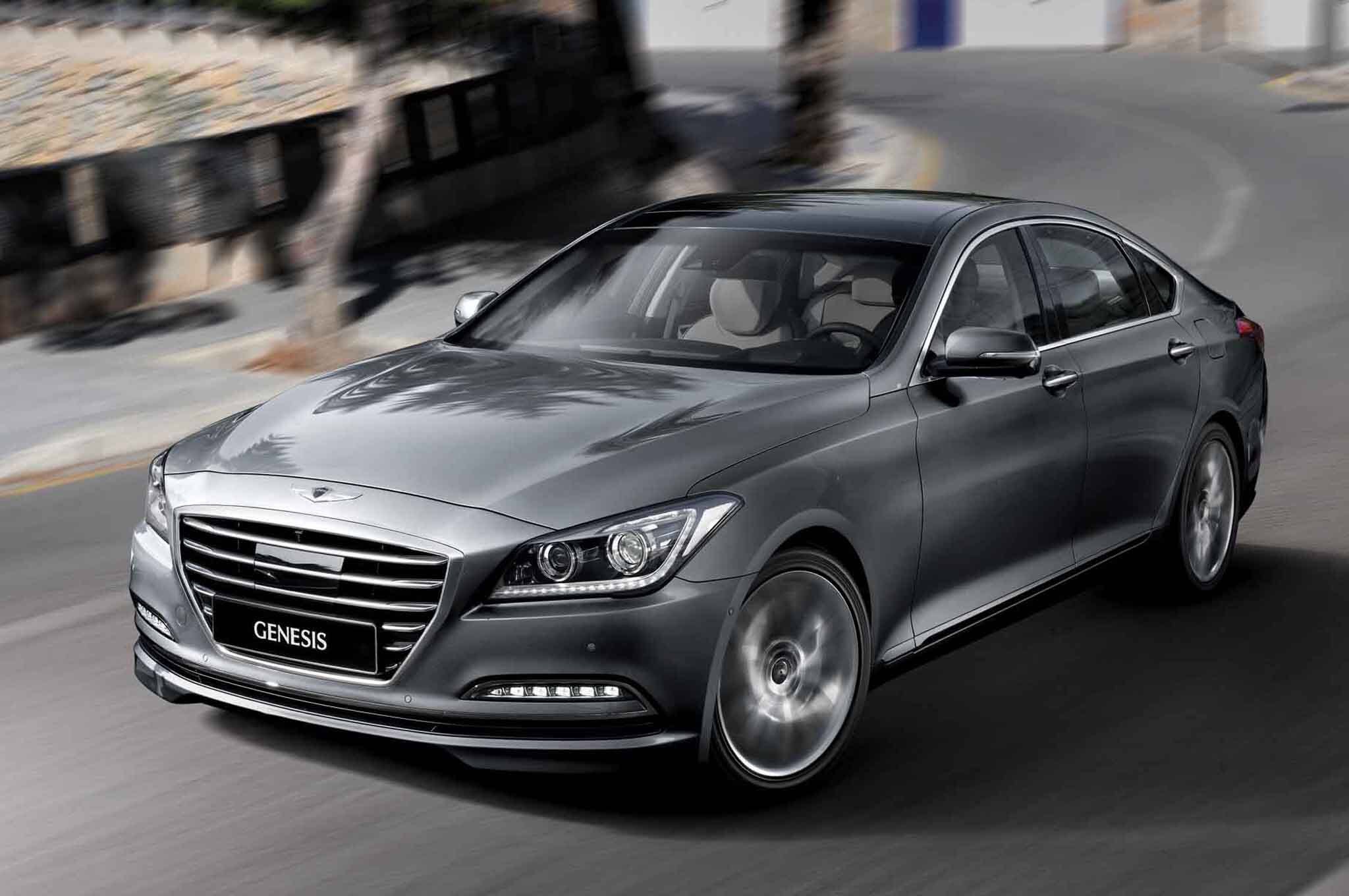
Hyundai’s logo isn’t present on the nose or tail of either car. Hyundai thinks so little of their own logo that they don’t put it on their two most prestigious cars. If this was a thing throughout their entire lineup, like Toyota in the 1980s, it would actually be really cool. But instead, they take their badge off their top two cars because they think not having a Hyundai badge on them is a selling point.
So Oppo. What are some of your favorite and least favorite manufacturer logos?
 TheHondaBro
> That Bastard Kurtis - An Attempt to Standardize My Username Across Platforms
TheHondaBro
> That Bastard Kurtis - An Attempt to Standardize My Username Across Platforms
05/12/2015 at 22:23 |
|
It’s an italic Honda logo.
|
That Bastard Kurtis - An Attempt to Standardize My Username Across Platforms
> TheHondaBro
05/12/2015 at 22:26 |
|
It really is though. I've always liked the Honda logo, it has a kind of purposeful, classic look.
 John_Harbinson
> That Bastard Kurtis - An Attempt to Standardize My Username Across Platforms
John_Harbinson
> That Bastard Kurtis - An Attempt to Standardize My Username Across Platforms
05/12/2015 at 22:27 |
|
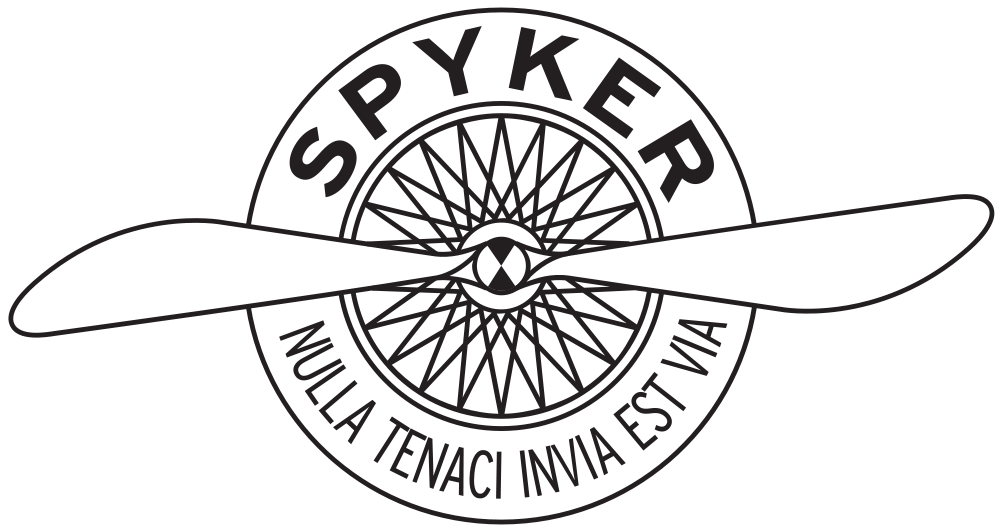
My vote goes to Spyker, because it’s just cooooooool.
 MLGCarGuy
> That Bastard Kurtis - An Attempt to Standardize My Username Across Platforms
MLGCarGuy
> That Bastard Kurtis - An Attempt to Standardize My Username Across Platforms
05/12/2015 at 22:34 |
|
The US spec Genesis has a H badge on the back.

As for best logo?
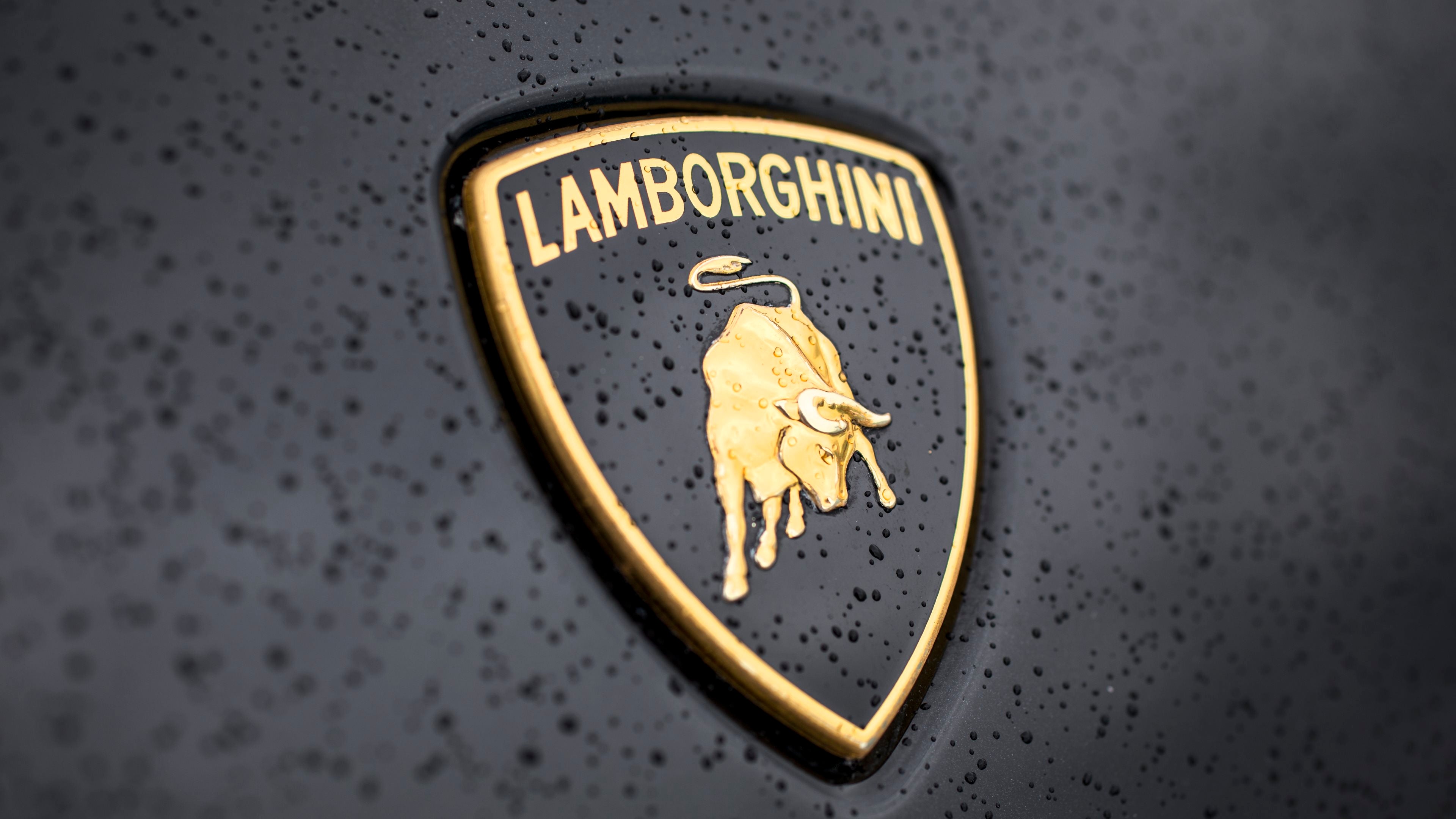
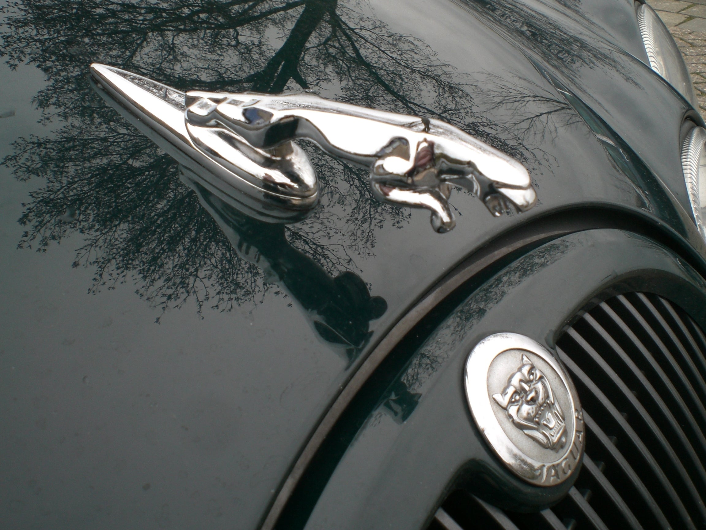
Tells you the car is fierce.
The worst?
It’s iconic, but what does it exactly symbolize? The story behind it is terrible.
 scoob
> John_Harbinson
scoob
> John_Harbinson
05/12/2015 at 22:35 |
|
Hngggggggg Spyker needs to come back, like right now.
 RazoE
> MLGCarGuy
RazoE
> MLGCarGuy
05/12/2015 at 22:37 |
|
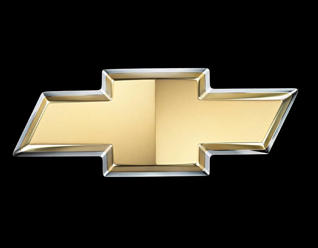
It’s a bow-tie because Louis Chevrolet was a sir.....I think..
 Rollo75
> That Bastard Kurtis - An Attempt to Standardize My Username Across Platforms
Rollo75
> That Bastard Kurtis - An Attempt to Standardize My Username Across Platforms
05/12/2015 at 22:39 |
|
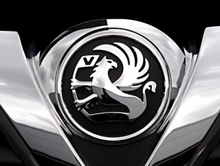
Vauxhall’s logo is pretty cool.
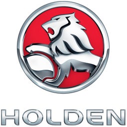
Holden’s logo is pretty cool.
Why the hell then does General Motors get it so spectacularly boring with the Opel and Chevrolet logos? The Opel logo is a lightning bolt which could have been so much cooler and Chevrolet’s bow-tie disproves the rule that “Bow-Ties are Cool”. Chevrolet’s logo just makes you want to go out an order a beige suit and some argyle socks.
 If only EssExTee could be so grossly incandescent
> That Bastard Kurtis - An Attempt to Standardize My Username Across Platforms
If only EssExTee could be so grossly incandescent
> That Bastard Kurtis - An Attempt to Standardize My Username Across Platforms
05/12/2015 at 22:42 |
|
.
 R Saldana [|Oo|======|oO|] - BTC/ETH/LTC Prophet
> That Bastard Kurtis - An Attempt to Standardize My Username Across Platforms
R Saldana [|Oo|======|oO|] - BTC/ETH/LTC Prophet
> That Bastard Kurtis - An Attempt to Standardize My Username Across Platforms
05/12/2015 at 22:43 |
|
Came to say this. Left not disappointed.
 phenotyp
> That Bastard Kurtis - An Attempt to Standardize My Username Across Platforms
phenotyp
> That Bastard Kurtis - An Attempt to Standardize My Username Across Platforms
05/12/2015 at 22:43 |
|
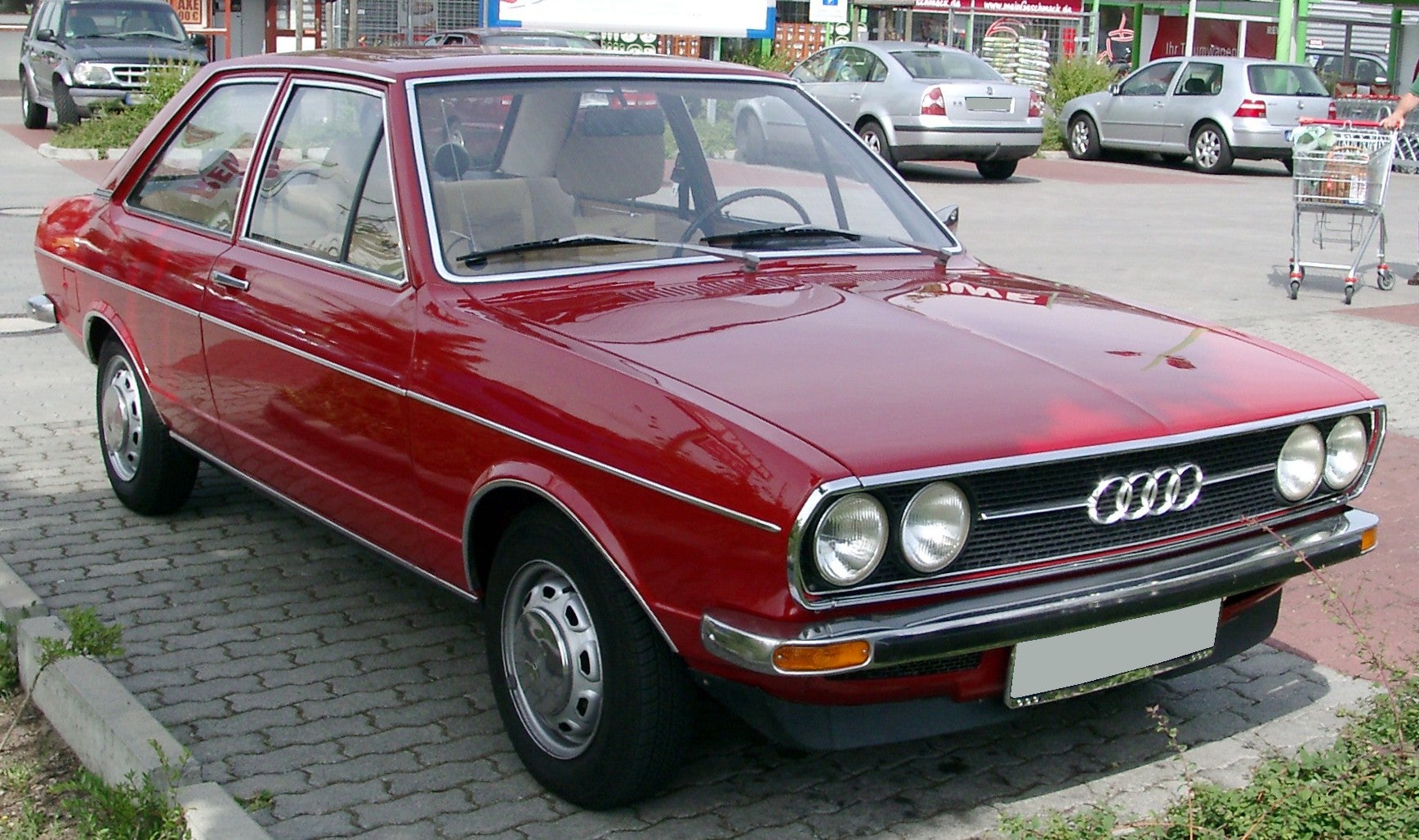
Honestly, I think Audi takes this one. Honda’s so clean and timeless, but the proportion of the four rings and the seriously oddball (for automotive industry) type on Audi is icing. Mercedes’s logo is great, but Audi’s type mark trumps it. And those 70s models, with the chrome spears on either side of the four rings?
Sold.
 Alfalfa Romeo
> That Bastard Kurtis - An Attempt to Standardize My Username Across Platforms
Alfalfa Romeo
> That Bastard Kurtis - An Attempt to Standardize My Username Across Platforms
05/12/2015 at 22:44 |
|
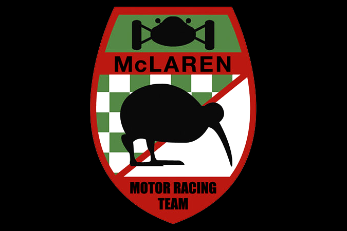
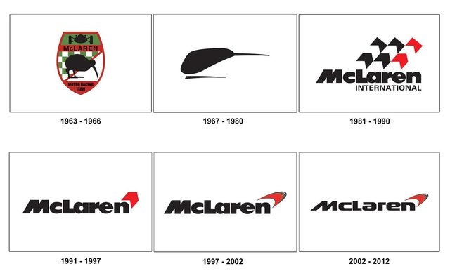
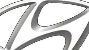
I think the current McLaren logo is one of the worst, for the simple fact that it’s still supposedly a bird.

That doesn’t look like any kiwi I’ve ever seen. But what do I know, I’ve never been to New Zealand.
|
MLGCarGuy
> RazoE
05/12/2015 at 22:45 |
|
He apparently saw an ad for a coal company.
http://jalopnik.com/5797651/the-re…
 Logansteno: Bought a VW?
> That Bastard Kurtis - An Attempt to Standardize My Username Across Platforms
Logansteno: Bought a VW?
> That Bastard Kurtis - An Attempt to Standardize My Username Across Platforms
05/12/2015 at 22:46 |
|
The current Chevrolet logo (sadly) gets my vote. Why does it have to be fucking gold Chevy? Literally any color is better than gold. Fuck, use the Z28’s flow tie on everything, that thing is minimalistic and just perfect all around.
|
That Bastard Kurtis - An Attempt to Standardize My Username Across Platforms
> MLGCarGuy
05/12/2015 at 22:47 |
|
Weird, I must have been looking at preproduction Genesis photos. Good to know.
 sm70- why not Duesenberg?
> That Bastard Kurtis - An Attempt to Standardize My Username Across Platforms
sm70- why not Duesenberg?
> That Bastard Kurtis - An Attempt to Standardize My Username Across Platforms
05/12/2015 at 22:51 |
|
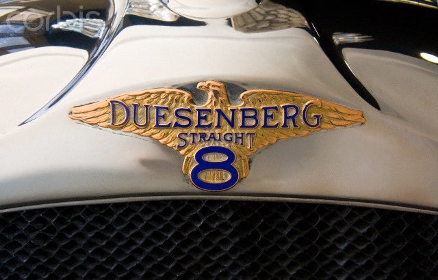
|
MLGCarGuy
> That Bastard Kurtis - An Attempt to Standardize My Username Across Platforms
05/12/2015 at 22:56 |
|
Many markets have the wing badges instead, the US ones have Hyundai logos I guess to establish what they are. Most dealers remove the H and put the wings instead though. The wing badges are an attempt to split the Equus and Genesis away from Hyundai, because at one point Hyundai was about to make the Equus and Genesis into their own company.
|
TheHondaBro
> Alfalfa Romeo
05/12/2015 at 23:00 |
|
It’s an homage to the MP4/4 Marlboro livery.
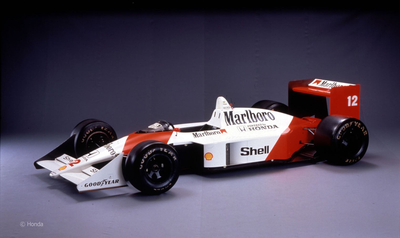
It’s also the reason Honda uses Championship White with red accents on their Type R models.
 wafflesnfalafel
> MLGCarGuy
wafflesnfalafel
> MLGCarGuy
05/12/2015 at 23:02 |
|
you know - I have that reaction to the chevy bow tie too. Looks fine on trucks, but is just sort of too chunky for cars. I think it actually distracts from cars like the Camaro. I prefer the chrome cursive text - and I think it would look good even on modern cars.
|
MLGCarGuy
> wafflesnfalafel
05/12/2015 at 23:04 |
|
But a Camaro with a flow tie instead? That looks great.
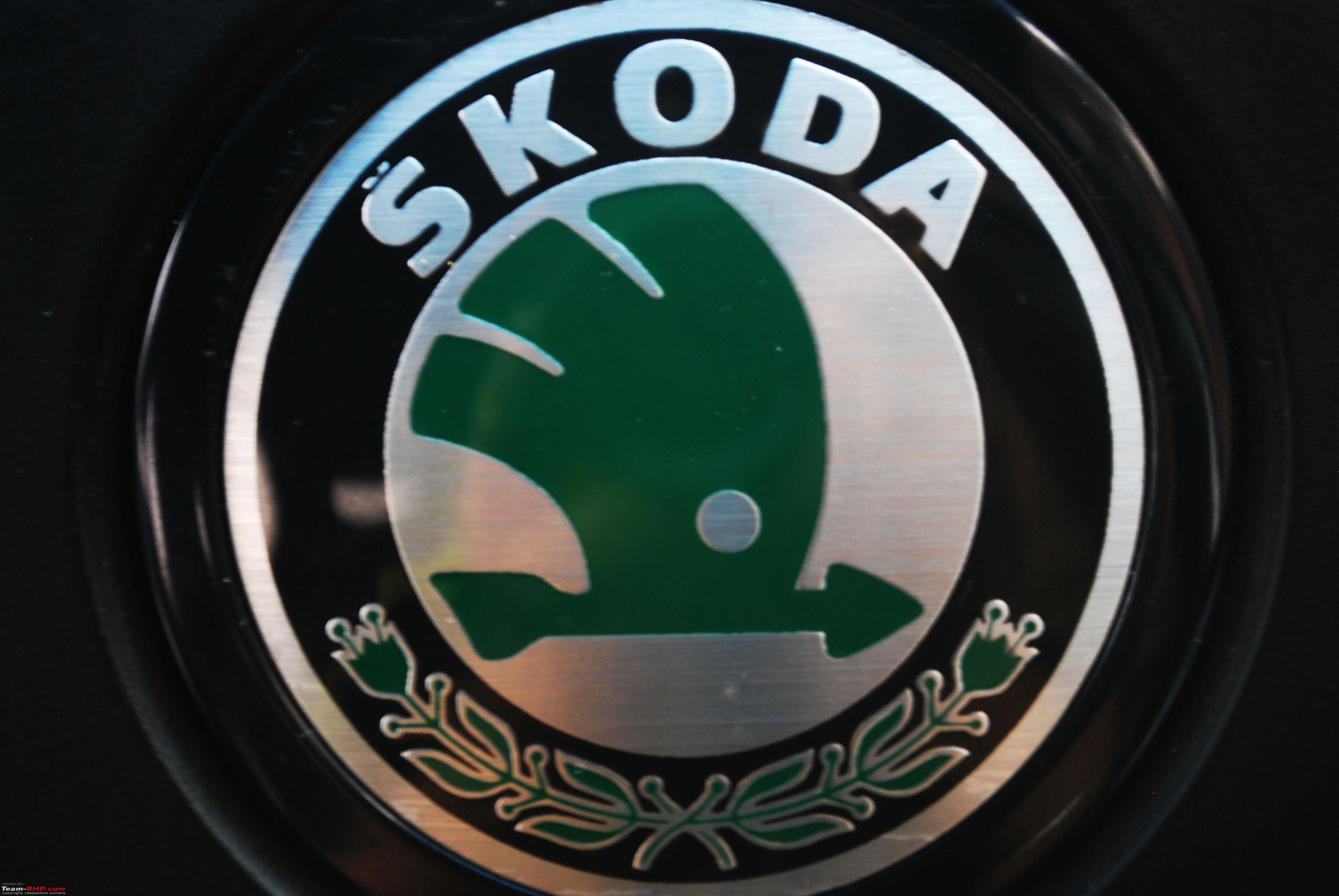
 Vicente Esteve
> That Bastard Kurtis - An Attempt to Standardize My Username Across Platforms
Vicente Esteve
> That Bastard Kurtis - An Attempt to Standardize My Username Across Platforms
05/12/2015 at 23:08 |
|
I love Škoda’s logo
 Svart Smart, traded in his Smart
> That Bastard Kurtis - An Attempt to Standardize My Username Across Platforms
Svart Smart, traded in his Smart
> That Bastard Kurtis - An Attempt to Standardize My Username Across Platforms
05/12/2015 at 23:54 |
|
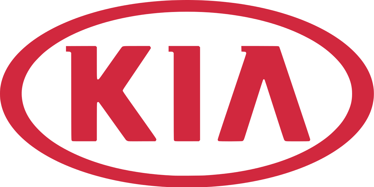
The worst for me is Kia. It’s just three block capitals inside an oval, and the A is missing its crossbar thingy. So generic and uninspired:
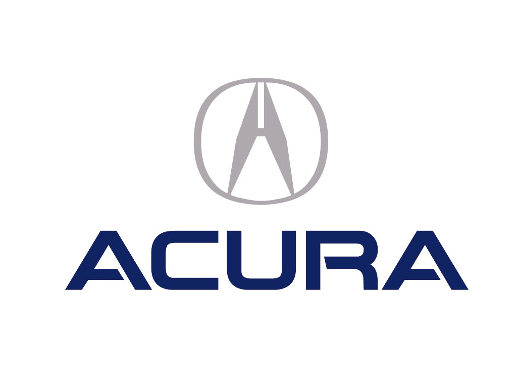
And a (dis)honorable mention goes to Acura. I think it’s supposed to be an A, but all I see is a clothespin. Or maybe an intergalactic tipi. Or a set of calipers? You figure it out:
 Et tu, Hellcat?
> That Bastard Kurtis - An Attempt to Standardize My Username Across Platforms
Et tu, Hellcat?
> That Bastard Kurtis - An Attempt to Standardize My Username Across Platforms
05/12/2015 at 23:58 |
|
Provided it hasn’t disintegrated or faded into oblivion:
 jkm7680
> Et tu, Hellcat?
jkm7680
> Et tu, Hellcat?
05/13/2015 at 00:00 |
|
“Elmo’s bad hair day begins.”
 AntiSpeed
> Alfalfa Romeo
AntiSpeed
> Alfalfa Romeo
05/13/2015 at 00:07 |
|
The original logo, on the other hand, was awesome.
 desertdog5051
> That Bastard Kurtis - An Attempt to Standardize My Username Across Platforms
desertdog5051
> That Bastard Kurtis - An Attempt to Standardize My Username Across Platforms
05/13/2015 at 00:19 |
|
I so agree with you on the Hyundai logo. I’ll go further to say it looks like crap on any of their cars.
 AM
> That Bastard Kurtis - An Attempt to Standardize My Username Across Platforms
AM
> That Bastard Kurtis - An Attempt to Standardize My Username Across Platforms
05/13/2015 at 00:52 |
|
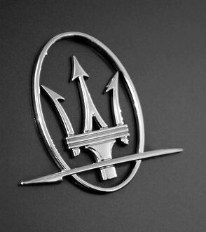
I’ve always liked the Maserati badge. The story behind it is that it’s based on the Fountain of Neptune in Bologna’s Piazza Maggiore.
The badge I really don’t like (even though it’s on my car) is the GMC badge. The big red letters look so stupid.
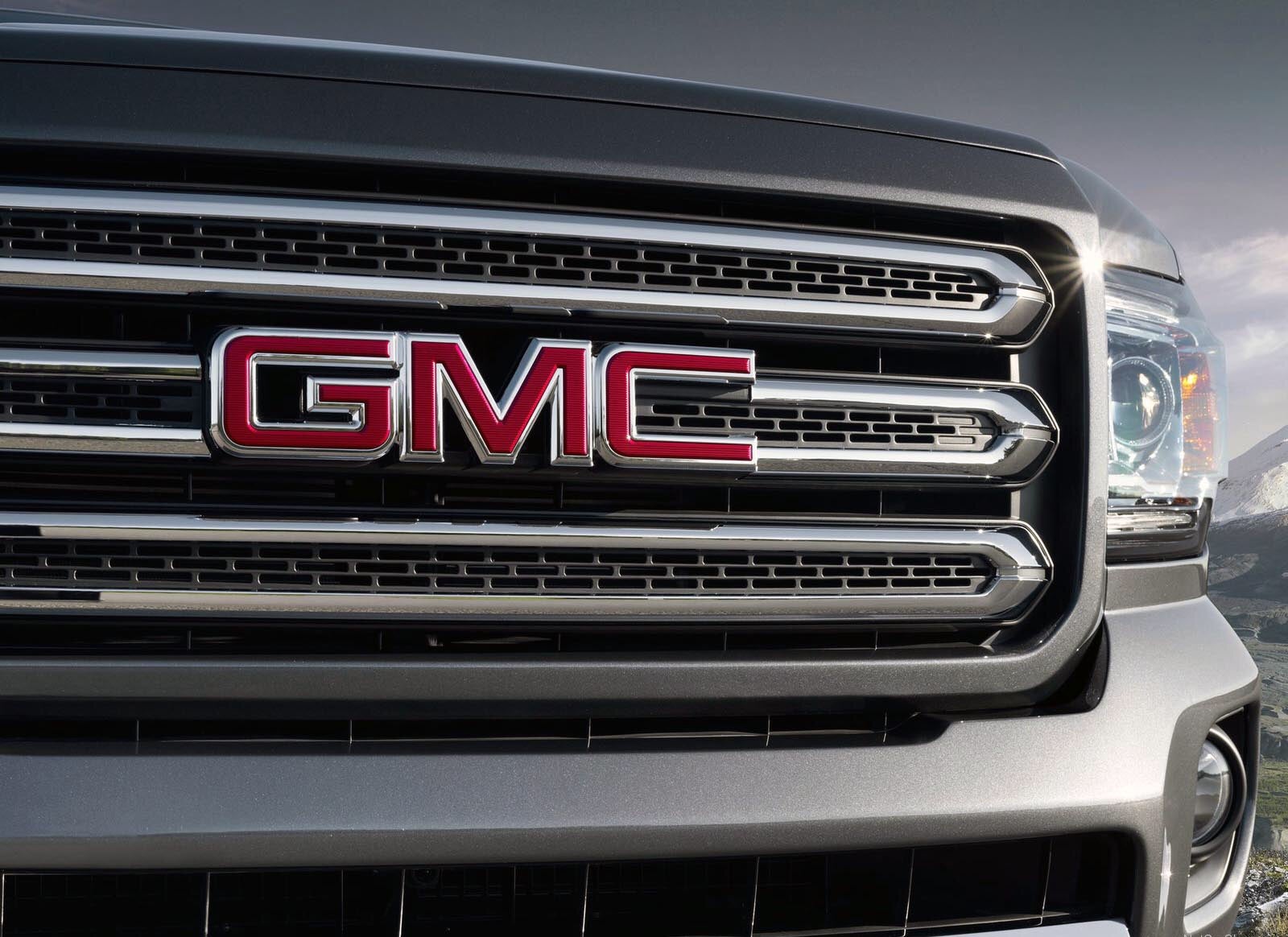
Black paint makes it look good though
 BATC42
> AntiSpeed
BATC42
> AntiSpeed
05/13/2015 at 01:17 |
|
I love some speedy kiwi!
 Saf1
> MLGCarGuy
Saf1
> MLGCarGuy
05/13/2015 at 01:57 |
|
 pip bip - choose Corrour
> That Bastard Kurtis - An Attempt to Standardize My Username Across Platforms
pip bip - choose Corrour
> That Bastard Kurtis - An Attempt to Standardize My Username Across Platforms
05/13/2015 at 04:24 |
|
Best = Citroen
worst = Mazda
 Jobjoris
> That Bastard Kurtis - An Attempt to Standardize My Username Across Platforms
Jobjoris
> That Bastard Kurtis - An Attempt to Standardize My Username Across Platforms
05/13/2015 at 05:44 |
|
The blue and white is often thought to symbolize a spinning propellor, since BMW was in the business of airplane engines, but is actually for the colors of the Bavarian flag.
True. But BMW did feed this urban legend a bit in it’s PR.
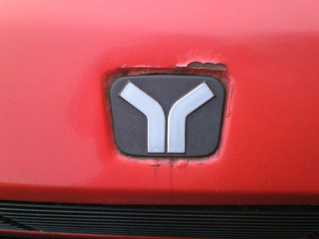
I think you’re on track with that Hyundai logo. Although I’m not entirely sure if it’s worse than the Yugo (corrosion added for drama):
One of the best is/was Wiesmann’s in my opinion:
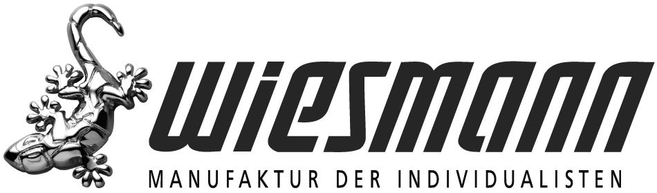
They even incorporated it in the factory design!

When it comes to simple, recognizable designs the VW logo is spot-on though.
|
That Bastard Kurtis - An Attempt to Standardize My Username Across Platforms
> MLGCarGuy
05/13/2015 at 06:16 |
|
I thought I had seen a Genesis around here with wings on the back. I actually don't care for that logo either...looks like a really low rent Bentley.
|
That Bastard Kurtis - An Attempt to Standardize My Username Across Platforms
> Jobjoris
05/13/2015 at 10:58 |
|
You’re dead on about Wiesmann, that’s a great logo. I had never seen the building before, but it’s fantastic.
Yugo’s logo was pretty low rent, but they were low rent, so at least it was honest. Still, a bad logo.
 NJAnon
> That Bastard Kurtis - An Attempt to Standardize My Username Across Platforms
NJAnon
> That Bastard Kurtis - An Attempt to Standardize My Username Across Platforms
05/13/2015 at 20:06 |
|
Well the logo for the Fiat 500 Abarth is cool. Too bad the intensity of the scorpion logo doesn’t translate to the cars identity.
But if your being specific for a carmakers overall logo, for me its probably Aston Martin. They fit in their name in and its simple and recognizable in a design.
 davesaddiction @ opposite-lock.com
> That Bastard Kurtis - An Attempt to Standardize My Username Across Platforms
davesaddiction @ opposite-lock.com
> That Bastard Kurtis - An Attempt to Standardize My Username Across Platforms
05/14/2015 at 15:58 |
|
Why the hell haven’t they replaced this yet?
|
davesaddiction @ opposite-lock.com
> That Bastard Kurtis - An Attempt to Standardize My Username Across Platforms
05/14/2015 at 16:02 |
|
Mercedes’ is simple and iconic.
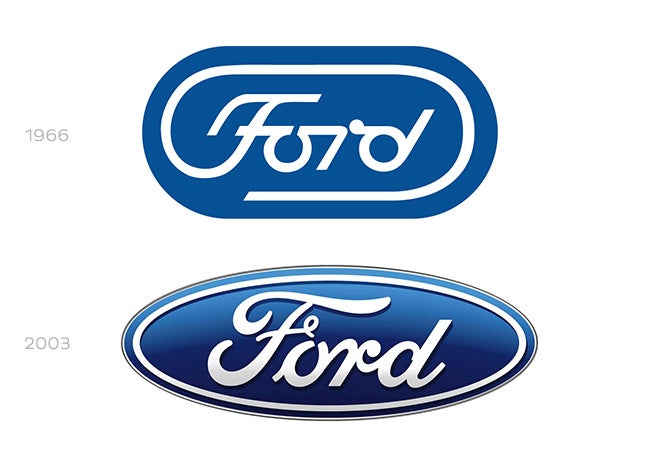
Did you know Ford’s logo could have become this?