 "MAXIMUMVRM" (maximumvrm)
04/22/2015 at 18:18 • Filed to: None
 2
2
 19
19|
"MAXIMUMVRM" (maximumvrm)
04/22/2015 at 18:18 • Filed to: None | 2
| 19 |
Did I miss something? This is horrible.
 TheHondaBro
> MAXIMUMVRM
TheHondaBro
> MAXIMUMVRM
04/22/2015 at 18:19 |
|
Yes. It’s terrible.
 JR1
> MAXIMUMVRM
JR1
> MAXIMUMVRM
04/22/2015 at 18:20 |
|
It is better than the old one but not great
 PushToStart
> MAXIMUMVRM
PushToStart
> MAXIMUMVRM
04/22/2015 at 18:22 |
|
Changed earlier today. Travis is trying to spruce things up around here I guess :P
I don’t mind it, the old look was getting... old.
 Axial
> MAXIMUMVRM
Axial
> MAXIMUMVRM
04/22/2015 at 18:26 |
|
It is terrible.
|
Axial
> PushToStart
04/22/2015 at 18:26 |
|
It’s not just Jalopnik, all of the sites are changing. Kotaku’s logo looks especially terrible.
|
PushToStart
> Axial
04/22/2015 at 18:30 |
|
Hmm, didn’t know that. Jalopnik is the only Gawker Media site I frequent.
 Blondude
> MAXIMUMVRM
Blondude
> MAXIMUMVRM
04/22/2015 at 18:31 |
|
It looks like some of the other Gawker sites changed to a similar style.
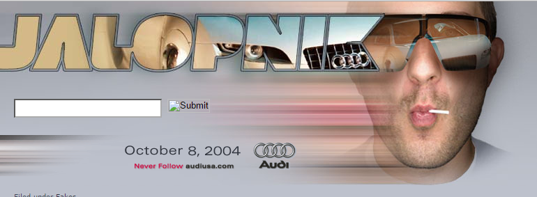
Jalopnik’s logo has never changed before today. Spinelli is weeping softly somewhere.
 D
> MAXIMUMVRM
D
> MAXIMUMVRM
04/22/2015 at 18:50 |
|
The chrome was famous in my mind, this new one is nothing.
 lonestranger
> Blondude
lonestranger
> Blondude
04/22/2015 at 18:52 |
|
Sure it has.
|
Blondude
> lonestranger
04/22/2015 at 19:14 |
|
Shh, we don’t talk about the puckerface-dudebro-Audi-RSQ-logo.
9 and a half years is still a long time.
 The Compromiser
> MAXIMUMVRM
The Compromiser
> MAXIMUMVRM
04/22/2015 at 19:43 |
|
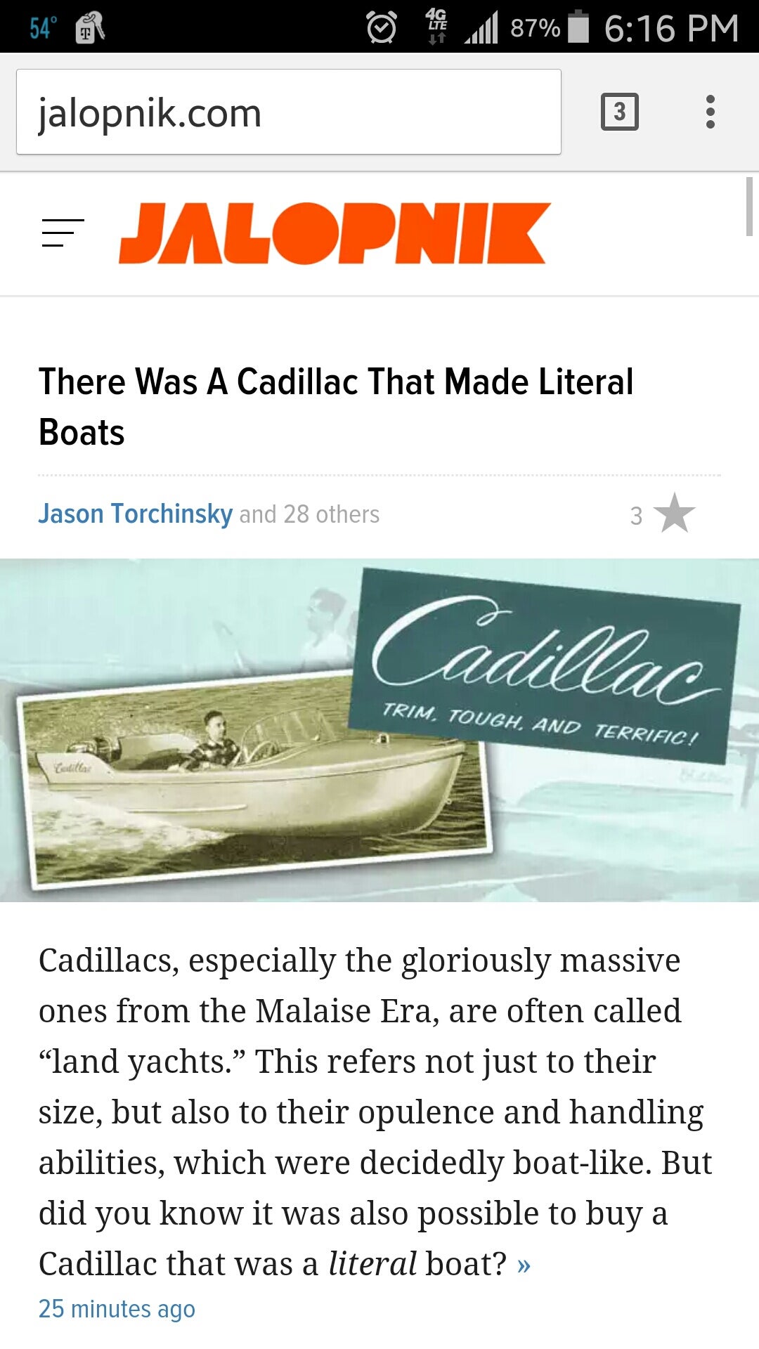
Yes. Cadillac made boats.
 sebdel
> MAXIMUMVRM
sebdel
> MAXIMUMVRM
04/22/2015 at 19:50 |
|
Corporate tricks to make me buy another car sticker... damn you gawker!!
 XJDano
> MAXIMUMVRM
XJDano
> MAXIMUMVRM
04/22/2015 at 20:46 |
|
!!! UNKNOWN CONTENT TYPE !!!
That “A” needs a fly & button outline to be pants, that's the only thing I don't like about it, but I didn't tweet that to Matt, so my bad.
 Funktheduck
> Blondude
Funktheduck
> Blondude
04/22/2015 at 21:46 |
|
I miss this
|
Funktheduck
> Axial
04/22/2015 at 21:47 |
|
Gawker is the same. I like Kotaku's better than Jalopnik
|
Funktheduck
> MAXIMUMVRM
04/22/2015 at 21:48 |
|
Hate it. Looks like crap
|
Axial
> Funktheduck
04/22/2015 at 21:59 |
|
I think Kotaku’s at least needs a pink drop-shadow under it to translate the original look.
 FromCanadaWithLove
> MAXIMUMVRM
FromCanadaWithLove
> MAXIMUMVRM
04/22/2015 at 22:01 |
|
I actually like it...
|
Funktheduck
> Axial
04/23/2015 at 07:37 |
|
Agreed