 "ttyymmnn" (ttyymmnn)
03/18/2014 at 09:49 • Filed to: kinja help
 1
1
 15
15|
"ttyymmnn" (ttyymmnn)
03/18/2014 at 09:49 • Filed to: kinja help | 1
| 15 |
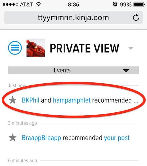
Aside from having to click a link and load a page to see my most recent notifications, which I feel is a significant step backwards in mobile usability, I came up against this issue yesterday. If I have received a recommendation from two people, or if a commenter has a particularly long screen name, it's impossible to know which post they are recommending since the text is limited to just one line. "BKPhil and hampamphlet recommended...." what ?
 Dukie - Jalopnik Emergency Management Asshole
> ttyymmnn
Dukie - Jalopnik Emergency Management Asshole
> ttyymmnn
03/18/2014 at 09:55 |
|
I get sporadic images on my mobile Kinja. I also get the "Person A and Person B recommended", but if someone comments, I get the full comment.
|
ttyymmnn
> Dukie - Jalopnik Emergency Management Asshole
03/18/2014 at 09:59 |
|
Yes, comments/replies show up in full, but long recommendations do not. As for the images, you only see images that were promoted. If you see a big picture on the Oppo page, then you will see it on mobile. If it's just a small thumbnail image on the desktop, you won't see it. If you go to Sploid, you will see every image because the owner of that blog promotes (embiggens) the picture for every article he posts.
|
Dukie - Jalopnik Emergency Management Asshole
> ttyymmnn
03/18/2014 at 10:03 |
|

 philipilihp
> ttyymmnn
philipilihp
> ttyymmnn
03/18/2014 at 10:12 |
|
Rotate your phone to landscape and it'll show the link at least! Found that out through trial and error yesterday. But the worst is, like you said, having to click a link to even see the notifications. Definite step backwards.
|
ttyymmnn
> philipilihp
03/18/2014 at 10:16 |
|

Now, why didn't I think of that?
|
philipilihp
> ttyymmnn
03/18/2014 at 10:19 |
|
LOL because we shouldn't have to. We had actual drop down notifications in the last Kinja. Why can't notifications be integrated into that left drop down menu. There is plenty of space at the bottom. Or, make that GIANT banner drop down smaller, perhaps a similar drop down image like the one that is on the friggin desk top version. That way there is space for the notifications circle that we have already. Pretty much just make the mobile header look like the menu header on the desktop.
GAWKER PEEPS, ARE YOU LISTENING??
 Sn210
> ttyymmnn
Sn210
> ttyymmnn
03/18/2014 at 10:43 |
|
I'm also having an issue of having to click things twice on mobile
 phenotyp
> ttyymmnn
phenotyp
> ttyymmnn
03/18/2014 at 10:43 |
|
Because you shouldn't have to? I used mobile for the first time in a couple months recently, and was really surprised how bad it's become.
 With-a-G is back to not having anything written after his username
> ttyymmnn
With-a-G is back to not having anything written after his username
> ttyymmnn
03/18/2014 at 17:46 |
|
Sure, but that's only a problem if people have long user names, so....
|
ttyymmnn
> With-a-G is back to not having anything written after his username
03/18/2014 at 17:49 |
|
Or if multiple people recommend, as in my example.
|
With-a-G is back to not having anything written after his username
> ttyymmnn
03/18/2014 at 18:17 |
|
I know. I have the same problem. I was pretending to think like a Kinja developer.
 Ernie @ Kinja
> philipilihp
Ernie @ Kinja
> philipilihp
03/19/2014 at 15:01 |
|
Yes.
|
Ernie @ Kinja
> ttyymmnn
03/19/2014 at 15:01 |
|
Mobile and notifications are going to get a new coat of paint soon.
|
ttyymmnn
> Ernie @ Kinja
03/19/2014 at 15:04 |
|
Excellent. I look forward to it.
|
philipilihp
> Ernie @ Kinja
03/19/2014 at 15:12 |
|
Oh shoot... lol thanks!