"JR1" (type35bugatti)
02/28/2014 at 12:02 • Filed to: Racing Livery, Castrol Edge, Oppositelock
 1
1
 24
24|
"JR1" (type35bugatti)
02/28/2014 at 12:02 • Filed to: Racing Livery, Castrol Edge, Oppositelock | 1
| 24 |
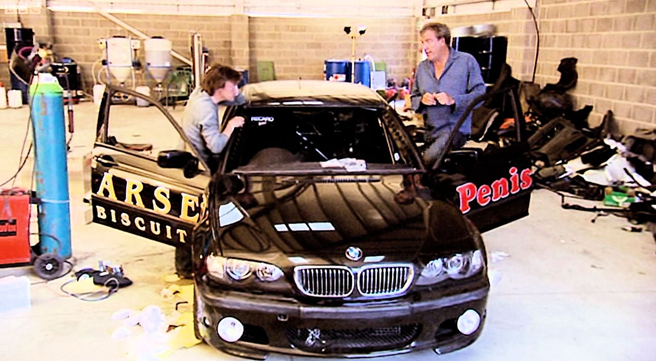
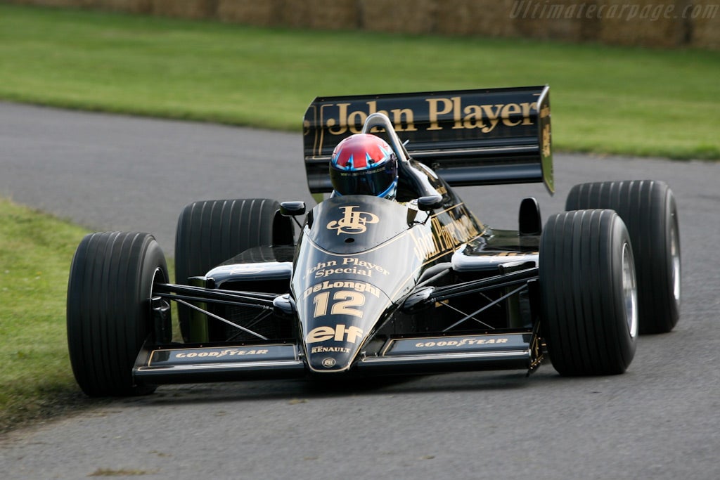
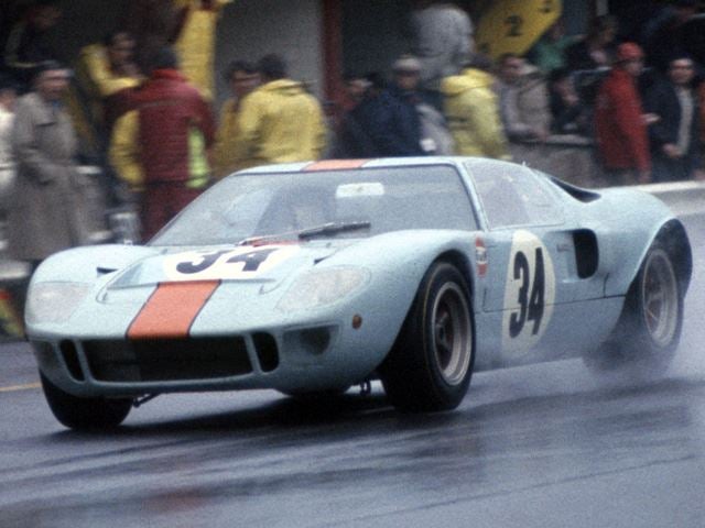
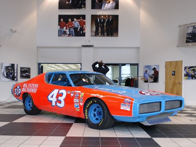
Racing car livery has be essential in the automotive industry since 1900. For whatever the reason people saw fit to paint racing cars in special colors to make them stand out from the rest of the crowd. As the years progressed some rather beautiful liveries appeared. Such as these:
I am not here today however to talk about the best livers. No. Today I am here to talk about an epidemic that is destroying the car industry as we know it. I am here to talk about the ugliest racing livers. Ones that make you crawl back into a little deep dark hole and cry yourself to sleep at night. The horrors of the car industry.
Yes Castrol Edge I am looking at you. For decades your company has destroyed the art in motion found on every racing car.
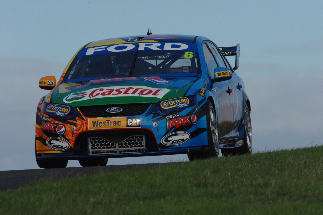
Your company ruins the beauty of a race car and turns them into Frankenstien's monster. Not only does it scare little children it makes grown adults weep. As a community we must ban together to stop this madness. Stop buying Castrol motor oil and maybe one day these images and paint schemes will be erased from our memories. Castrol is the enemy. We must destroy it.
 With-a-G is back to not having anything written after his username
> JR1
With-a-G is back to not having anything written after his username
> JR1
02/28/2014 at 12:05 |
|
So, you are communicating that your car is so slow that moss grows on it?
|
JR1
> With-a-G is back to not having anything written after his username
02/28/2014 at 12:06 |
|
Eww that one is bad too
 ttyymmnn
> With-a-G is back to not having anything written after his username
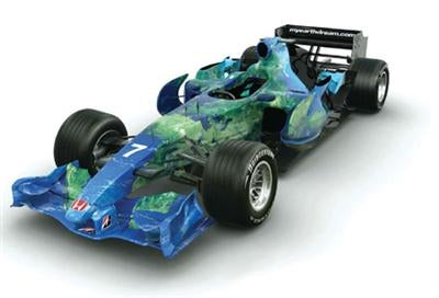
ttyymmnn
> With-a-G is back to not having anything written after his username
02/28/2014 at 12:08 |
|
I liked the idea of that livery, but it fell flat on the execution. And really, when you tool around something that pumps out as much carbon as an automobile, covering your car with the Blue Marble is just a bit disingenuous.
 Newsboy
> JR1
Newsboy
> JR1
02/28/2014 at 12:09 |
|
 Bad Idea Hat
> JR1
Bad Idea Hat
> JR1
02/28/2014 at 12:09 |
|
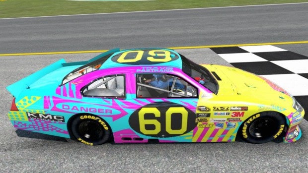
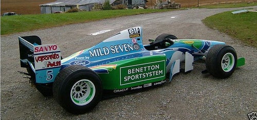
It's like it's waving a yellow caution flag and saying "DANGER: This car is balls".
Additionally, it was the first livery after the JPS years.
|
JR1
> Bad Idea Hat
02/28/2014 at 12:10 |
|
That is disgusting
 themanwithsauce - has as many vehicles as job titles
> JR1
themanwithsauce - has as many vehicles as job titles
> JR1
02/28/2014 at 12:10 |
|
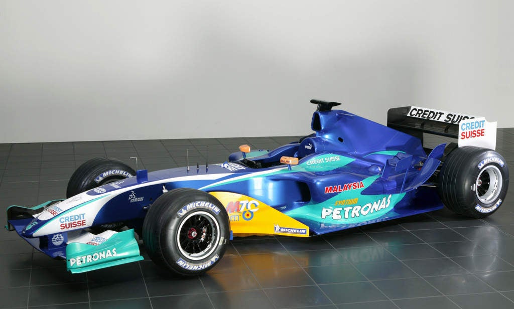
Don't forget Sauber-Petronas. Not exactly a looker, though it did well for a mid-pack car.
|
JR1
> themanwithsauce - has as many vehicles as job titles
02/28/2014 at 12:11 |
|
Very 90s paint scheme, not pretty
 quarterlifecrisis
> Newsboy
quarterlifecrisis
> Newsboy
02/28/2014 at 12:11 |
|
There was at least a good reason behind that...
|
Bad Idea Hat
> JR1
02/28/2014 at 12:12 |
|
Senna drove around in the thing without going blind, so there's something else in his favor.
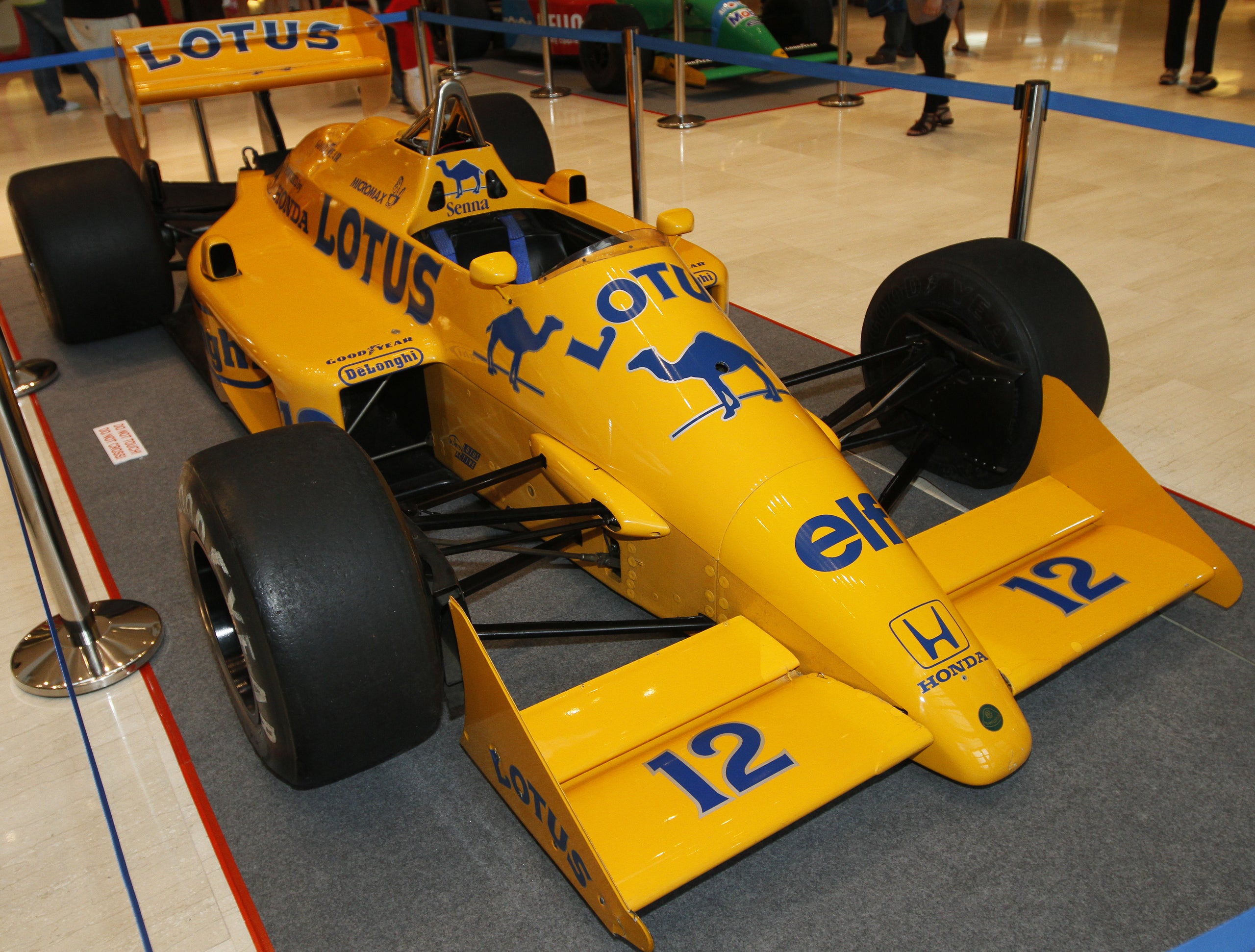
 DConsorti
> Bad Idea Hat
DConsorti
> Bad Idea Hat
02/28/2014 at 12:15 |
|
I respectfully disagree.
For me, this was one of the most memorable liveries ever.
Of course it came after JPS and Golden Leaf, but still was simple and beautiful!
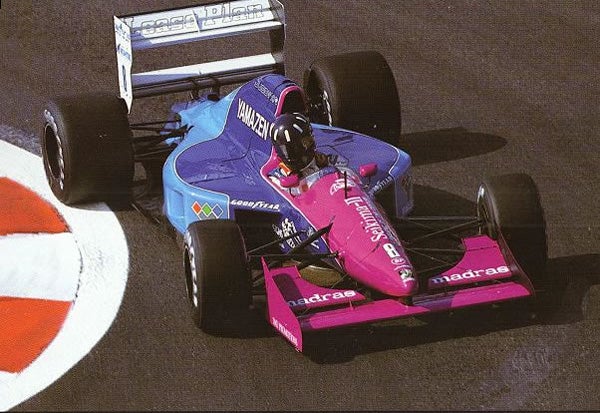
UNlike this one:
|
JR1
> Bad Idea Hat
02/28/2014 at 12:17 |
|
Senna was secretly a God though so that's why.
 Aaron Short - PROUD OF LEYLAND
> Newsboy
Aaron Short - PROUD OF LEYLAND
> Newsboy
02/28/2014 at 12:20 |
|
I love this livery just because it was a huge middle finger to the FIA
 DeltawingGothamDeserves
> JR1
DeltawingGothamDeserves
> JR1
02/28/2014 at 12:24 |
|
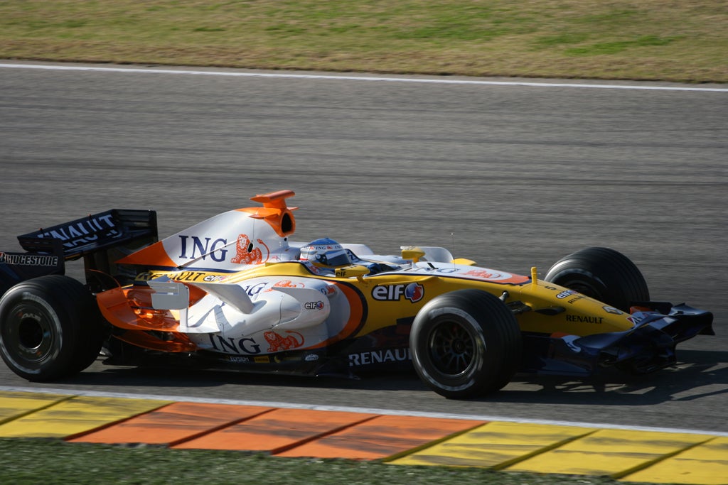
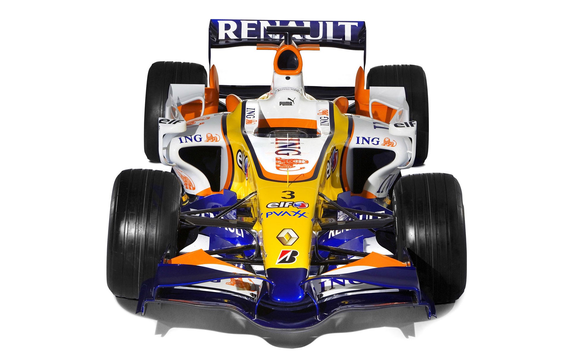
Renault holds the honor of making the ugliest cars, and dressing them up in an awful combination of colors. The R24-R28 were horrible.
|
JR1
> DeltawingGothamDeserves
02/28/2014 at 12:35 |
|
Yikes that is pretty horrible as well
 minardi
> JR1
minardi
> JR1
02/28/2014 at 12:38 |
|
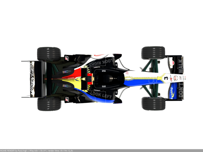
Here is another bad one
|
minardi
> Newsboy
02/28/2014 at 12:38 |
|
Beat me to it!
|
minardi
> Aaron Short - PROUD OF LEYLAND
02/28/2014 at 12:39 |
|
Yeah, FIA didn't want car with 2 major sponsors
|
Aaron Short - PROUD OF LEYLAND
> JR1
02/28/2014 at 12:42 |
|
Awful mess, atleast they made up for it in 2010.
The 2000 F1 season had the best collection of liveries, and anyone that tries to say the telefonica minardi is ugly can come to Coventry and fight me.
 Chuck 2(O=[][]=O)2
> JR1
Chuck 2(O=[][]=O)2
> JR1
02/28/2014 at 16:14 |
|
 BlazinAce - Doctor of Internal Combustion
> quarterlifecrisis
BlazinAce - Doctor of Internal Combustion
> quarterlifecrisis
03/04/2014 at 19:40 |
|
What's the story behind that one? I assume it has something to do with the end of tobacco sponsorship in Formula 1, but I honestly don't know :p
|
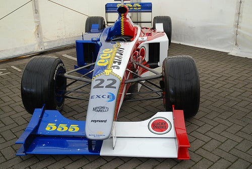
quarterlifecrisis
> BlazinAce - Doctor of Internal Combustion
03/04/2014 at 20:46 |
|
For 1999 BAR Honda intended to run one car in the 555 livery, and one in the Lucky Strike livery. (British American Racing was an offshoot of British American Tobacco.) However, Uncle Bernie reminded them of the rules that said the team cars needed to have identical livery, so they combined the two.
|
BlazinAce - Doctor of Internal Combustion
> quarterlifecrisis
03/04/2014 at 20:49 |
|
Oh, I get it now. Also, I didn't know about the British American Tobacco thing, that's some good info!
 MGBhoon
> JR1
MGBhoon
> JR1
03/05/2014 at 02:12 |
|
Amirite?