 "Victorious Secret" (victorioussecret)
02/10/2014 at 14:08 • Filed to: None
 1
1
 16
16|
"Victorious Secret" (victorioussecret)
02/10/2014 at 14:08 • Filed to: None | 1
| 16 |
Its happening!
 Tim (Fractal Footwork)
> Victorious Secret
Tim (Fractal Footwork)
> Victorious Secret
02/10/2014 at 14:09 |
|
good or bad?
|
Victorious Secret
> Tim (Fractal Footwork)
02/10/2014 at 14:10 |
|
Potato
Definitely potato.
 All Motor Is Best Motor
> Victorious Secret
All Motor Is Best Motor
> Victorious Secret
02/10/2014 at 14:14 |
|

 RazoE
> Tim (Fractal Footwork)
RazoE
> Tim (Fractal Footwork)
02/10/2014 at 14:15 |
|
Always bad. But then it becomes good and we all get mad when it's changed again. It's happened over and over and over and over.
 Gamecat235
> Victorious Secret
Gamecat235
> Victorious Secret
02/10/2014 at 14:16 |
|
And it's cleaner and mostly more functional than the previous beta's. I was pretty harsh on some of my feedback for the previous betas ("change for the sake of change, not improving functionality") and I am, with a couple of exceptions, liking the approach of this platform. Let's see where it goes.
|
Victorious Secret
> Gamecat235
02/10/2014 at 14:17 |
|
I like the less fluff mentality, for now.
Comments though, my perpetual fear. How are they going to cock those up next?
|
Gamecat235
> Victorious Secret
02/10/2014 at 14:20 |
|
They'll manage. But, like always, there will be changes once it goes live.
|
Gamecat235
> RazoE
02/10/2014 at 14:29 |
|
But, like Kinja 1.0 (and prior Kinja beta's), the interface of this starts off in a good place, some of the execution will surely need to be ironed out, but I have faith.
 BrtStlnd
> Gamecat235
BrtStlnd
> Gamecat235
02/10/2014 at 14:31 |
|
I honestly can't tell how to bring up CONVERSATIONS NOT COMMENTS (ahem) with this format. Am I wrong or are we back to side scrolling?
 ttyymmnn
> Gamecat235
ttyymmnn
> Gamecat235
02/10/2014 at 14:32 |
|
I noticed you making some comments on this thread (or one like it on Valleywag) about a new comments layout. I can't make any sense of it (the new layout), even after reading the attached article.
!!! UNKNOWN CONTENT TYPE !!!
|
Gamecat235
> BrtStlnd
02/10/2014 at 14:35 |
|
It's like side-scrolling, but vertical, you need to click on the timestamp of the lead post you want to dive into. It is similar to our current commenting system, but instead of seeing the first three comments in a conversation, you only see one (except for the one's which have been "cultivated" by authors or their proxies).
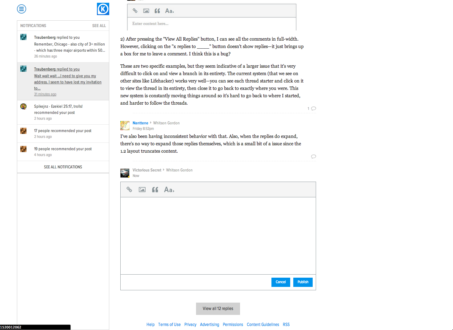
Going back into the post and scrolling to the bottom and selecting the "view all x replies" is needed to see all of the threads.
And there will be duplicates from what was above. Which is, of course, weird. But it's not as horrible as the side scrolling mishaps.
|
Gamecat235
> ttyymmnn
02/10/2014 at 14:38 |
|
Yeah I engaged Nick about his pruning concept here: http://product.kinja.com/nick-i-have-a-…
and had some more general (and mostly positive) feedback here: http://product.kinja.com/this-has-some-…
I like the aesthetics of it, and I'm not going to get too tied up with the functionality in minute detail, as it is still a live beta at Valleywag/Product. It took me about half an hour, and actually trying to have a conversation and participate in other threads to get the hang of it. But it's not terrible. And I prefer the look of the interface (and also, hearts have come back - as checkmarks, which is really exciting for me).
|
ttyymmnn
> Gamecat235
02/10/2014 at 14:40 |
|
I'll check out your links when I get some time. Thanks. I'm really working to have an open mind about all the impending changes.
|
BrtStlnd
> Gamecat235
02/10/2014 at 14:43 |
|
Is a one-click process to view a thread too simple of a solution? The current system is very good IMO... and clicking on the timestamp is a nigh impossible task on mobile.

|
Gamecat235
> BrtStlnd
02/10/2014 at 14:49 |
|
Mobile is a MESS with the platform (and yeah, I remember when the entire system was formatted so that it would be workable on "the way of the future", the iPad, so I see the irony).
And yes, the current platform is stable, functional, and easy to use. And my guess is that after some iterations and pitfalls and feedback, we'll get back to it being highly functional again, but they do need to overhaul some features to get where they want to go. And I think this is just a waypoint on the roadmap to get there.
 Hanzr
> Victorious Secret
Hanzr
> Victorious Secret
02/28/2014 at 09:42 |
|
Does anyone have any idea about how to revert to the old Kinja layout?