 "Arch Duke Maxyenko, Shit Talk Extraordinaire" (arch-duke-maxyenko)
12/13/2013 at 23:38 • Filed to: None
 3
3
 9
9|
"Arch Duke Maxyenko, Shit Talk Extraordinaire" (arch-duke-maxyenko)
12/13/2013 at 23:38 • Filed to: None | 3
| 9 |
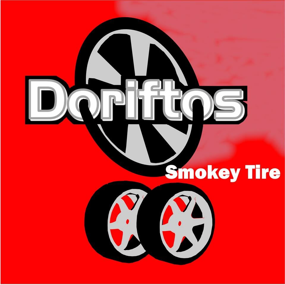
Yes, I've posted this here before, but should I submit it?
 shpuker
> Arch Duke Maxyenko, Shit Talk Extraordinaire
shpuker
> Arch Duke Maxyenko, Shit Talk Extraordinaire
12/13/2013 at 23:40 |
|
Do it! Maybe play with colors a bit. Looks cool though.
|
Arch Duke Maxyenko, Shit Talk Extraordinaire
> shpuker
12/13/2013 at 23:44 |
|
any particular changes?
 Lets Just Drive
> Arch Duke Maxyenko, Shit Talk Extraordinaire
Lets Just Drive
> Arch Duke Maxyenko, Shit Talk Extraordinaire
12/13/2013 at 23:57 |
|
It's far enough away from any trademarked brands that I couldn't see it being a problem.
I'd suggest making the flavor "Smokey Tire" font a bit more slanty and bold, but I actually really like it as is.
The shame is that I've never built the collection of Blipshift shirts I want.
|
shpuker
> Arch Duke Maxyenko, Shit Talk Extraordinaire
12/14/2013 at 00:06 |
|
Mainly the pink. Looks goofy to me.
|
shpuker
> Arch Duke Maxyenko, Shit Talk Extraordinaire
12/14/2013 at 00:08 |
|
Font and placement are off on the "smokey tire" part too. It's clever though. I like it.
|
Arch Duke Maxyenko, Shit Talk Extraordinaire
> shpuker
12/14/2013 at 00:08 |
|
It was supposed to be tire smoke, but the red background interfered
|
shpuker
> Arch Duke Maxyenko, Shit Talk Extraordinaire
12/14/2013 at 00:09 |
|
I know, if you laid a base color of white beneath it (or black) you could get it to come out non-pink.
|
Arch Duke Maxyenko, Shit Talk Extraordinaire
> shpuker
12/14/2013 at 00:10 |
|
yeah ill give it some work
 KillerRaccoon - Group J's Sébastien Loeb
> Arch Duke Maxyenko, Shit Talk Extraordinaire
KillerRaccoon - Group J's Sébastien Loeb
> Arch Duke Maxyenko, Shit Talk Extraordinaire
12/14/2013 at 00:15 |
|
I WOULD buy that.