 "El Rel·mpago(LZone) - Humanity First!" (lightningzone)
11/01/2018 at 14:45 ï Filed to: None
 1
1
 15
15
 "El Rel·mpago(LZone) - Humanity First!" (lightningzone)
11/01/2018 at 14:45 ï Filed to: None |  1 1
|  15 15 |
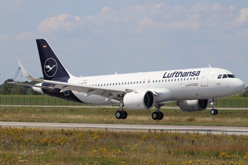
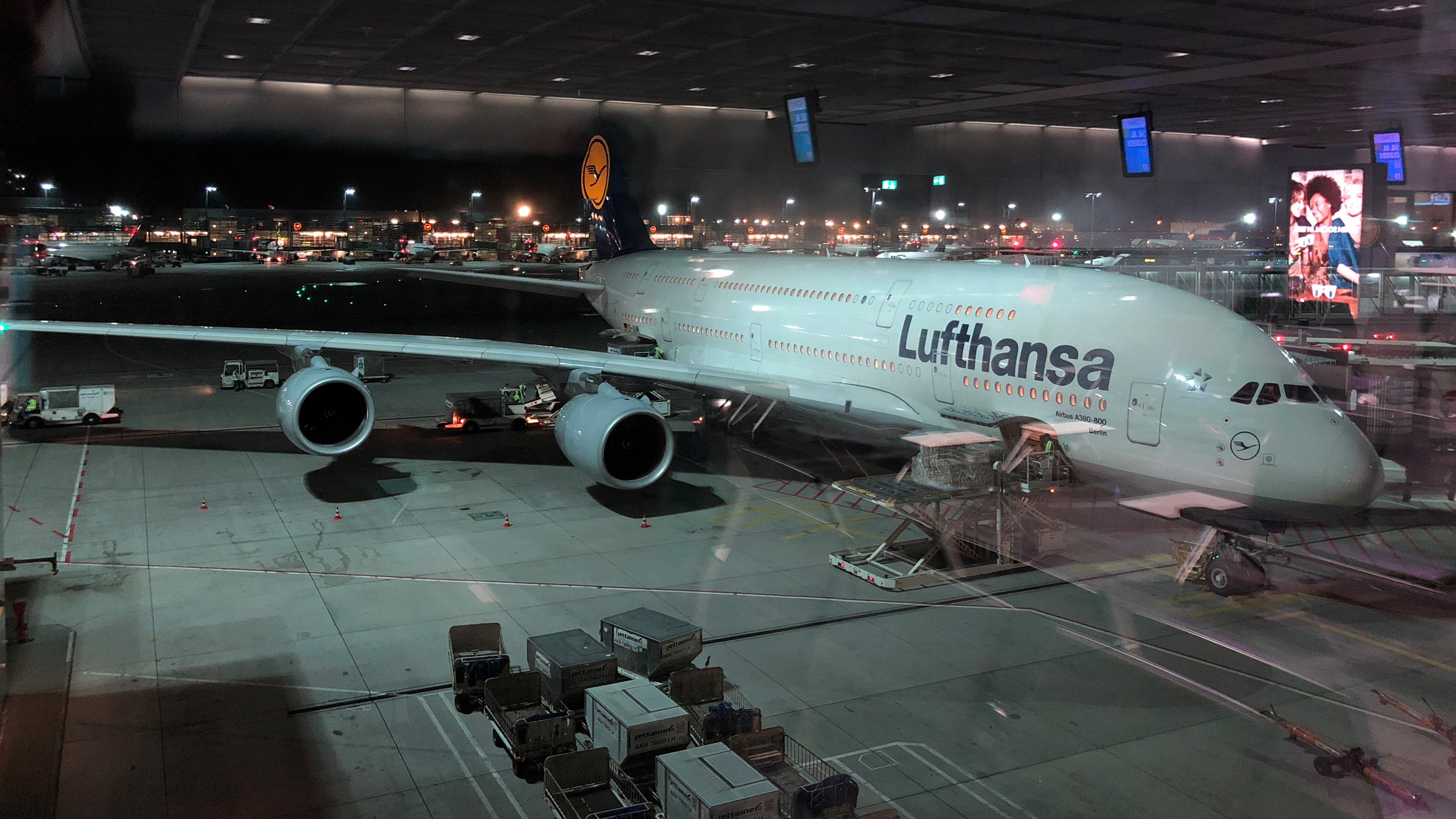
I imagined that it would grow on me, but it doesnít. Itís not bad, but itís too generic. I mean thereís at least two more European airlines that share the color palette.
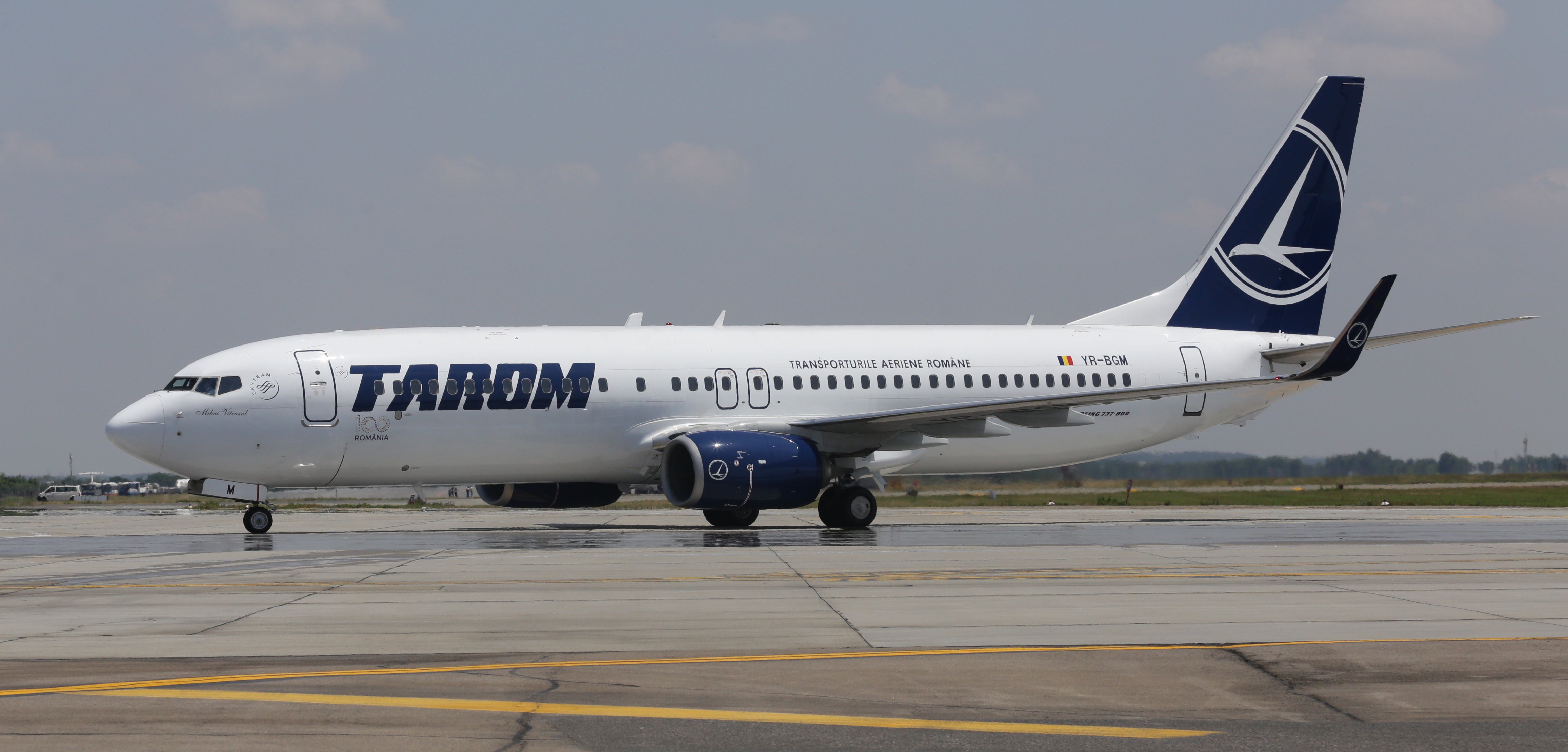
TAROM Romanian Airways
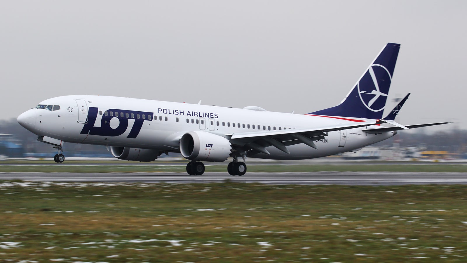
LOT Polish Airlines
It's like some kind of uniform.
 Spanfeller is a twat
> El Rel·mpago(LZone) - Humanity First!
11/01/2018 at 15:01 |
|
I like it. But I miss Aeromexicoís old.
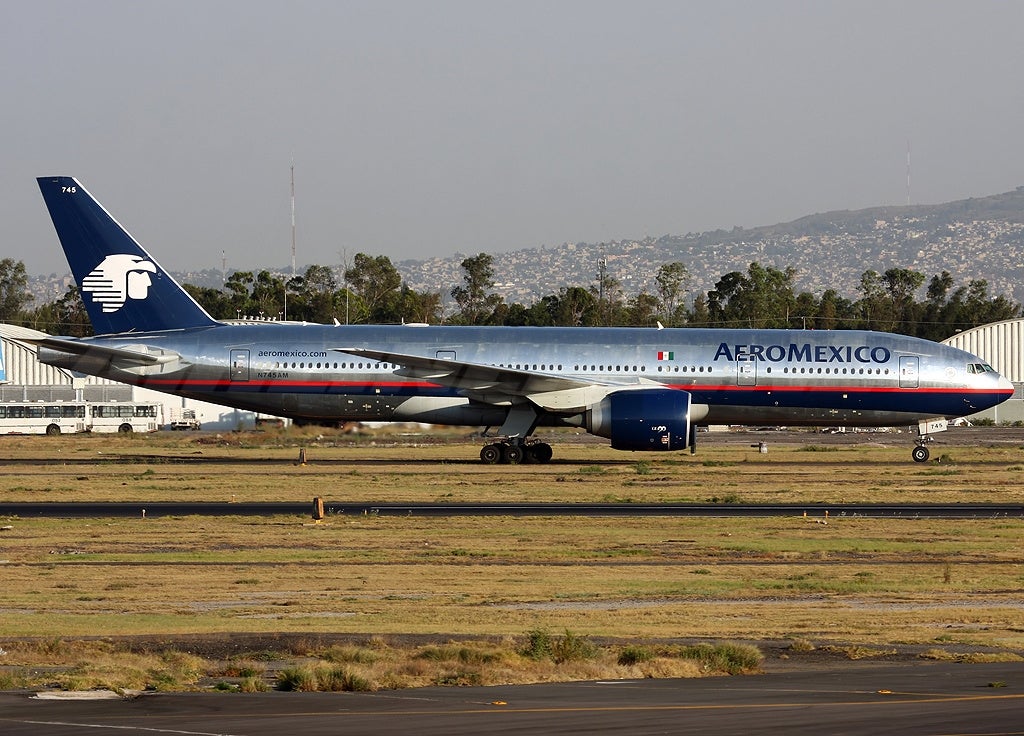
 WilliamsSW
> Spanfeller is a twat
11/01/2018 at 15:11 |
|
Aluminum should be polished, not painted
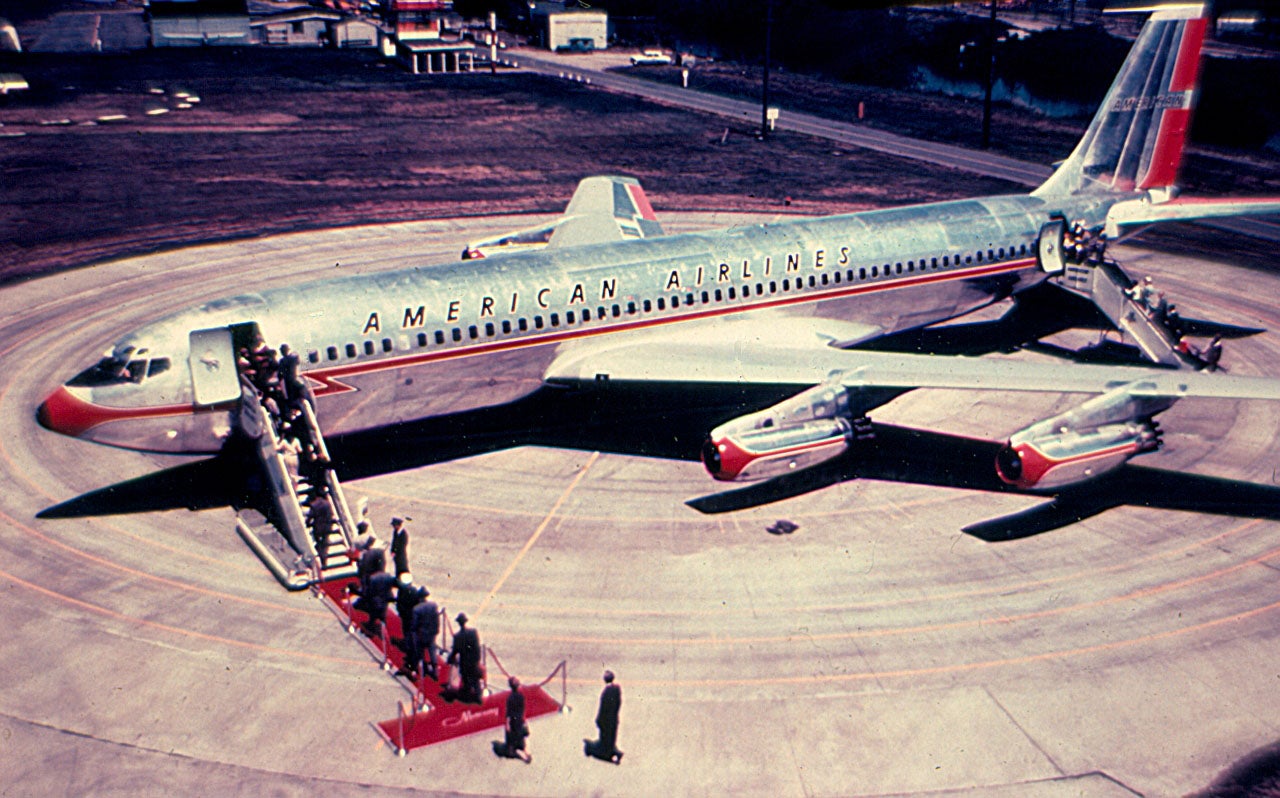
 ttyymmnn
> WilliamsSW
11/01/2018 at 15:16 |
|
Astrojet!
 facw
> El Rel·mpago(LZone) - Humanity First!
11/01/2018 at 15:17 |
|
Itís definitely worse than the old design.
 ttyymmnn
> Spanfeller is a twat
11/01/2018 at 15:19 |
|
I miss Americanís polished aluminum. It photographed so much better than that drab livery they have now.
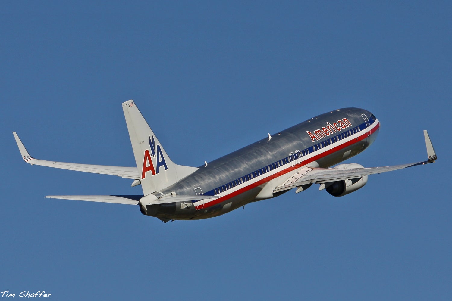
 facw
> WilliamsSW
11/01/2018 at 15:20 |
|
Good luck with that on your 787/A350. Even planes with aluminum fuselages tend to have lots of non-aluminum bits these days.
And of course , if you want polished aluminum, you have to actually polish it. Americanís planes always looked dingy to me because they never put in the time required to actually keep the aluminum looking good.
 ttyymmnn
> El Rel·mpago(LZone) - Humanity First!
11/01/2018 at 15:21 |
|
I donít understand why they felt the need to get rid of the Lufthansa yellow. Itís what made the livery pop and also be instantly recognizable. Now it looks like everything else, and Iím getting tired of this trend of putting the tail art all the way down the empennage. There was absolutely nothing wrong with this.
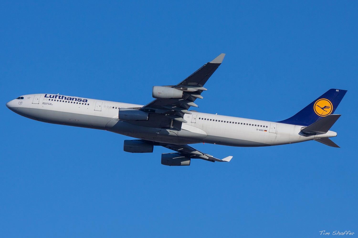
 WilliamsSW
> facw
11/01/2018 at 15:21 |
|
I believe thatís actually a good part of the reason that American changed their livery.
And yeah, their Mad Dog fleet always looked particularly dingy (as well as the 727's back in the 1990's).
 C62030
> ttyymmnn
11/01/2018 at 15:27 |
|
I agree that it should stay, but I wouldnít mind a less discordant Ýshade. The old one reminds me too much of Ikea.
 El Rel·mpago(LZone) - Humanity First!
> ttyymmnn
11/01/2018 at 15:50 |
|
The old one was a bit dusty, and the silver belly didnít helped it either. Itís just that they werenít daring/creative enough with the new one.
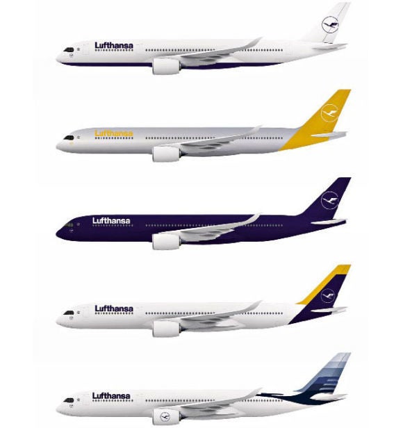
B asically they took the safest way, as most of the other proposals were fresher.
I dont mind painted empennages, makes the design more compelling.Ý
 ttyymmnn
> El Rel·mpago(LZone) - Humanity First!
11/01/2018 at 16:06 |
|
If it were up to me, Theyíd be rocking this:
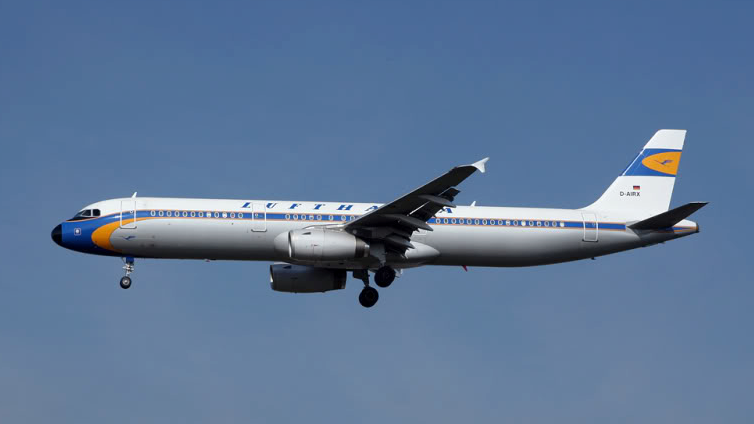
Iím a sucker for retro liveries.
 ttyymmnn
> El Rel·mpago(LZone) - Humanity First!
11/01/2018 at 16:07 |
|
I like that last one. Perhaps if they had done the crane in yellow.
 Svend
> El Rel·mpago(LZone) - Humanity First!
11/01/2018 at 16:17 |
|
I miss the old British Airways livery.
It was simple, understated and elegant.
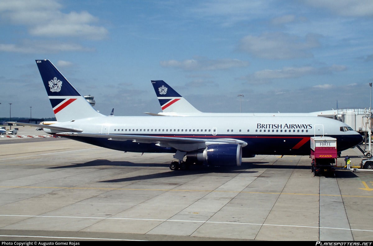
This does nothing for me.
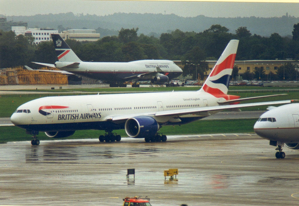
 Bengal55
> El Rel·mpago(LZone) - Humanity First!
11/01/2018 at 16:24 |
|
I wonder how much money they are saving a year by literally just having one color to their logo. I suspect this change had much less to do with ìReinventing the brandî than it was to save some coin.
I agree, their yellow bird was a much more interesting and visually appealing design.
 gmporschenut also a fan of hondas
> El Rel·mpago(LZone) - Humanity First!
11/01/2018 at 21:26 |
|
