 "Wheelerguy" (wheelerguy)
09/19/2017 at 03:24 Ľ Filed to: Fonts, Sci-Fi
 2
2
 14
14|
"Wheelerguy" (wheelerguy)
09/19/2017 at 03:24 Ľ Filed to: Fonts, Sci-Fi | 2
| 14 |
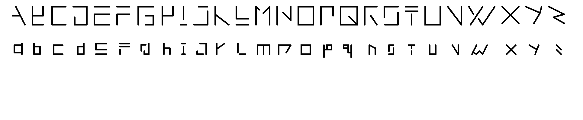
What do you think? Itĺs shite, isnĺt it? Or at least really inconsistent.
 Shabadool
> Wheelerguy
Shabadool
> Wheelerguy
09/19/2017 at 03:31 |
|
Itĺs pretty cool
 Tapas
> Wheelerguy
Tapas
> Wheelerguy
09/19/2017 at 03:32 |
|
I like it.
A different ôBö that is more reminiscent of the traditional character would be nice.
Outside the context of the alphabet, I wouldnĺt be able to recognize it.
 TheHondaBro
> Wheelerguy
TheHondaBro
> Wheelerguy
09/19/2017 at 03:36 |
|
It lacks consistency and legibility. I know that that capital B is supposed to be a B, but I still canĺt see it. Y and Z seem to have strange angles that contradict the test of the alphabet, hence the lack of consistency. Most of the lowercase letters look okay, nice and simple but p and q look way too complicated compared to the others.
|
Wheelerguy
> TheHondaBro
09/19/2017 at 04:14 |
|
1. I ran out of ideas for Y and Z (EDIT: Oh no actually I think I do have an idea for a Z). B is where I struggled, because all other configs looked generic and predictable (you take away the spine of the B and it looks like a 3, pull out the top curve and you get a lowercase b).
2. It seems to me as if Iĺm really shoddy with the diagonals. It isnĺt uniform, too many angles used everywhere.
3. Initially the lowercase p and q were much simpler (a vertical line and a square) but it looked too much like a flag so I added a couple lines and now I screwed it up.
 beardsbynelly - Rikerbeard
> Wheelerguy
beardsbynelly - Rikerbeard
> Wheelerguy
09/19/2017 at 04:35 |
|
A Y C D E F G Y I J L L M NZ O R Q K O T U V XV X I am bored
|
Wheelerguy
> TheHondaBro
09/19/2017 at 05:26 |
|
Alright, I made the revisions.
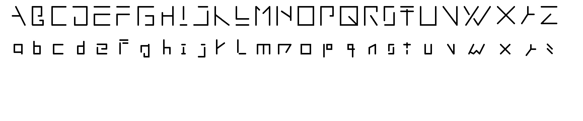
Howĺs that? Numbers are for later.
 shop-teacher
> Wheelerguy
shop-teacher
> Wheelerguy
09/19/2017 at 06:55 |
|
Honestly, I would probably be angry at anybody who sent me something in that font.
 RamblinRover Luxury-Yacht
> Wheelerguy
RamblinRover Luxury-Yacht
> Wheelerguy
09/19/2017 at 08:31 |
|
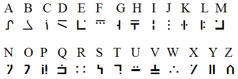
Itĺs a little reminiscent of the Standard Galactic Alphabet, to me. Although SGA is farther removed from normal. Itĺs an ôalienö alphabet that was invented for Idĺs Commander Keen series back in the Ĺ90s, and was revived by Notch for Minecraft.
 DipodomysDeserti
> Wheelerguy
DipodomysDeserti
> Wheelerguy
09/19/2017 at 08:57 |
|
Reminds me of nordic runes.
|
Wheelerguy
> RamblinRover Luxury-Yacht
09/19/2017 at 09:07 |
|
Plot twist: that is the ACTUAL Standard Galactic Alphabet, or at least part of it. Lord knows how many characters the real SGA have.
 diplodicus
> Wheelerguy
diplodicus
> Wheelerguy
09/19/2017 at 13:43 |
|
Youĺre the zodiac killer arenĺt you.
 Ssfancyfresh
> Wheelerguy
Ssfancyfresh
> Wheelerguy
09/19/2017 at 14:23 |
|
Thatĺs dope.
|
Wheelerguy
> diplodicus
09/19/2017 at 21:23 |
|
No, heĺs from another crime group. I fired him in 2015.
 CCC (formerly CyclistCarCoexist)
> Wheelerguy
CCC (formerly CyclistCarCoexist)
> Wheelerguy
09/19/2017 at 23:29 |
|
Could I get a sans serif version of that?