 "LimitedTimeOnly @ opposite-lock.com" (limitedtimeonly)
05/15/2017 at 13:06 • Filed to: Autocross, Numbers
 1
1
 4
4|
"LimitedTimeOnly @ opposite-lock.com" (limitedtimeonly)
05/15/2017 at 13:06 • Filed to: Autocross, Numbers | 1
| 4 |
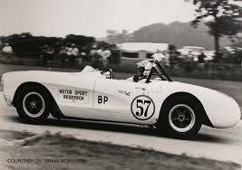
Pictured: Not my car
Update on
!!!error: Indecipherable SUB-paragraph formatting!!!
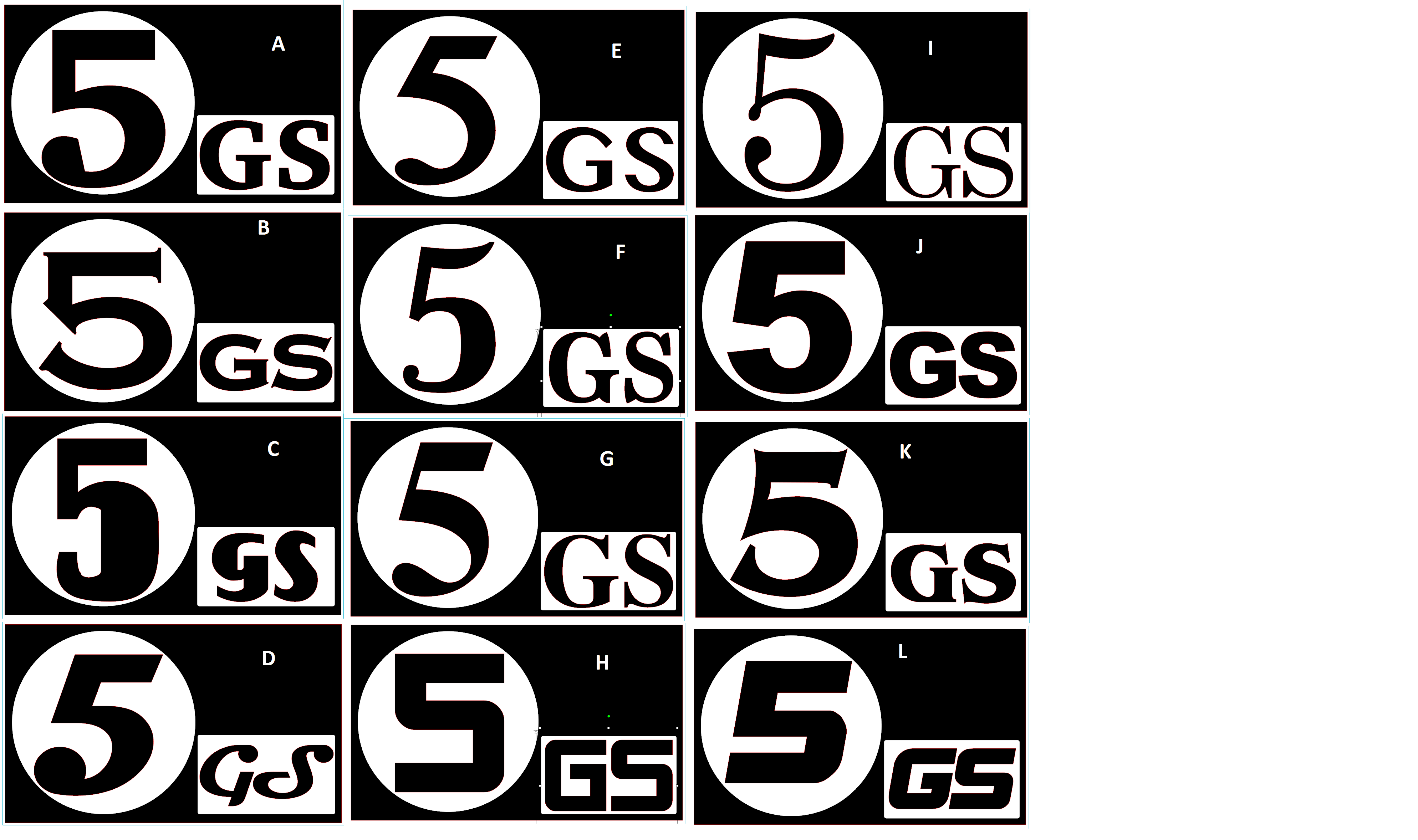
: I appreciate the input from Oppo on my number font for autox use. I had been thinking that I liked F the best because it looked old-fashioned but clean, while my wife had said A or G. We both ruled out H and L because they look too much like “S.”
Respondents to my post leaned toward option D, with J and L tying for second. But seven of the 12 got votes.
At this point I’m thinking J for a clean, contemporary look, but I haven’t ruled out G if I want something with more character. I still like F, but now I don’t feel like it is bold enough. All of them need a bit more white space around the number.
I need to make a decision soon, since I’d like to have this for a two day event Memorial Day weekend. Any final thoughts are welcome.
 CaptDale - is secretly British
> LimitedTimeOnly @ opposite-lock.com
CaptDale - is secretly British
> LimitedTimeOnly @ opposite-lock.com
05/15/2017 at 13:12 |
|
I still say D
 Bob LeDrew
> LimitedTimeOnly @ opposite-lock.com
Bob LeDrew
> LimitedTimeOnly @ opposite-lock.com
05/15/2017 at 14:07 |
|
J, then L
 Die-Trying
> LimitedTimeOnly @ opposite-lock.com
Die-Trying
> LimitedTimeOnly @ opposite-lock.com
05/15/2017 at 14:54 |
|
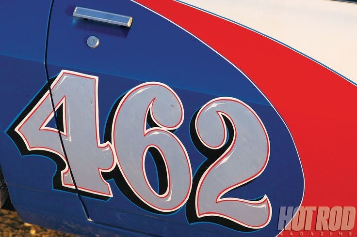
i like the OLD hand lettered style numbers. they are the big FAT numbers, with an outline, some highlighting in them, a shadow, and another outline.

the one in the upper right is almost it, it has about the right....... BULK? to it......
so from your options id say the fattest bulkiest number 5 you got. f or d.........
 Blondude
> LimitedTimeOnly @ opposite-lock.com
Blondude
> LimitedTimeOnly @ opposite-lock.com
05/15/2017 at 16:45 |
|
B > F > I