"TheHondaBro" (wwaveform)
05/01/2017 at 20:11 • Filed to: None
 2
2
 14
14|
"TheHondaBro" (wwaveform)
05/01/2017 at 20:11 • Filed to: None | 2
| 14 |
 Die-Trying
> TheHondaBro
Die-Trying
> TheHondaBro
05/01/2017 at 20:16 |
|

polygraph..........
|
TheHondaBro
> Die-Trying
05/01/2017 at 20:18 |
|
Polygon.
 facw
> TheHondaBro
facw
> TheHondaBro
05/01/2017 at 20:20 |
|
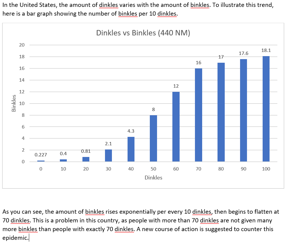
If dinkles vary with binkles, I feel like it makes more sense to have binkles be the x-axis?
Also, I feel like a bar graph is not the best choice. I’d probably just do a line chart (unless there’s some reason for dinkles to only come in bundles of 10), but I think there are other choices. I recommend kidnapping Tufte to get a more expert opinion.
 Smallbear wants a modern Syclone, local Maple Leafs spammer
> TheHondaBro
Smallbear wants a modern Syclone, local Maple Leafs spammer
> TheHondaBro
05/01/2017 at 20:22 |
|
Polly wants a cracker.
|
TheHondaBro
> facw
05/01/2017 at 20:24 |
|
Probably, but it has been suggested to me that I might perhaps try out a sort of chart that I maybe am not particularly very experienced with, perhaps.
|
TheHondaBro
> Smallbear wants a modern Syclone, local Maple Leafs spammer
05/01/2017 at 20:24 |
|
Pollycracker.
 Cash Rewards
> TheHondaBro
Cash Rewards
> TheHondaBro
05/01/2017 at 20:47 |
|
 saabstory | fixes bikes, breaks cars
> TheHondaBro
saabstory | fixes bikes, breaks cars
> TheHondaBro
05/01/2017 at 20:53 |
|
Cracker Barrel
 gmporschenut also a fan of hondas
> TheHondaBro
gmporschenut also a fan of hondas
> TheHondaBro
05/01/2017 at 20:57 |
|
|
Smallbear wants a modern Syclone, local Maple Leafs spammer
> saabstory | fixes bikes, breaks cars
05/01/2017 at 20:57 |
|
Barrel of monkeys.
|
Smallbear wants a modern Syclone, local Maple Leafs spammer
> TheHondaBro
05/01/2017 at 20:57 |
|
Tallywacker.
 Chariotoflove
> Cash Rewards
Chariotoflove
> Cash Rewards
05/01/2017 at 21:06 |
|
That deserves a big star.
 Discerning
> TheHondaBro
Discerning
> TheHondaBro
05/01/2017 at 21:44 |
|
Why not chart the direct relationship between count of dinkles to count of binkles with a scatter plot and then find the trend line and run an ANOVA analysis to find the statistical significance and general relationship between the two metrics?
A bar chart works for comparisons but a scatter plot is so much more fun
|
Discerning
> TheHondaBro
05/01/2017 at 21:48 |
|
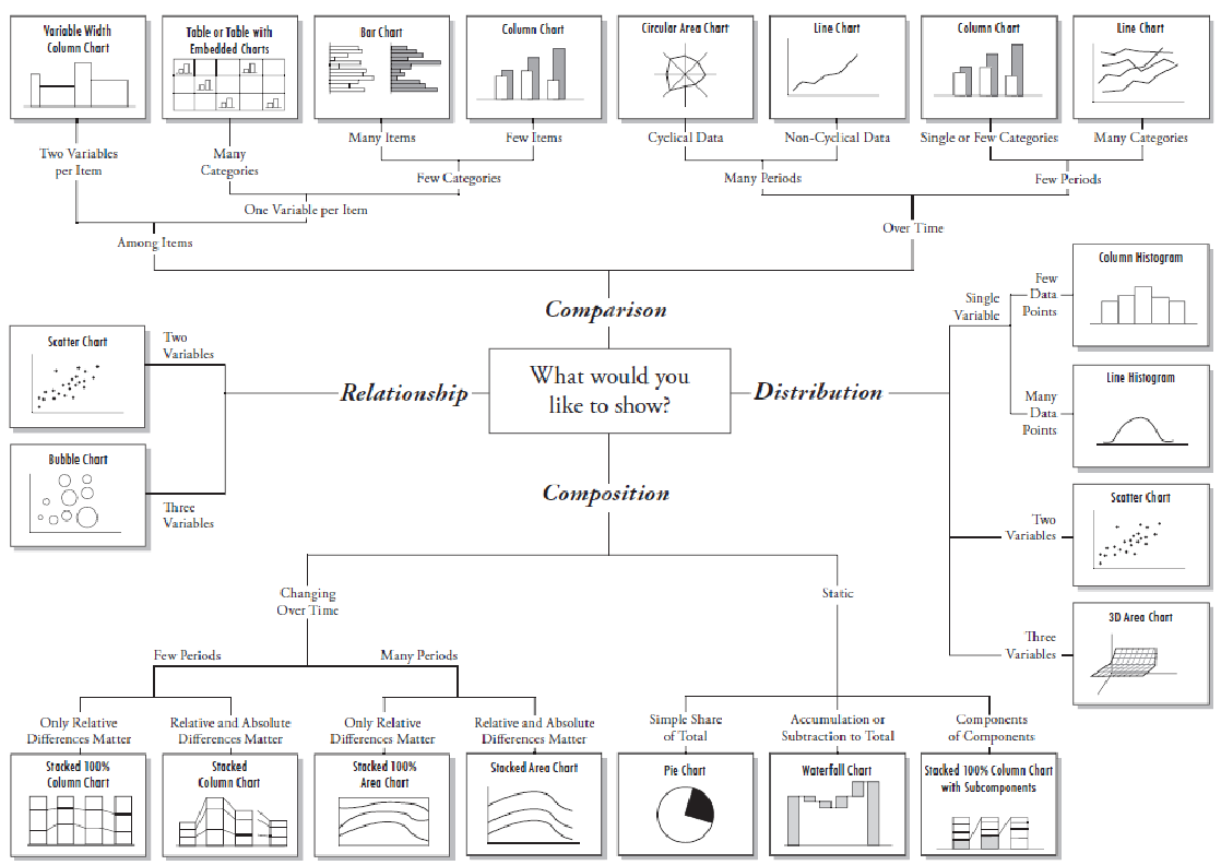
Here’s a fun little chart I share with coworkers when they aren’t sure what type of graph that they should use.