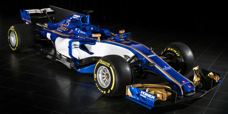
 "For Sweden" (rallybeetle)
02/20/2017 at 13:11 • Filed to: Facts, Correct Opinions, F1, Sauber, Formula 1
 3
3
 11
11|
"For Sweden" (rallybeetle)
02/20/2017 at 13:11 • Filed to: Facts, Correct Opinions, F1, Sauber, Formula 1 | 3
| 11 |
fight me
 RamblinRover Luxury-Yacht
> For Sweden
RamblinRover Luxury-Yacht
> For Sweden
02/20/2017 at 13:16 |
|
i mean i like how it looks too but if you insist
YOUR MOM
 TheHondaBro
> RamblinRover Luxury-Yacht
TheHondaBro
> RamblinRover Luxury-Yacht
02/20/2017 at 13:20 |
|
Came here to type this.
 Tareim - V8 powered
> For Sweden
Tareim - V8 powered
> For Sweden
02/20/2017 at 13:20 |
|
yeah it’s not bad to be honest, nice that there is some colour difference on the grid, also I like how they tried to hide the shark fin
 LongbowMkII
> For Sweden
LongbowMkII
> For Sweden
02/20/2017 at 13:28 |
|
youre wrong.
it looks great
 Tripper
> For Sweden
Tripper
> For Sweden
02/20/2017 at 13:28 |
|
I like it too.

 Viggen
> For Sweden
Viggen
> For Sweden
02/20/2017 at 13:40 |
|
It’s like if the 2008 and 2010 season cars had a child.
 Textured Soy Protein
> For Sweden
Textured Soy Protein
> For Sweden
02/20/2017 at 13:44 |
|
I don’t believe you’ll find much fighting to be had on this topic, yours is I think the third post I’ve seen today in favor of this livery.

 Mazarin
> For Sweden
Mazarin
> For Sweden
02/20/2017 at 13:45 |
|
Reminds me of the Williams Rothman’s livery. I love it and hope more go the retro-ish route.
 Sampsonite24-Earth's Least Likeliest Hero
> For Sweden
Sampsonite24-Earth's Least Likeliest Hero
> For Sweden
02/20/2017 at 14:50 |
|
I don’t hate it?
 Andy Sheehan, StreetsideStig
> For Sweden
Andy Sheehan, StreetsideStig
> For Sweden
02/20/2017 at 15:08 |
|
Agreed. A definite improvement over last year.
Plus, doesn’t something become more beautiful contextualized? Because the context for this artwork is, “OMG F1 SO SOOOOOON!!!”
 ceanderson920
> For Sweden
ceanderson920
> For Sweden
02/20/2017 at 15:17 |
|
I like it to, I’m excited to see what the McLaren looks like. The rest of the cars with probably have similar liveries to what they had last year.