 "SnapUndersteer, Italian Spiderman" (dasborgen)
11/26/2017 at 10:02 • Filed to: F1
 0
0
 12
12|
"SnapUndersteer, Italian Spiderman" (dasborgen)
11/26/2017 at 10:02 • Filed to: F1 | 0
| 12 |

 Nerd-Vol
> SnapUndersteer, Italian Spiderman
Nerd-Vol
> SnapUndersteer, Italian Spiderman
11/26/2017 at 10:06 |
|
FANTASTIC!
 Wheelerguy
> SnapUndersteer, Italian Spiderman
Wheelerguy
> SnapUndersteer, Italian Spiderman
11/26/2017 at 10:09 |
|
Offset the 1!
Otherwise it actually looks cool.
 scoob
> SnapUndersteer, Italian Spiderman
scoob
> SnapUndersteer, Italian Spiderman
11/26/2017 at 10:18 |
|

 Ash78, voting early and often
> SnapUndersteer, Italian Spiderman
Ash78, voting early and often
> SnapUndersteer, Italian Spiderman
11/26/2017 at 10:21 |
|
That’s not a one. Especially not by European standards where it has a long tail on it and looks like an American seven.
 If only EssExTee could be so grossly incandescent
> SnapUndersteer, Italian Spiderman
If only EssExTee could be so grossly incandescent
> SnapUndersteer, Italian Spiderman
11/26/2017 at 10:22 |
|
Ew.
 interstate366, now In The Industry
> SnapUndersteer, Italian Spiderman
interstate366, now In The Industry
> SnapUndersteer, Italian Spiderman
11/26/2017 at 10:26 |
|
 farscythe - makin da cawfee!
> SnapUndersteer, Italian Spiderman
farscythe - makin da cawfee!
> SnapUndersteer, Italian Spiderman
11/26/2017 at 10:32 |
|

 Rainbow
> SnapUndersteer, Italian Spiderman
Rainbow
> SnapUndersteer, Italian Spiderman
11/26/2017 at 10:41 |
|
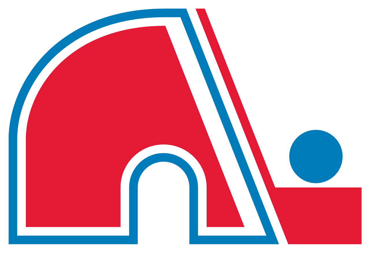
Even though they look totally different, I can’t help but see a bit of Quebec Nordiques in this.
|
Rainbow
> SnapUndersteer, Italian Spiderman
11/26/2017 at 10:41 |
|
Even though they look totally different, I can’t help but see a bit of Quebec Nordiques in this.
 Urambo Tauro
> SnapUndersteer, Italian Spiderman
Urambo Tauro
> SnapUndersteer, Italian Spiderman
11/26/2017 at 11:36 |
|
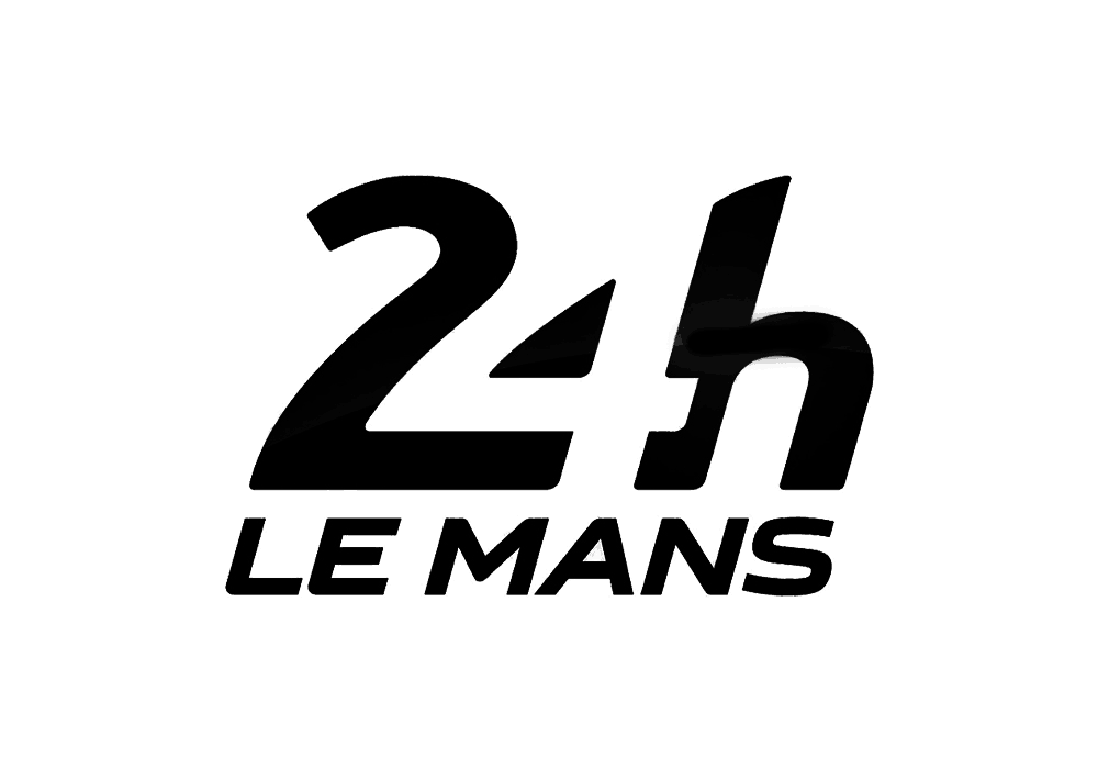
I like it. But not as much as the old one.
Here’s hoping that the 24 Hours of Le Mans logo sticks around.
 PanchoVilleneuve ST
> SnapUndersteer, Italian Spiderman
PanchoVilleneuve ST
> SnapUndersteer, Italian Spiderman
11/26/2017 at 13:16 |
|
Just as boring as the sport it represents.
 ttyymmnn
> Urambo Tauro
ttyymmnn
> Urambo Tauro
11/26/2017 at 15:05 |
|
That is simply a brilliant example of graphic design.