 "Saracen" (manualdoucheelitist)
12/23/2016 at 23:51 • Filed to: None
 9
9
 5
5
 "Saracen" (manualdoucheelitist)
12/23/2016 at 23:51 • Filed to: None |  9 9
|  5 5 |
 Matt Nichelson
> Saracen
12/24/2016 at 00:02 |
|
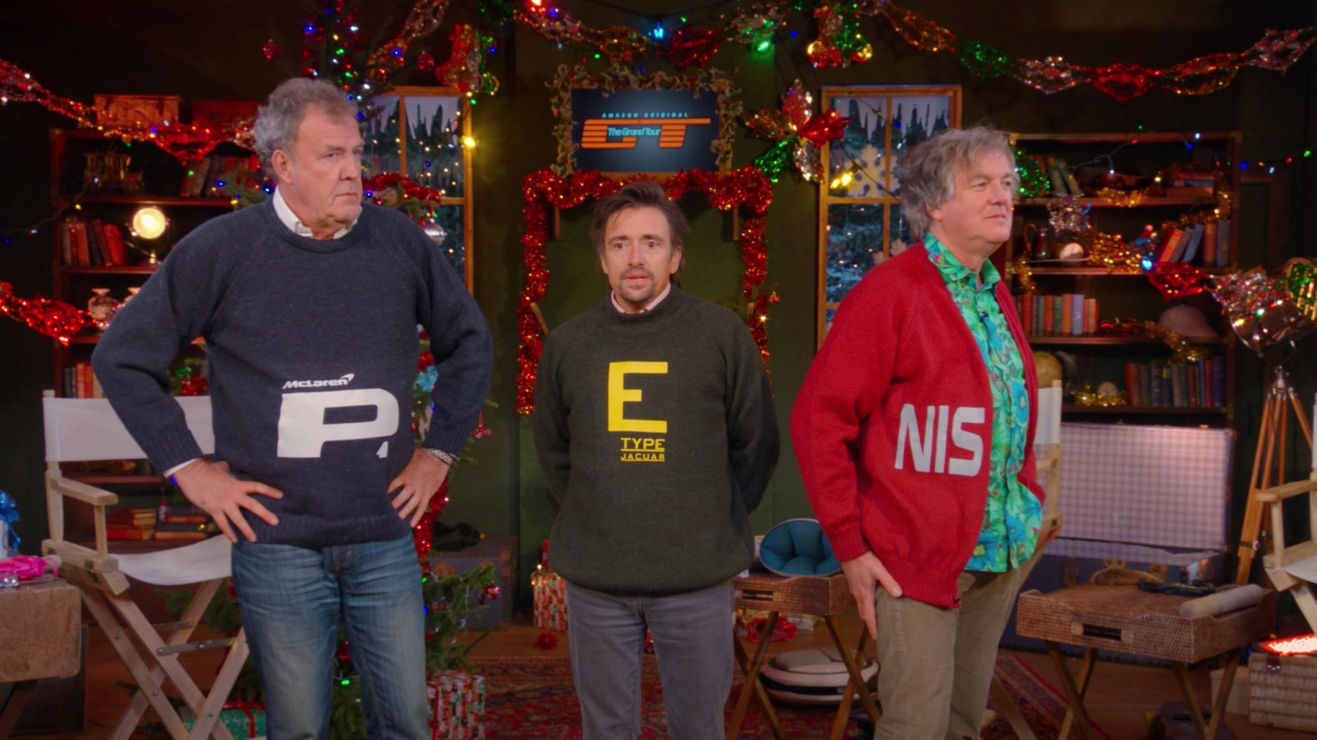
Did anybody else notice that it looks like it’s spelled Jacuar below the E? It just doesn’t look like a G to me.
 FTTOHG Has Moved to https://opposite-lock.com
> Matt Nichelson
12/24/2016 at 00:06 |
|
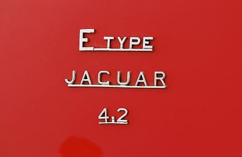
It does, but it is accurate. The real badge barely looks like a G.
 InFierority Complex
> Matt Nichelson
12/24/2016 at 00:06 |
|
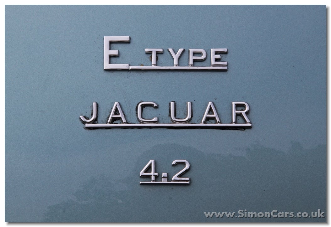
Just the early Jag font. It never did look like G on their old badges.
 Matt Nichelson
> FTTOHG Has Moved to https://opposite-lock.com
12/24/2016 at 00:14 |
|
Well there ya go. Guess I never paid attention to that.
 Matt Nichelson
> InFierority Complex
12/24/2016 at 00:16 |
|
Two comments at the same time. Impressive! At least y’all didn’t use the same picture ha. Yeah I just never paid attention to how the old font looked.