 "StingrayJake" (stingrayjake)
12/13/2015 at 17:30 • Filed to: Forza, Corvette
 6
6
 15
15
 "StingrayJake" (stingrayjake)
12/13/2015 at 17:30 • Filed to: Forza, Corvette |  6 6
|  15 15 |
Forza’s letter graphics don’t scale consistently, but we have names.
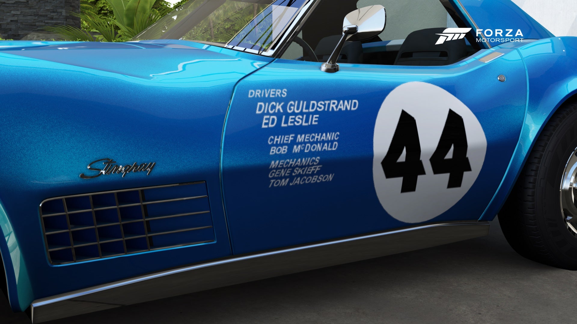
Here’s my reference image:
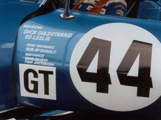
The GT box isn’t going to fit to scale in the space I have left on the door panel. I’ll need to either make it smaller and just live with it or scrunch my names down a bit. What sucks is that’s almost as small as Forza’s livery editor will let me get and keep them legible.
Old post:
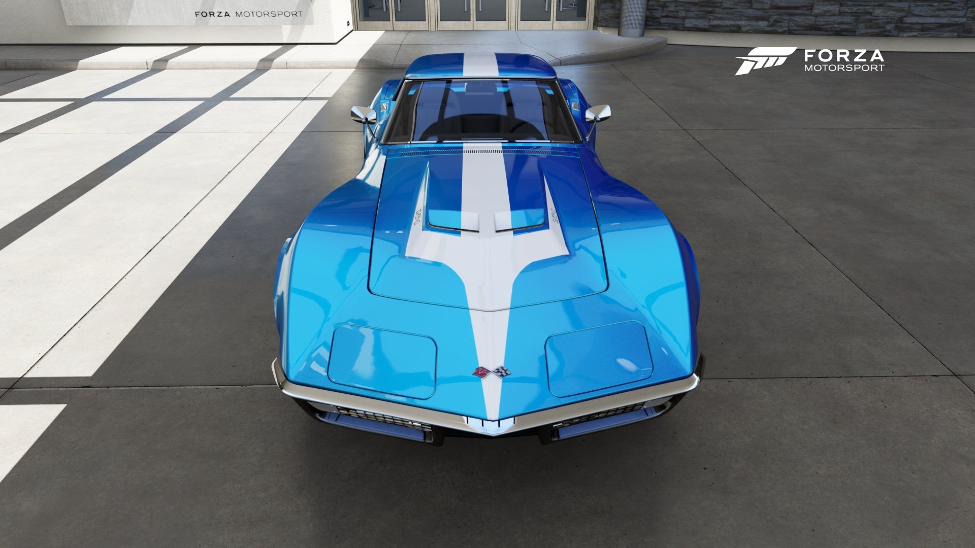
I’m turning Forza 6’s 1970 Corvette ZR1 into one of the short-lived James Garner American International Racing L88s.
It’s the first complex livery I’ve ever attempted. I always appreciated what Forza designers did but wow is this an exercise in patience.
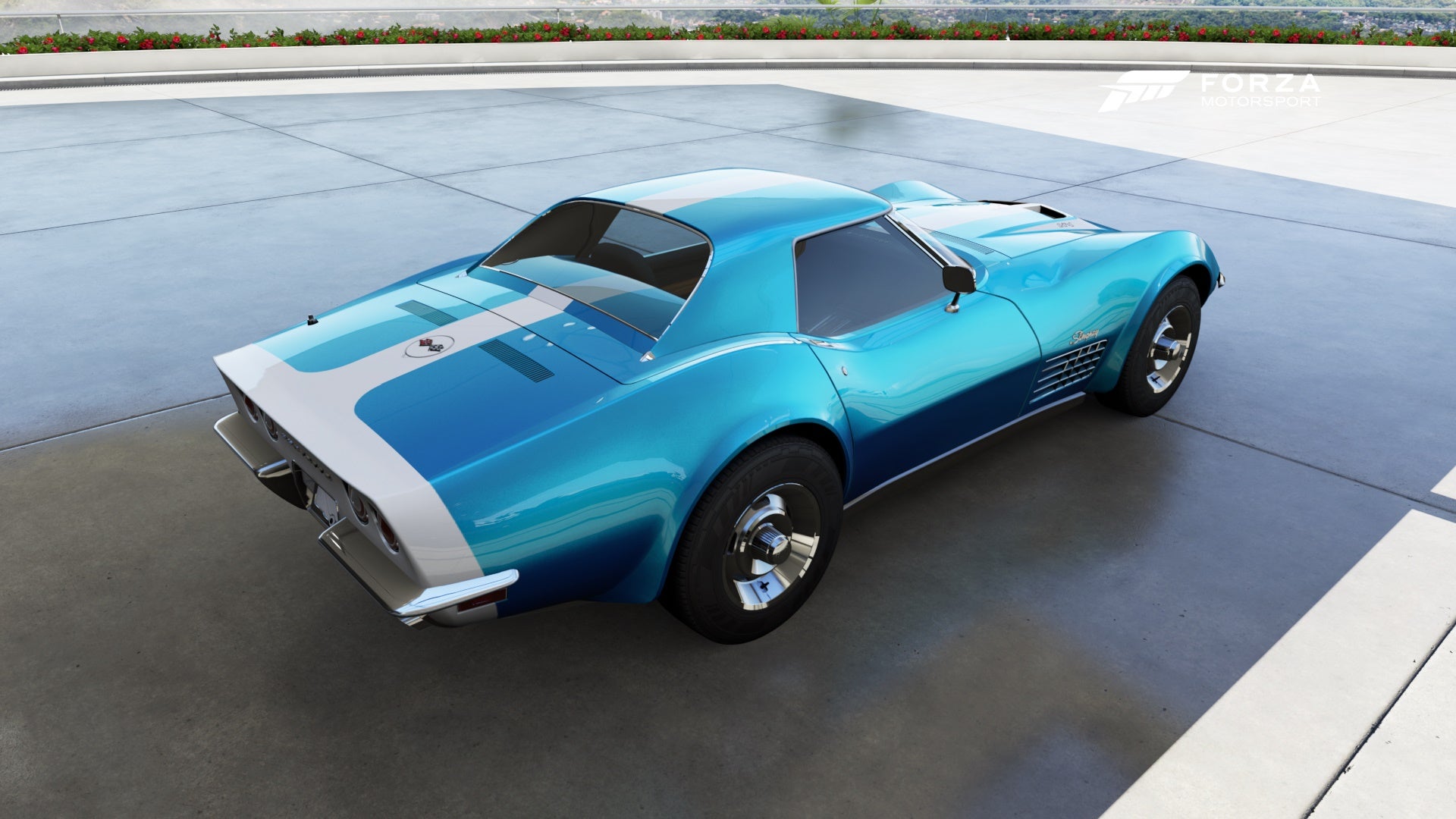
Complex bends and shapes take patience and a good eye.
Not looking forward to attempting the James Garner script on the rear quarter panels. Might just settle for Forza’s script fonts and call it good.
I know the blue isn’t exactly right but I like the metal flake.
 C62030
> StingrayJake
12/12/2015 at 15:02 |
|
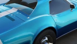
Hnnnnhghnghgnhnhnnnnnnnnnnnnnnnngyessssss
 StingrayJake
> C62030
12/12/2015 at 15:15 |
|
You have a thing for Coke bottles?
 C62030
> StingrayJake
12/12/2015 at 15:19 |
|
Little bit.
 camaroboy68ss
> StingrayJake
12/12/2015 at 16:03 |
|
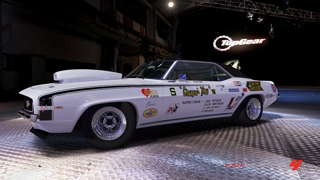
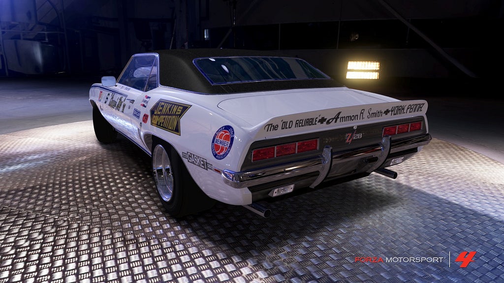
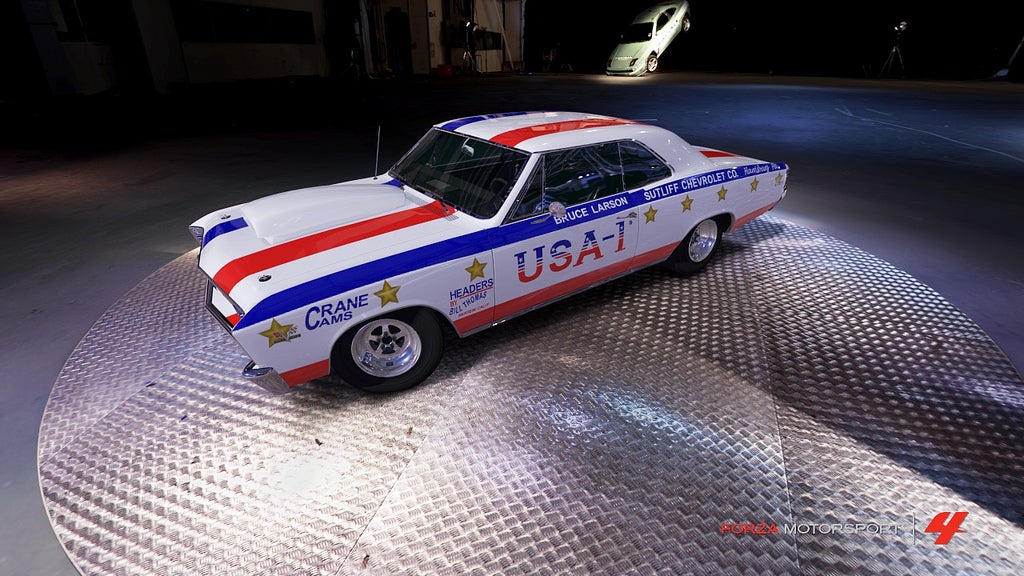
Script is tedious and pain but goes along way in completing the look. My attempts at doing some drag car replicas in Forza 4 we some of the toughest I did.
 StingrayJake
> camaroboy68ss
12/12/2015 at 17:43 |
|
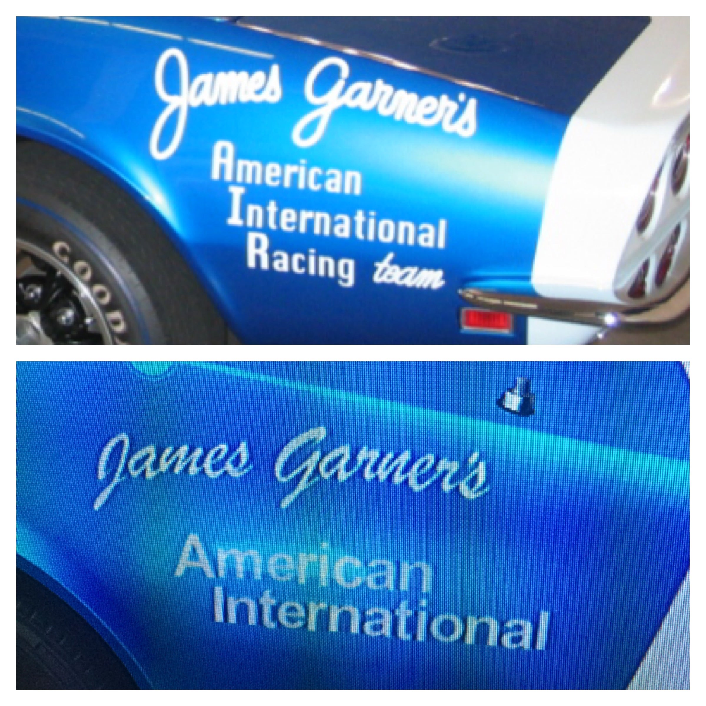
Forza doesn’t have the exact fonts but it doesn’t look too bad.
Your work looks great!
 camaroboy68ss
> StingrayJake
12/12/2015 at 17:52 |
|
Thanks, I for some dumb reason to actually make most of my letters with basic shapes and creating my own fonts to match the real cars. Like you could make your own A I R to match the cars with some basic shapes, while the basic font matches really well. Same with the J and G. Devil is in the details.
 StingrayJake
> camaroboy68ss
12/12/2015 at 18:05 |
|
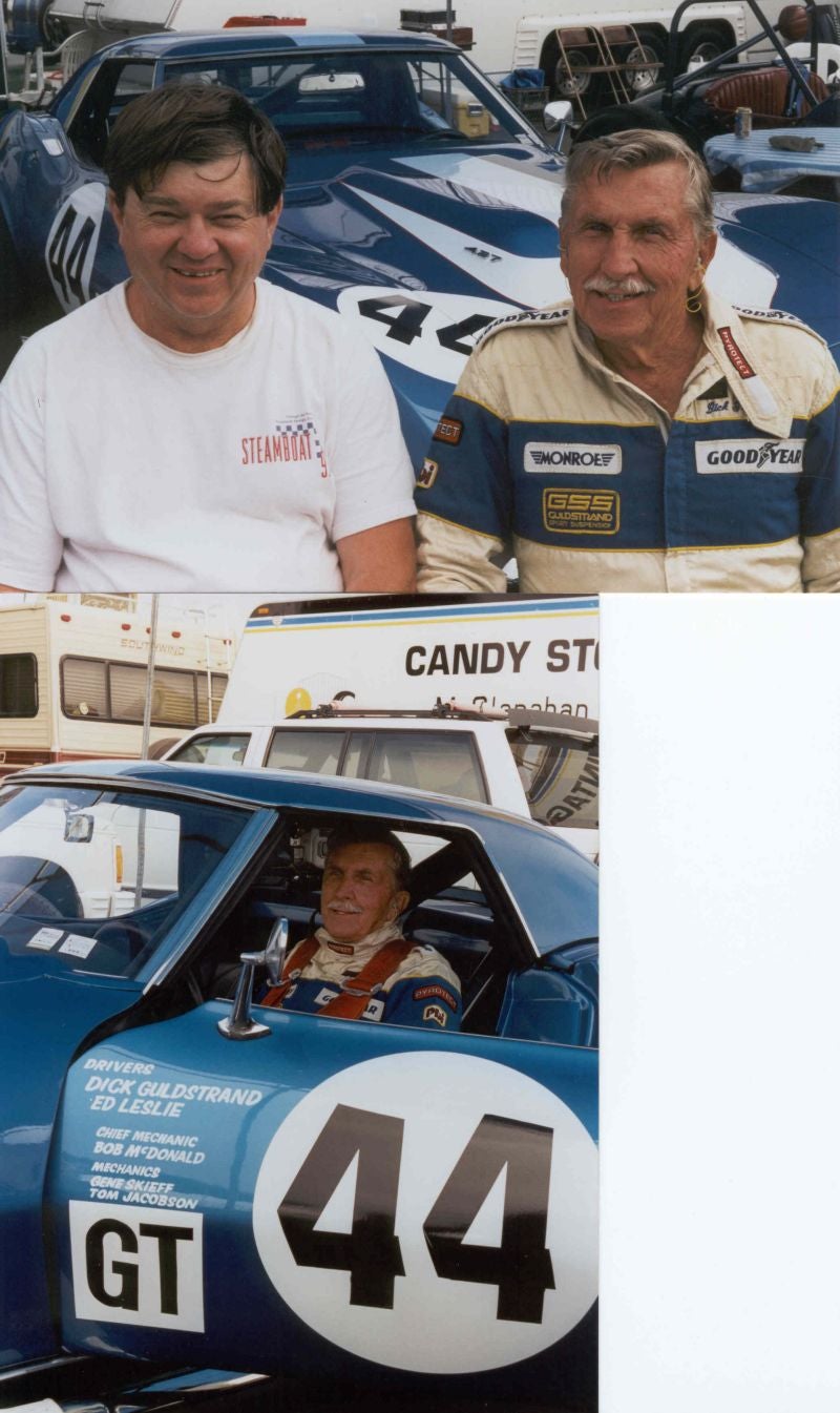
Yeah I might revisit the AIR. Sculpting the script J and G... not sure I’m up for that.
Of course once I get to doing numbers and the driver font, I might have to break down and do it the hard way.
 camaroboy68ss
> StingrayJake
12/12/2015 at 18:20 |
|
yeah, but those numbers look pretty easy to me, but I haven’t messed much yet with forza 6 and its vinyl editor
 StingrayJake
> camaroboy68ss
12/12/2015 at 18:39 |
|
Yeah numbers shouldn’t be bad. And the hand-painted driver names don't have extreme serifs. Looks like they're actually rounded off. The slant will be the interesting part.
 camaroboy68ss
> StingrayJake
12/13/2015 at 17:45 |
|
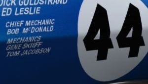
Looking great!
 daender
> StingrayJake
12/13/2015 at 17:50 |
|
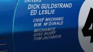
I would recommend shrinking it down some more and positioning it higher to make for the GT box to fit. Judging by the reference picture the list of names stops right before the kink in the door.
 StingrayJake
> daender
12/13/2015 at 17:58 |
|
Yeah that's what I was thinking.
 Blondude
> StingrayJake
12/13/2015 at 19:46 |
|
If you’re trying to get the text just the right size but the increments are too large (0.05 is too big, 0.04 is too small) you can highlight all of the text you want to adjust, place another random bigger shape somewhere on the car, highlight that too, group them all together, and then shrink the size. It’ll give you the full 1.00 scaling and once you have the text at the right size just ungroup it and delete the extra shape.
 Dingers Ghost, Champion Jockey
> StingrayJake
12/13/2015 at 21:39 |
|
The trick I always use for writing on Forza (mostly Horizon) was to make the first letter the size I needed, then keep stamping it repeatedly in a line. After that I go back and edit the letters to be what I actually want them to be. That way, you get uniform sizing, and if you’re careful, you can also get words to be in a single line and not like they’re floating in soup.
 Roundbadge
> StingrayJake
12/14/2015 at 14:01 |
|
This is pretty sweet.
I just got my xbone and Forza last week. Add ‘CountyRacer136’, if you like.