 "Fred Smith" (porsche9146)
09/10/2014 at 16:28 • Filed to: None
 2
2
 38
38
 "Fred Smith" (porsche9146)
09/10/2014 at 16:28 • Filed to: None |  2 2
|  38 38 |
As you can see, the latest Kinja interface is live on Oppositelock, and I'd like to know what you think of it. I'll be forwarding this to Gawker IT, so if you have any thoughts you'd like them to hear, please post them here.
 Alex from Toronto
> Fred Smith
09/10/2014 at 16:29 |
|
It's not bad just kinda odd.
 RazoE
> Fred Smith
09/10/2014 at 16:31 |
|
I...I like it....by GEORGE I LIKE IT!!!
 RMudkips
> Fred Smith
09/10/2014 at 16:32 |
|
AH AH AH
I'm not used to it yet so I'll give you more when I use it. Right now it's messing me up without those circles. I actually thought the circles were good.
 Dwhite - Powered by Caffeine, Daft Punk, and Corgis
> Fred Smith
09/10/2014 at 16:32 |
|
My only criticism would be the notifications button. I would rather it light up red like it used to as its much more noticeable since there is already a lot of blue here.
Wait...
Holy shit, if this is my biggest complaint you did a pretty good job this time Gawker.
 Brian Silvestro
> Fred Smith
09/10/2014 at 16:32 |
|
I'd like it better if the notifications circle was red when I have a notification instead of just blue. Red stands out more.
 ly2v8-Brian
> Fred Smith
09/10/2014 at 16:33 |
|

so far anyway....
 Alfalfa
> Fred Smith
09/10/2014 at 16:33 |
|
I haven't used it on a computer yet, but I love it so far on mobile.
 Takuro Spirit
> Fred Smith
09/10/2014 at 16:34 |
|
I would like a scroll-able list of notifications, not just the last 5. Other than that I LIKE IT.
 Big Bubba Ray
> Fred Smith
09/10/2014 at 16:36 |
|
Whenever Kinja changes, I think "don't fix it if it ain't broke," but this seems to work well so far.
 Biased Plies
> Fred Smith
09/10/2014 at 16:36 |
|
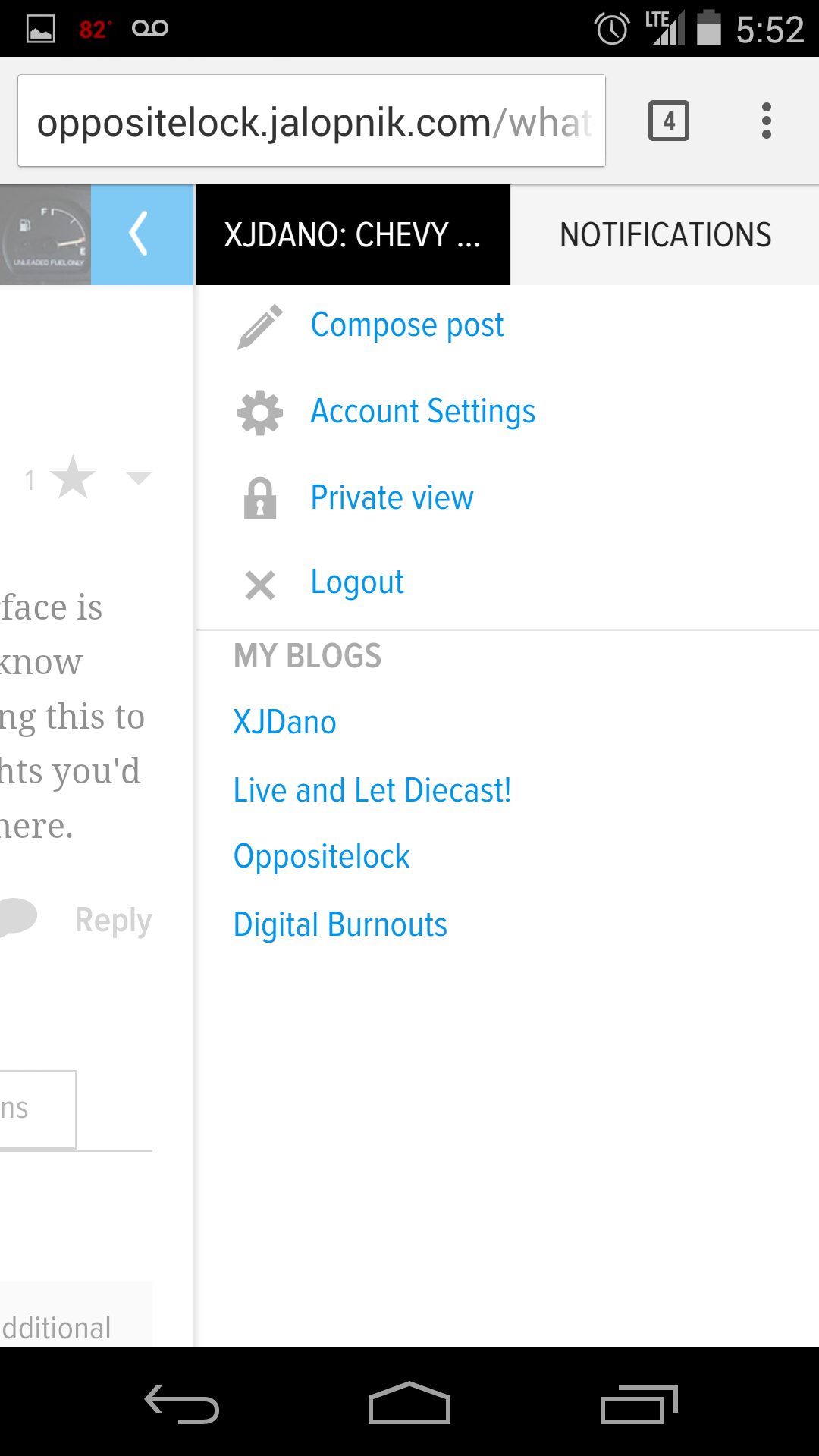
It's alright. The only issue I have is with the use of vertical space; it is already at a premium with typical widescreen (16:9 or 16:10 if you're lucky) displays. I'd prefer to have the display image and notification button in place of the Kinja logo, kind of as they were previously but in the style they are in now (which I like) and then use the rest of the white bar at the top for post/article space. I get that doing so would make the left side a little busy but they could easily take away from the recommended stories column, which I think is a bit intrusive anyway (lose the bolded font please).
 Blunion05 drives a pink S2000 (USER WAS BANNED FOR THIS POST)
> Fred Smith
09/10/2014 at 16:38 |
|

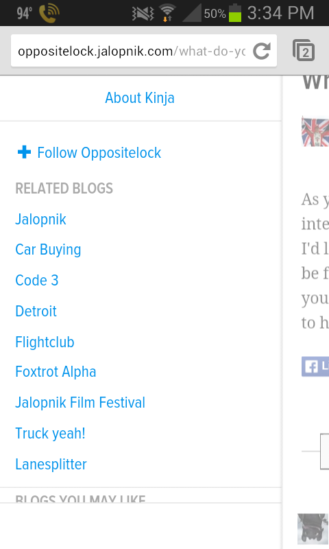
why is there so much empty white space after the text of blog names taking up a fourth of the screen when I open the tab? I also don't get notifications often so I can't see the new notifying system notifying me but I want to be able to see that I have notifications without opening a new tab.
 Denver Is Stuck In The 90s
> Dwhite - Powered by Caffeine, Daft Punk, and Corgis
09/10/2014 at 16:38 |
|
I second this request. Red instead of blue
 $kaycog
> Fred Smith
09/10/2014 at 16:39 |
|
It's very nice, and I like it. Small thing though is that the newest notifications don't have a blue dot beside them like they used to.
 Bandit
> Fred Smith
09/10/2014 at 16:39 |
|
If the mobile version didn't have the menu that followed you everywhere that'd be great. It cuts down a bit too much on reading space. If it would just stay at the top life would be good.
 ttyymmnn
> Fred Smith
09/10/2014 at 16:41 |
|
These are nitpicky things. On the whole, it's fine. Unless the design gets in the way, I'm more interested in content and stability than looks.
• List of Notifications does not indicate which are read or unread (used to be a blue dot marking unread)
• You can no longer option-click a notification and have it open in a new tab/window (you can still right-click or ctl-click on the Mac to get a contextual menu) (FF, Mac OS 10.7.5)
• I would like to have Formatting options open by default when replying
• Replying on mobile still requires a backspace to capitalize first character (iPhone, iOS 7)
• Like others, I would prefer a red notifications circle
 Laird Andrew Neby Bradleigh
> Fred Smith
09/10/2014 at 16:42 |
|
Better than the last one, I actually really like it (but red for notifications would've been better).
Now let's just hope Nibbles won't come and eat half the posts again (as he's done every single time there's been a change).
Edit: there's a whole lot of white on each side.. not a huge fan of that, makes the thing feel cramped.
 Lauren Bertolini
> ttyymmnn
09/10/2014 at 16:46 |
|
Those first two are bugs, we're hoping to tackle those today, if not, first thing tomorrow.
As for your feedback on mobile replies, I'll pass those along to the team who handles the editing experience. Thank you for your notes!
Edit: The first bug is actually already fixed.
 Lauren Bertolini
> $kaycog
09/10/2014 at 16:46 |
|
That's a bug, we're going to fix it ASAP!
 Lauren Bertolini
> $kaycog
09/10/2014 at 16:48 |
|
And this is already fixed!
 ttyymmnn
> Lauren Bertolini
09/10/2014 at 16:49 |
|
My pleasure. And thanks to the whole team for all the hard work.
 Arben72
> Fred Smith
09/10/2014 at 16:52 |
|
On mobile the bar on top can be as thin as oppositelock logo (no white space). That's just nit picking though.
 Pabuuu, JDM car enthusiast & Italian parts hoarder
> Fred Smith
09/10/2014 at 16:56 |
|
The thing that moves with you as you are scrolling down the page, the bar on top with you username, avatar etc. is too big for my taste.
 $kaycog
> Lauren Bertolini
09/10/2014 at 16:59 |
|
Indeed! Thank you! Talk about fast.
 Lauren Bertolini
> ttyymmnn
09/10/2014 at 17:04 |
|
And the second bug is fixed!
 Biased Plies
> ttyymmnn
09/10/2014 at 17:05 |
|
The issues on mobile are true for Android as well (Kit Kat 4.4.4). Just mentioning that for the techs.
 ttyymmnn
> Lauren Bertolini
09/10/2014 at 17:11 |
|
That was fast! I'll let others know who experienced the same issue. Thanks!!
 craig-oesterling
> Fred Smith
09/10/2014 at 17:20 |
|
There's one thing that still confuses me, as it did in the last iteration. How do I find/access certain blogs that aren't necessarily the main ones? For instance, I randomly discovered
http://liveandletdiecast.kinja.com
, and
http://oppositeblog.kinja.com
. Is it possible for them to show up in that blue drop-down menu, or under the My Blogs section under my name? Seems those are limited to the ones I have author privileges to . . .
Sorry if this question has been asked before, or if there's something simple that I'm missing.
 desertdog5051
> Fred Smith
09/10/2014 at 17:23 |
|
I like it. Only thing is it would be nice if notifications changed color when you have some waiting.
 Lauren Bertolini
> Biased Plies
09/10/2014 at 17:29 |
|
Thanks, I'll send this thread to support.
 Lauren Bertolini
> craig-oesterling
09/10/2014 at 17:30 |
|
We don't have a good way for you to access these right now. That's a problem we still need to solve.
 Dusty Ventures
> Lauren Bertolini
09/10/2014 at 17:53 |
|
Just a thought, would it be possible to have a drop down that lists the blogs one chooses to subscribe to? Wondering if that could work as a solution to the problem.
 SVTyler
> Fred Smith
09/10/2014 at 18:41 |
|
My only would be to move the 'search' function to the top bar instead of hiding it in the drop-down menu, but other than that it's a very clean design, liking it so far.
 XJDano
> craig-oesterling
09/10/2014 at 18:54 |
|
if you reply on the lald blog you can ask for authorship. Then it should show up under the "My Blogs" although all blogs won't give you authorship. They'll have to figure a good way to get subscribed blogs under that, maybe.

 f86sabre
> Fred Smith
09/10/2014 at 23:13 |
|
I'm generally pleased, but have two items:
1) I'm not a fan of having to pull search from a drop down.
2) I don't like the notifications on the right. I prefer the left where they cover up popular stories as opposed to the main feed.
 delia
> Fred Smith
09/10/2014 at 23:59 |
|
Welcome to www.buyincoins.com , it's a nice site where you can buy your need items in cheap price.also, it offer free shipping all over the world. You can't miss it.
 Just wear your damn mask...
> Fred Smith
09/11/2014 at 08:36 |
|
The Kinja logo in the upper left hand corner reminds me of when GM started putting its corporate logo on the front fenders of every car it built. I'm just saying those weren't great days for GM...
 MontegoMan562 is a Capri RS Owner
> Fred Smith
09/11/2014 at 10:05 |
|
Man I had to dig deep to find this again this morning.
I've noticed something odd.
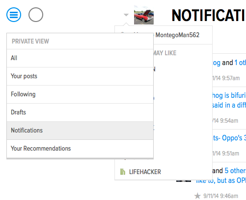
When you go to "all notifications" page, your menu overlaps the drop down shortcut menu.
Picture for reference:

 craig-oesterling
> Lauren Bertolini
09/11/2014 at 13:49 |
|
I suppose a secondary drop-down menu featuring each user's subscriptions is either impossible, too cluttered, or just doesn't fit with the end-goal? I've just found it supremely confusing that there's no real way to see an overview of all the kinja-sphere. Or, once I find something, I either have to bookmark it or start typing it into my browser's search bar. Glad I'm not just completely missing some obvious solution!
Anyway, thanks for the reply!