 "ttyymmnn" (ttyymmnn)
05/23/2014 at 18:50 • Filed to: kinja
 2
2
 12
12
 "ttyymmnn" (ttyymmnn)
05/23/2014 at 18:50 • Filed to: kinja |  2 2
|  12 12 |
Who wants to design a favicon for Planelopnik?

 Brian, The Life of
> ttyymmnn
05/23/2014 at 19:22 |
|
Maybe something simple like this?

 ttyymmnn
> Brian, The Life of
05/23/2014 at 19:26 |
|
Simple is good, though it might resemble the Flight Club logo a bit too much. Now, if we made it Oppo orange, it would show it's Oppo heritage. A fighter silhouette might be better to differentiate it from Flight Club's emphasis on commercial aviation.

 ttyymmnn
> Brian, The Life of
05/23/2014 at 19:30 |
|
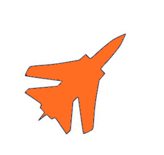
I found this on the Interwebz. Looks like a Tornado. If we turned it about 45 degrees clockwise it would look more dynamic.

 Brian, The Life of
> ttyymmnn
05/23/2014 at 19:32 |
|
That's good!
 ttyymmnn
> Brian, The Life of
05/23/2014 at 19:35 |
|
There's a bunch of them online if you Google "jet fighter silhouette."
 Bricks
> ttyymmnn
05/23/2014 at 19:53 |
|
here is a hastily done mockup of the logo
 ttyymmnn
> Bricks
05/23/2014 at 20:03 |
|
That's exactly what I was working on. I got it cranked, but wasn't sure about turning it orange. I'm trying to decide on the black outline. The outline might be good.
 ttyymmnn
> Brian, The Life of
05/23/2014 at 20:04 |
|
http://oppositelock.jalopnik.com/here-is-a-hast…
 f86sabre
> ttyymmnn
05/23/2014 at 22:58 |
|
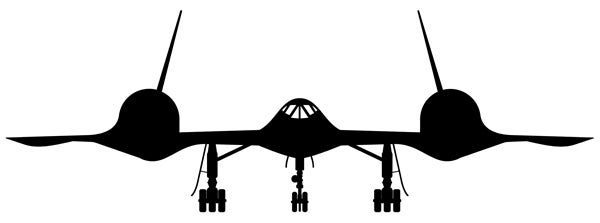
I'd get rid of the gear.
 ttyymmnn
> f86sabre
05/23/2014 at 23:01 |
|
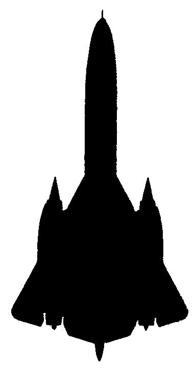
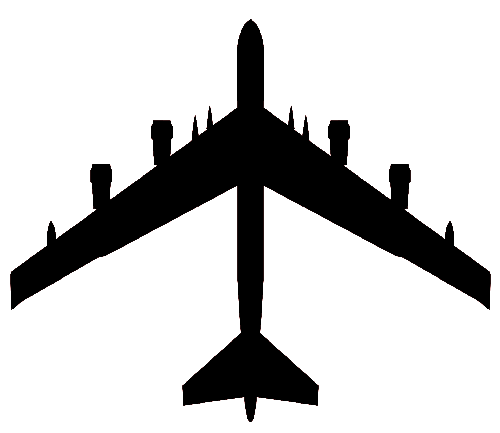
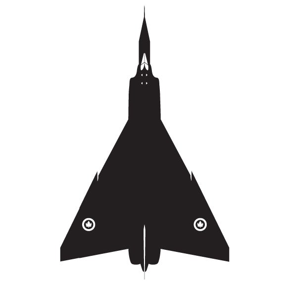
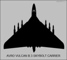
It has to fit in a square space, though. The Buff would work. And the Vulcan. Did you see the orange Tornados?
 f86sabre
> ttyymmnn
05/23/2014 at 23:09 |
|
I did. Neat.
 ttyymmnn
> f86sabre
05/23/2014 at 23:33 |
|
I made another one that didn't have the black outline, but I'm no Photoshopper. I don't think it's sharp enough.
