 "Alex B" (alexb420)
10/05/2014 at 16:24 • Filed to: None
 4
4
 3
3|
"Alex B" (alexb420)
10/05/2014 at 16:24 • Filed to: None | 4
| 3 |
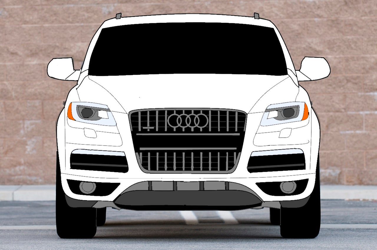
Do you like it?
 All Motor Is Best Motor
> Alex B
All Motor Is Best Motor
> Alex B
10/05/2014 at 16:26 |
|
It's good. I think you might want to use thicker lines to smooth the aliases a bit so some of the thin lines don't end up looking so jagged. Would also give it a bit more stylized look.
|
Alex B
> All Motor Is Best Motor
10/05/2014 at 16:31 |
|
This is true.
 Tapas
> Alex B
Tapas
> Alex B
10/05/2014 at 16:58 |
|
Me likey :)
Make a french racing blue F-type!