 "Axial" (axial)
12/11/2013 at 00:00 • Filed to: None
 7
7
 46
46
 "Axial" (axial)
12/11/2013 at 00:00 • Filed to: None |  7 7
|  46 46 |
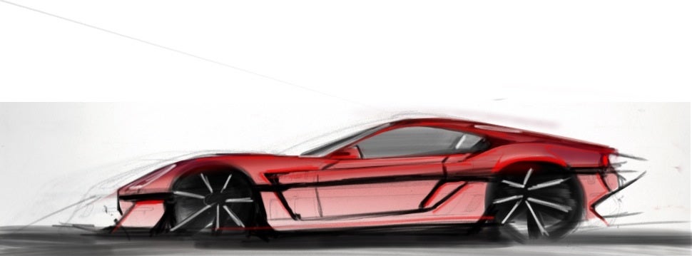
As some of you know, I've been working on my own car concept. The most recent iteration of it looked like this:

There are twol things wrong with this version. First, it looks too much like a mid-engined car. There's nothing wrong with mid-engine cars unless, you know, you want it to be a sports car, and this is supposed to be one. Second, the image is dirty and hard to look at.
So, I've made a new one using the wheelbase from this one:

My gripes are that the tail seems truncated in comparison and the windshield is steeper than I'd like. Yes, I am aware the side mirror is missing.
So, ladies and gentlemen, what are your thoughts?
 Reigntastic
> Axial
12/11/2013 at 00:02 |
|
I'd like the bumper more if it wasn't flared out, otherwise I think it looks great. Would hoon.
 PetarVN, GLI Guy, now with stupid power
> Axial
12/11/2013 at 00:02 |
|
I guess front axle lift system, like that in the GT3 RS Carrera, so it can clear speed bumps?
 TyFc3s-A car hating millennial
> Axial
12/11/2013 at 00:06 |
|
wow, i like it, the only thing i would change would maybe be the rear end, id add a pure kamm back style, but thats just a personal thing, i cant wait to see more
Ironically i just started to draw the tube frame for my concept car lol
 HammerheadFistpunch
> Axial
12/11/2013 at 00:06 |
|
The front clip still bothers me, too long, makes the wheelbase look too short. it looks like an aero package stuck on in the 90s to an LM car...half that clip again and push out the front wheel a little.
 Axial
> PetarVN, GLI Guy, now with stupid power
12/11/2013 at 00:07 |
|
Possibly. Honestly, what I'm drawing is basically a racing version sans the tail because let's face it, even with a front-axle lift system this is not going to clear a speed-bump.
C8 GT comes first, then street-legal C8. :ţ
 Kailand09
> Axial
12/11/2013 at 00:09 |
|
I like it. I especially love the side gills (swoon). I love this on vehicles. The greenhouse is a great shape, and I love the shape as it leads into the rear fender and back of the car. I think you did that part better on the first drawing though, it's slightly changed in the second iteration.
My personal opinion-based constructive criticism (please take with a grain of salt!)
-It seems overall a little bit too boxy, and a bit too close to 80's cues from the boxiness. This is most prevalend in the front fender area leading to the wind shield and the A pillar.
-The curving outward of the front bumper doesn't flow right to me, I think a lip could serve the same function in a nicer manner.
-The rear end may need some work to flow with the rest a bit better, though I'm not sure how, that's your job!
-While I love the gills, they may need a little more shape, again on the boxy look.
Overall, WAAY better than anything I could do, but just my own thoughts looking at it.
 Desu-San-Desu
> Axial
12/11/2013 at 00:12 |
|
That front overhang is a little much, isn't it...?
 Axial
> Reigntastic
12/11/2013 at 00:13 |
|
Sorry, I can't change that! It was one of the earliest mandates for the design. The best I can do without violating the mandate is straight up and down, but that honestly looks really weird with the rest of the body. Perhaps it'll grow on you once I make it to the top and perspectives.
Cheers!
 Axial
> HammerheadFistpunch
12/11/2013 at 00:20 |
|
But...it's supposed to look like a 90s car. If I halve the front clip, the fenders also can't form a razor edge at the nose without tucking the front fascia under. I just might push the front wheel back out again, though I think reducing the diameter to a more real-world beneficial 17" instead of the 19" I imagine these to be at would achieve much the same result while also allowing me to pancake it and whip the greenhouse back into shape.
 Axial
> Desu-San-Desu
12/11/2013 at 00:22 |
|
Maybe if you're from 2013...wait a minute...
 Agrajag
> Axial
12/11/2013 at 00:22 |
|
I like it. Maybe a wing, but slightly bigger than the one in top pic.
 Axial
> Kailand09
12/11/2013 at 00:28 |
|
Thank you! I loved the gills on the late ('78-'82) Stingrays, and I combined it with the 90s blunted-box to get what you see there.
It is indeed boxy! That's by design, though I am trying to figure out a way to add some more shapes without compromising the retro look. It's really hard to do! I definitely agree that the roof-line in the first one is better. I'm going to reduce the wheel size so that I can flatten the car a little bit and get the rear section and roof back into the original shape while retaining the front-engine look. The front bumper is supposed to be straight, I guess the mass of graphite near the bottom is making it look like it curves outward before reaching the splitter. I'll fix it.
This whole thing is a fantastic learning experience in proportions!
 Axial
> Agrajag
12/11/2013 at 00:32 |
|
Thanks! Funny about the wing, it's not actually there in the top picture. It was a half-weight blurb I drew just to visualize and it showed up when I enhanced the saturation curves of the scan.
I am not a fan of wings, I'm trying to get this design to look right without one, but I do intend to have a winged version because it's necessary for racing. Perhaps I'll draw it on for the next update. Stay tuned!
 Axial
> TyFc3s-A car hating millennial
12/11/2013 at 00:36 |
|
I appreciate the appreciation! Good to know that I'm on the right track with my retro cues!
It sort of is a kammback, though a good place to look for how the rear glass is done would be the Ferrari F430, except my glass sits below the C-pillars (my B-pillars are invisible) and ends before, giving it a half-buttress.
 Kailand09
> Axial
12/11/2013 at 00:38 |
|
I don't ever mind giving out my opinion! Lol.
You have achieved your design of boxiness, I just wasn't sure if that was purposeful. Definitely a very difficult task indeed.
If I ever try drawing a car, it looks preposterous.
 Axial
> Kailand09
12/11/2013 at 00:39 |
|
You know what, just as a confidence booster for you I think I'll upload some of the beginnings of this car! Don't change that channel just yet!
 stuttgartobsessed
> Axial
12/11/2013 at 00:42 |
|
Great overall. Much better than I can do. However I think that the front overhang is w aaaaaaaaaaaaa y to long. Thought I'm not sure how to remedy it without ruining the great wheel arch line you've got going. (It reminds me of an F40). As for the tail section, I agree with you that it is a bit truncated but i love how the roofline flows into the rear as well as that wheel arch. I also like the lip spoiler and the indented bumper. Again, no real ideas or solution. The mid section is fabulous though! Love the grill and skirts. Keep up the good work! You'll get there.
 saabstory | fixes bikes, breaks cars
> Axial
12/11/2013 at 00:51 |
|

This is what I changed. It only comes in metallic brown flake) with an 8-cylinder turbodiesel and manual.
 phenotyp
> Axial
12/11/2013 at 00:58 |
|
Proportions, pal. Proportions.
 Axial
> saabstory | fixes bikes, breaks cars
12/11/2013 at 00:59 |
|
Not sure I like that nose, but I am saving this. Not for this car, but for its contemporary version of the Sonic, which in my future comes as a proper hot-hatch and shares styling cues with this C8. A proper halo-car effect.
Well-done!
 saabstory | fixes bikes, breaks cars
> Axial
12/11/2013 at 01:01 |
|
Should the nose be more extreme? I was debating whether it was too Supra-y and pedestrian. Also, that sounds awesome.
 Axial
> phenotyp
12/11/2013 at 01:01 |
|
I'm already aware of the issues. That said:

 OkCars- 22k Crossroads
> saabstory | fixes bikes, breaks cars
12/11/2013 at 01:02 |
|
I liked this better than the original. That front looks good, and the rear now makes sense.
 Axial
> saabstory | fixes bikes, breaks cars
12/11/2013 at 01:04 |
|
It's too vertical, doesn't work with the slope of the hood. The nose on mine is all but lifted straight from the F50 GT. Your car is decidedly 80s looking while mine is more 90s.
Also, I plan to draw a whole stable of vehicles using this car's style covering subcompact, mid-size, full-size, and CUV ranges. The truck and SUV will be a separate line based on each other, but with some cues to throw back to these.
 phenotyp
> Axial
12/11/2013 at 01:05 |
|
That's the example I brought up the first time. And you specifically said this time that it's a "sports car" and not mid-engined. And there's a lot more than just the front overhang.
So, you gonna actually make this thing, or what?
 rad_mike
> Axial
12/11/2013 at 01:05 |
|
I'm liking it. I don't mind the rear end at all, though agree with others that the front clip is still a bit long. I'm having a bit of a problem with the "thinness" over the front wheel well, it just doesn't seem practical. Are the wheels drawn too large?
 saabstory | fixes bikes, breaks cars
> OkCars- 22k Crossroads
12/11/2013 at 01:07 |
|
Thanks, it's really a 355, Breadvan and RV-2 smashed together. Maybe a little F40/F50 thrown in there, too.
 saabstory | fixes bikes, breaks cars
> Axial
12/11/2013 at 01:09 |
|
Yeah, I noticed that my edits took it further towards the 355 and F40, while the original drawing was really F50 and Speed 12.
 Axial
> phenotyp
12/11/2013 at 01:16 |
|
I was making a fun jab at mid-engined fans with the "sports car" thing, that's all. Don't take that part seriously.
The issues with this iteration are the rear being too short relative to the front, the fender scoops being too tall and causing too much of a slope down the rear, the wheels are slightly too large, the windshield being too vertical, and front fender coming back at too harsh of an angle.
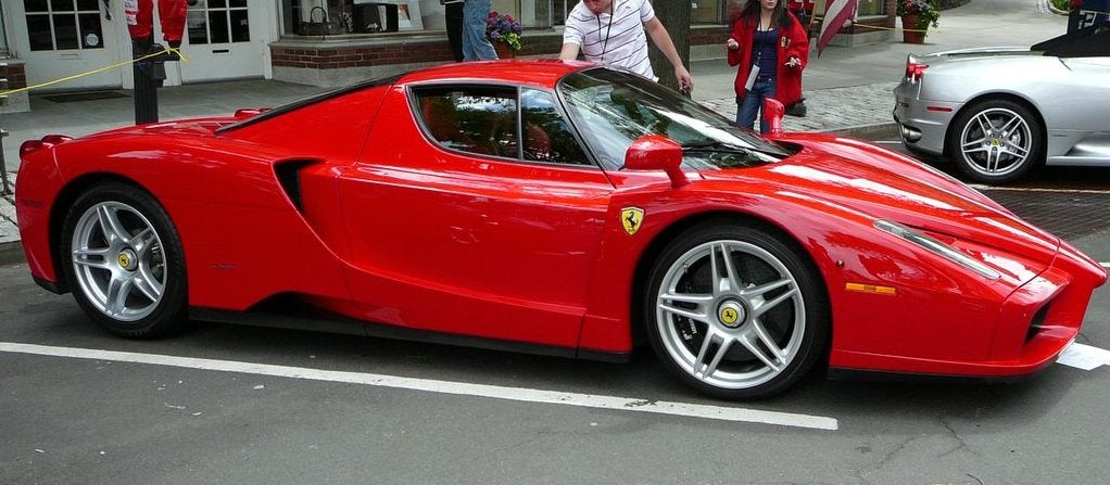
The Enzo has its own proportionality problems, the most glaring of which is a wheel-base that is far too long causing it to have this awkward deck protruding out the back end. It's functional though, so I might have to just bite the bullet and extend my base again.
As for planning on building it, that would be something. I don't have the money to fund fabricating something like this. It's more or less a grounded family design study; I'm cutting out the whimsical over-styled concepts companies like to show us because I think those are a waste of time and money because they always get re-designed by committee anyway. You either have a vision and the backbone to build it or you don't.
 Axial
> rad_mike
12/11/2013 at 01:23 |
|
Thanks! It's a racing posture, the Enzo looks similar. That said, I've never seen anybody with a lowered car have issues with top clearance and in fact, most lowered cars have wheels whose tops sit past the top of the opening, F50 GT included. You'd only run into issues if your wheels are sticking out past the sides of the car, because they'd hit the arches during turning. Otherwise, it's fine.
The wheels weren't intentionally drawn large and are proportionally the same size as they are in the top image since I scanned and traced a larger version of the top image to form the base for this one, but I think I'm going to reduce them. This is the Porsche 918 look, and I've decided it doesn't work too well with what I'm trying to do.
What makes you think the front is too long? Is it the short back? The truncated green-house? The fact that most modern cars have wheels pulled out to the corners?
 phenotyp
> Axial
12/11/2013 at 01:23 |
|
Yeah. Exactly. You're not actually building this, so don't take things so seriously. The more you learn about proportion, drawing, and automotive design the better you'll be able to be.
 Axial
> stuttgartobsessed
12/11/2013 at 01:25 |
|
Thanks for the feedback!
What is it about the front that makes it seem too long? Is it the lack of material after the rear wheel? The smaller greenhouse? The fact that modern cars have the wheels in the corners?
Trivia about the skirts: I had wings on it before the 458 Speciale was even a thing!
 stuttgartobsessed
> Axial
12/11/2013 at 01:49 |
|
As for the front, I just think how impractical speedbumps will be. As for the rest, its my personal taste. I think car design peaked in 1950's. But generally 1930's-1970's were the best years for car design and that's why I find problems with your design. Its modern. If a modern, cutting edge design is what you're going for then you're doing a great job.
 Axial
> phenotyp
12/11/2013 at 02:03 |
|
But as a more grounded design study, the point of this is to design it as if I am building it. Otherwise I could go nuts and come up with something totally rad but also totally unfeasible.
Now I'm not dismissing what you are saying because I do and did recognize the proportionality problems, but my ability to sense and execute proportions isn't the issue and I'm going to be bold and claim right now that I've got a better eye than whoever penned 90% of road-going automobiles including atrocities such as the Veyron, the Huayra, and the LaFerrari. I post the iterations here because I thought some might like to share in my fun of drafting up a new car and because I am curious to see if peoples' reactions confirm my suspicions; I started changing it before I even posted it. Going with the predominant shortcoming, so you think the front is too long. I know why I think the front is too long, but none of you have said anything more specific and the only suggestions I've received have been counter to the aesthetic mission statement: 90s throwback Corvette. That's why this:

...is no good. I already gave you a longer version, but the short version is that it's just too modern and loses the entire feel I was going for. It also says BR-Z more than it does Corvette. It's a nice concept, but misplaced.
 Axial
> stuttgartobsessed
12/11/2013 at 02:10 |
|
And here I thought it was retro, ha!
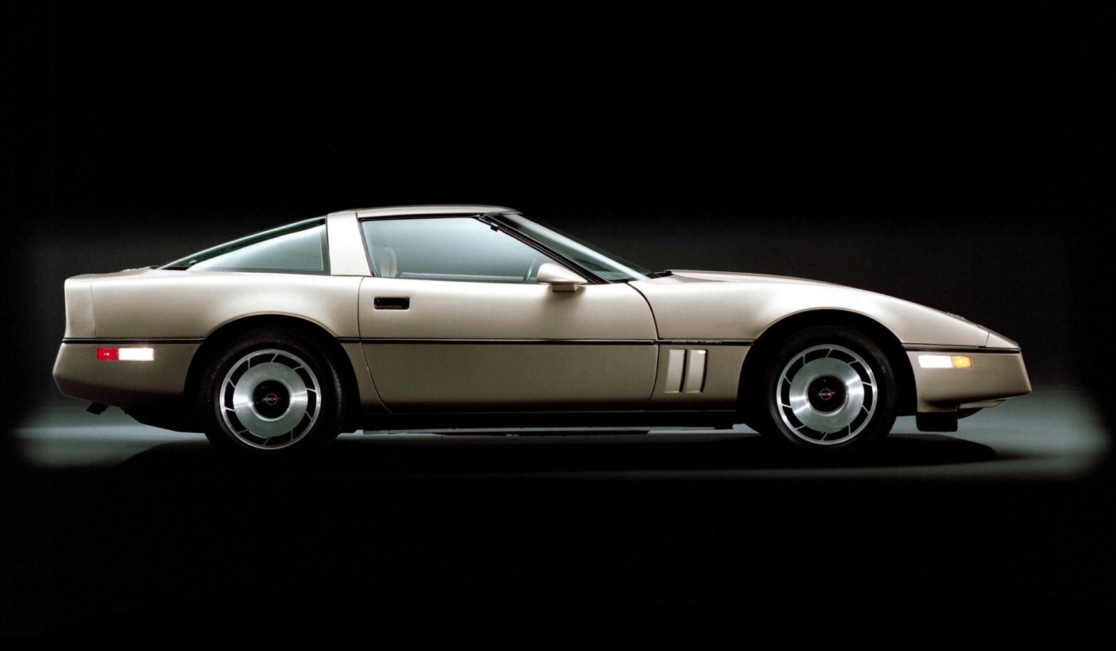
I don't know if you saw it, but I mentioned it in the first post for this project that the idea is a somewhat modernized late 80s, early 90s look. That's why I've got long overhangs, a beltline, boxy cross-section, and gills.
!!! UNKNOWN CONTENT TYPE !!!
I am of the same mind as you, that car design peaked in the 50s and that the best came between the 1930s and the 1970s. I thought about sketching a more 50s throwback car, but I decided to leave that for another time because as a 90s kid feeling nostalgic, I felt that the early 90s could use some throwback love more than the 50s.
As for speed bumps, yup, no arguing there. But it comes with the class of performance being targeted, I guess.
 stuttgartobsessed
> Axial
12/11/2013 at 02:24 |
|
Well the 90's is modern compared the the 70's. JK. Yah I see where you're coming from. Basically What I see is the aftermath of the new mustang rear ending an F40 LM. (the indented rear screams mustang to me and the from mid-door forwards it's very F40 LM. I also like the attitude of "screw speedbumps. they're for prii attracting slow people roads. I wanna go fast."
 Axial
> stuttgartobsessed
12/11/2013 at 02:28 |
|
o_O New Mustang...run away!
I'll just leave this here:

 phenotyp
> Axial
12/11/2013 at 02:29 |
|
Look, man. I'm not trying to change your aesthetic opinions/goals, or anything. I'm trying to help you see what you're doing wrong. You're missing a whole lotta points. If you want to be "bold," you'd better back it up.
Try drawing in perspective. Try adding some realism, like people in the car. Freeman Thomas was once told, when he presented a full-size tape of a car whose proportions he'd described as "magical," was told: "Freeman, if people can't get in and out of the car, there is no magic."
And that was Freeman Thomas.
 stuttgartobsessed
> Axial
12/11/2013 at 02:42 |
|
touchée. i always forget about the c4 'vette... you should stop listening to me now haha
 Axial
> phenotyp
12/11/2013 at 03:02 |
|
Woah, don't think I'm in a huff over this. I'm just not really seeing your concern is all. You've just been stating things that I've either already stated myself or that you haven't provided any details for; your initial post was rather crass and so naturally I moved to defend myself (might want to check that use of the word "pal").
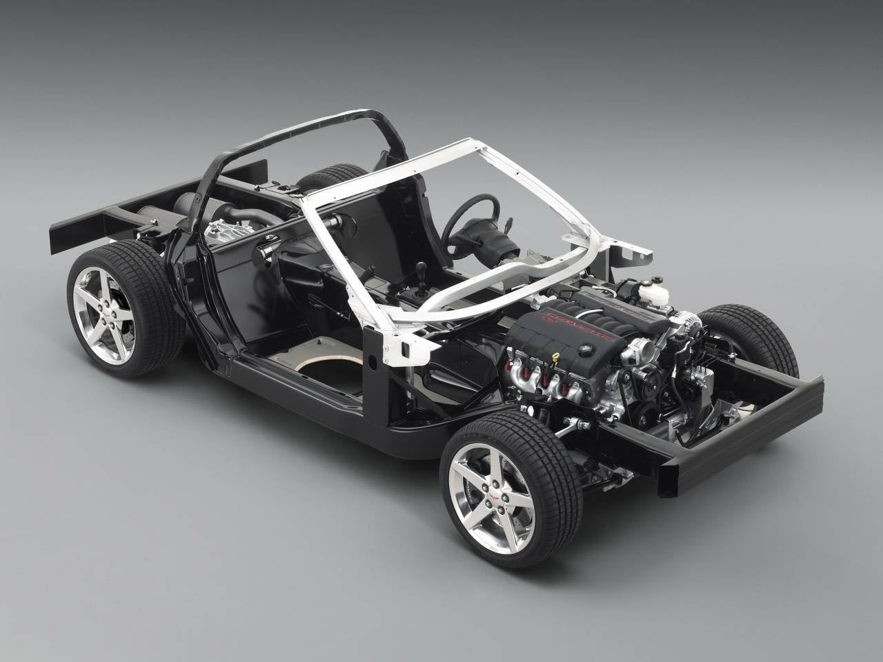
I've drawn it with blocks for the engine(s), alternators, batteries, ducts, fuel tank, and cargo space. I had an actual person sitting in a seat since a car is designed around the 'T-point', or the position of the hips relative to the rest of the car. I erased all of this once I had the car around it because they were no longer necessary. Interestingly enough, the proportions on a car have little to do with any of that, since a car without its body looks something like this:

...which is all but a blank slate for me to do whatever I want with. I will admit, that thing would be the coolest go-kart ever.
I find Your Freeman Thomas reference is intriguing, because I find most of his designs to be cars I don't like, notably the TT.
Since you brought it up, I am curious what your other gripes are. Is it the door sills? Are you seeing a lack of space or less-than-ideal placement for certain items? Are you bothered by excess space?Are you worried about road clearance? Are you a professional car designer? I am genuinely interested, please elaborate.
 Axial
> Kailand09
12/11/2013 at 05:58 |
|
And here you go !
!!! UNKNOWN CONTENT TYPE !!!
 William Byrd
> Axial
12/11/2013 at 07:23 |
|
Reminds me a Callaway C4 Corvette. I like it, just reduce the front end overhang.
 Axial
> William Byrd
12/11/2013 at 14:28 |
|
The Aerobody? I've been thinking about those while drawing these, actually. Those were pretty neat, just get ruined in front-plate states.
 phenotyp
> Axial
12/11/2013 at 18:42 |
|
Well, there's a lot. And "pal" wasn't meant in the way that you'd say "mate" when you mean "cunt," it was really just for the alliteration.
And, like I said in my last post, I'm not like out to bash you or whatever. I'm just trying to help you see what you're not seeing, and also hoping that you try to take this a little less seriously. To answer your other question, yes, I am a designer, with a degree in car design, who has designed actual cars and lots of other stuff.
Have fun.
 Axial
> phenotyp
12/11/2013 at 19:01 |
|
If you want to give me pointers, then I request that you please give the pointers with some context. I want to learn, so by all means, rip right into the car. Telling me "proportions," "there's a lot wrong," or drawing your own car for me, though, doesn't help me at all if you aren't telling me precisely what you are seeing as issue. As far as I can tell, I don't have any design issues going on other than subjective taste, and perhaps what you are seeing are things I've missed or things you don't understand since all you have to work with is what I've shown.
As for "pal," it has a negative connotation, as in Blade Runner , that's all. I praise your creative writing, though.
 shpuker
> Axial
12/12/2013 at 02:23 |
|
Only real issue with it is the length of that front overhang. Looks slightly goofy. Love it overall still though.