 by "ttyymmnn" (ttyymmnn)
Published 05/08/2017 at 16:38
by "ttyymmnn" (ttyymmnn)
Published 05/08/2017 at 16:38
No Tags
STARS: 2
I went to a small air show on Saturday, and took pictures with both of my cameras: a Canon 20D with a Tamron 17-50, and a Canon 50D with a Tamron 70-200. Take a look at these two photos of a North American P-51 Mustang, then I’ll explain my conundrum.
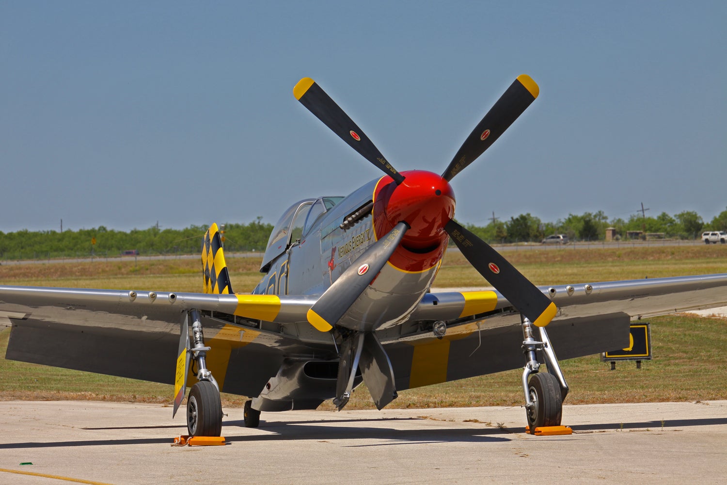
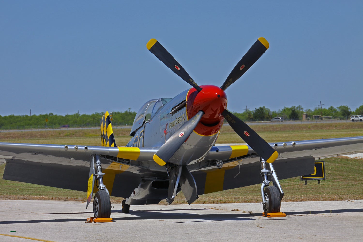
Since I was on the road, I edited the photos at the hotel on my late 2008 13" MacBook. Then I came home and transferred the edited photos to my iMac (early 2009 24"). The first photo was copied directly from the laptop and has not been edited on the iMac. Compared to the way it displays on the laptop, the photo looks significantly yellower. On the laptop, the colors are blue and silver and yellow, and it is very luminous. But the laptop screen is brighter, and generally whiter. It has a color calibration that I can’t duplicate on the iMac.
The second one is an edit of the first using automatic color correction in Photoshop Elements on the iMac (not my usual tool, but it was quick for the purposes of experimentation). To me, the second photo comes nearer to the original version that is on the laptop, though the blue is a little heavy. Look at the color of the pavement. On my iMac, the first one has a distinct red/yellow cast to it, but on the second, edited photo, the concrete is gray, as it should be. The sky is also bluer in the second than in the first. But the first photo, when displayed on my laptop, looks fine, if not better.
So, what I’m trying to figure out is how others see the photos. I suppose it’s a bit of a wild goose chase, since everybody’s monitor is different, and no matter what I do on my end the result will be different for everybody who is viewing the photos. One thing that I did discover in this process is that my 20D/17-50 makes “truer” colors than the 50D/70-200, even though both are set on AWB. The 50D, which was used for this attached shot, tends to make the photos yellower (on my iMac), while the 20D does not. I don’t know if that is a function of the camera or the lens or both. I wonder if shooting in RAW will make any difference, since I would have much greater control over white balance, but I think it boils down to an issue with color calibration on the different screens, and the different physical construction of the two displays.
I fear I’m opening a very large can of worms.
You can see all of the shots here , and I’m going to do a dump on Oppo in the next day or two. I think you’ll be able to see how the two cameras deliver such different results. For example, towards the end of the gallery, there are two consecutive shots of a blue biplane with yellow wings (Stearman PT-13). The first, where you see the entire plane, was taken with the 20D and the short lens while the second, a tighter shot, was taken with the 50D and the long lens. The photo of the soldier with the machine gun was also taken with the 50D and long lens. It looks fine on the laptop, but it looks very yellow to me on the iMac and, despite my best efforts, I can’t make it look satisfactory to me. The same is true of the last two photos of the Travel Air 4000 in the gallery. EXIF data should be available for all the shots.
So, I guess what I’m trying to figure out is whether I should do my best to make the color happy where I see it on my iMac, or if I should worry about how others see the colors, knowing that everybody has a different monitor/calibration and I may be wasting my time. Is it even possible to get the same calibration on the iMac and the laptop? Or is apples and oranges and I’ll never get them to match?
 "chaozbandit" (chaozbandit)
05/08/2017 at 16:45, STARS: 1
Every display will be calibrated differently, but one way to try and mitigate it is to make sure you’re exporting in the most commonly available colour spaces. Any one of the sRGB variants should be suitable, usually available in your editor. Additionally, if your editor allows you to set your preview window to a set colour space make sure to check that as well.
Beyond that, it wouldn’t hurt to manually set WB in post. It’s the easiest way to go through a batch quickly, I find.
 "HammerheadFistpunch" (hammerheadfistpunch)
05/08/2017 at 16:45, STARS: 1
Time to learn to read a histogram like the matrix.
"ttyymmnn" (ttyymmnn)
05/08/2017 at 16:45, STARS: 0
That is on my lengthy to-do list.
"HammerheadFistpunch" (hammerheadfistpunch)
05/08/2017 at 16:48, STARS: 0
Since these shots are so insanely close you could just bring up both and normalize one histogram against the other...in fact I think there is a fuction in photoshop to match colors based on a source, but I can’t remember where I saw that.
 "Rustholes-Are-Weight-Reduction" (rustholes-are-weight-reduction)
05/08/2017 at 16:49, STARS: 2
Every screen will display it differently.
FWIW, the second picture looks way better on both my phone and my laptop (both Sony)
 "MonkeePuzzle" (monkeypuzzle)
05/08/2017 at 16:51, STARS: 0
my brother uses a monitor colour calibrator. a tool that reads what colours your monitor is outputting and helps you adjust it to a standard.
of course, not everyone’s monitors are calibrated, so...
"ttyymmnn" (ttyymmnn)
05/08/2017 at 16:52, STARS: 0
I like the second one better too. When I take pictures at the airport using the long lens, I always have to correct the hue by selecting a white spot and correcting for it. That leads me to believe that the yellow cast is a function of the lens/camera. But with all the work that I put into editing, I’d like them to at least look decent when others view them.
"ttyymmnn" (ttyymmnn)
05/08/2017 at 16:53, STARS: 0
You could fit what I know about Photoshop/PS Elements in a thimble. I have Lightroom, but haven’t started using it. I am in no way a power user.
"ttyymmnn" (ttyymmnn)
05/08/2017 at 16:54, STARS: 0
Exactly. I downloaded a calibration app last night and it did a terrible job. Of course, there are many out there. The one that seems to be most recommended (can’t remember the name) is over $100, and I don’t want to spend that kind of money.
"ttyymmnn" (ttyymmnn)
05/08/2017 at 17:07, STARS: 1
Thanks, but you’re already getting into things I know very little about. I clearly have a lot of homework to do....
 "Jonathan Harper" (jbh)
05/08/2017 at 21:30, STARS: 2
My two cents:
The top image looks better to my eye. The bottom image color temp is too cool, too blue. With cars I usually only adjust the color temp to make the body look the true color. The silver of the plane comes through best in the first image for me.
That said, I see a wide array of WB weirdness when I switch lenses on my Sony A7, especially with non-system manual lenses. Sometimes I have to create two color profiles to apply to photos from each lens if I use more than one on a single shoot.
"ttyymmnn" (ttyymmnn)
05/08/2017 at 22:09, STARS: 1
There is a lot going on here, and it’s going to take some homework to work it out. As I continue to advance in my photography, it seems that the more I learn the less I know.
I agree that the second one is too blue. That was just an auto correction by PS Elements, and I wouldn’t have left it that way, though it does tend in the direction I prefer.
 " The Compromiser" (charger)
05/09/2017 at 01:04, STARS: 0
My wife is going through this right now. She shot a wedding on the weekend and hates how everything looks on her MacBook pro.Too pinky, too orangey, too this, that and the other.
I want to help, but I’m shit at it.
(The top one looks yellowy on my samsung tablet.)
"ttyymmnn" (ttyymmnn)
05/09/2017 at 09:45, STARS: 1
“Yellowy,” while others say “warm.” Not only am I fighting calibration, I’m fighting basic human perception. Best wishes to your wife. As a trumpet player, I’ve played hundreds of weddings, and they suck. I would never want to be the one responsible for the visual record of the event.
" The Compromiser" (charger)
05/09/2017 at 14:38, STARS: 0
She does it with another Photographer (as a second), but her mother volunteered her for this one. Bride not cooperative/overmedicated/eating the groom’s face in each shot, guests getting in the way not letting her do her job, everything occurred during a rainstorm and couldn’t get outside to get shots, so tiny little 19th century rooms full of people, no one letting the bride and groom be in the middle of the family shots. It was a mess. The family was the whitest of trash from the whitest trash part of the town I’ve been told. I dont know if they didnt know what was expected, or just didn’t care. A and B???
" The Compromiser" (charger)
05/09/2017 at 14:40, STARS: 0
I’m on my desktop at work and I still prefer the bottom one. the colours are less vibrant (the yellow looks a little washed), but the picture looks more crisp.
"ttyymmnn" (ttyymmnn)
05/09/2017 at 14:48, STARS: 0
Crisp. Interesting. I imagine that Elements added some sharpening, which I usually do as the last step. Some have said the top one looks “warmer,” but I think it just looks yellow. Thanks.
 "The Powershift in Steve's '12 Ford Focus killed it's TCM (under warranty!)" (steve-still-hasnt-wrecked-the-powershift-in-his-12-ford-focus)
05/09/2017 at 14:48, STARS: 0
Not that this helps any, but the top photo looks more red and the bottom more blue on my desktop screen. On my phone, the top looks more yellow and the bottom about right. Its amazing how little things like that change your perception of a picture.
"ttyymmnn" (ttyymmnn)
05/09/2017 at 14:50, STARS: 1
All of the above. I try not to work with brides or mothers. They can be a supreme PITA. For our wedding (1990), I hired a member of our church who is a pro sports photographer. He did a fantastic job.
"ttyymmnn" (ttyymmnn)
05/09/2017 at 14:53, STARS: 0
Exactly. I think the second is a bit too blue, but that decision was made by the software. If you look at my photo site, you’ll see the picture the way I edited it. I think I’m also up against an older iMac vs newer, brighter LCDs, particularly on phones.
https://tshaff.smugmug.com/Aviation/Big-Country-Air-Fest-2017
"Jonathan Harper" (jbh)
05/09/2017 at 15:48, STARS: 1
It’s a continuous learning process even for me. I’m happy to answer questions, feel free to email me if you need help. Jharper1126@gmail.com cheers! Loving your content as always!
"ttyymmnn" (ttyymmnn)
05/09/2017 at 16:05, STARS: 0
Thanks so much. The challenge is finding the time to go to school on this.
"Jonathan Harper" (jbh)
05/09/2017 at 16:39, STARS: 0
I have zero formal training. YouTube is my schooling.
"ttyymmnn" (ttyymmnn)
05/09/2017 at 16:40, STARS: 1
I learned how to fix my electric dryer and my lawn mower on YouTube.
"Jonathan Harper" (jbh)
05/09/2017 at 23:43, STARS: 1
People also accost me to no end on youtube. But hey, that’s youtube.
 "sonicgabe" (gabeloewenberg)
05/10/2017 at 00:41, STARS: 1
I have a similar issue with our laptop. When I edit things to have a natural look, they always have a little too much blue and/or yellow, depending on the lens and lighting. I usually edit one as a baseline and then bounce it to my iPhone to see how it looks as the screen has a good representative display.
Shooting in RAW will definitely give you more room to get the colors right.
I’ve gotten to the point where in most cases, I know when it’s right without having to check on the phone first.
There was one recently that took a few hours to get right because it needed to be perfect.
Ultimately, just edit until you are happy with the pics. If they are a little warmer or cooler (yellow or blue) than real life, so be it. If you like the end result, then that’s the right way to do it.
"ttyymmnn" (ttyymmnn)
05/10/2017 at 09:07, STARS: 0
Ultimately, just edit until you are happy with the pics. If they are a little warmer or cooler (yellow or blue) than real life, so be it. If you like the end result, then that’s the right way to do it.
This is definitely the way I’m leaning, but I want others to see exactly what I see. And I suppose that unless I do prints, that’s just never going to happen.
 "Smallbear wants a modern Syclone, local Maple Leafs spammer" (smallbear94)
05/10/2017 at 10:57, STARS: 0
The top image doesn’t look yellower to me, it looks less blue .
All in all the top one looks warmer, more natural and is the one I prefer.
"ttyymmnn" (ttyymmnn)
05/10/2017 at 11:04, STARS: 1

Thanks. I agree that the second one is too blue; the aluminum doesn’t look like aluminum.