 by "FTTOHG Has Moved to https://opposite-lock.com" (alphaass)
Published 01/31/2017 at 02:36
by "FTTOHG Has Moved to https://opposite-lock.com" (alphaass)
Published 01/31/2017 at 02:36
Tags: Old memes never die they just hibernate
; Oppo after hours
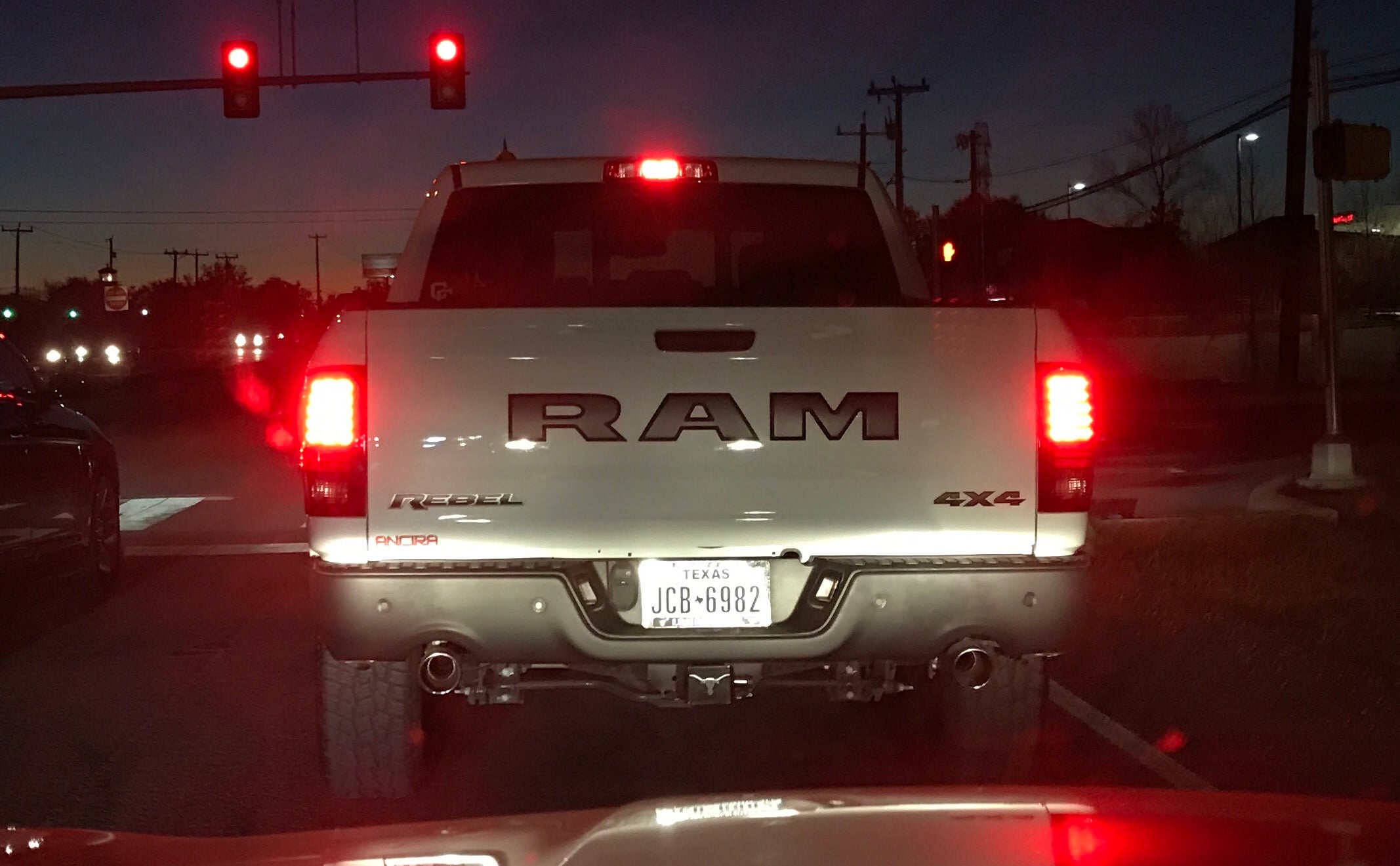
; Ram Rebel
; Is it still OK to call it a Dodge?
; How many tags can I have in here anyway?
STARS: 2
I upgraded your RAM
 "PWRandSPD" (Pwrandspd)
01/31/2017 at 08:08, STARS: 3
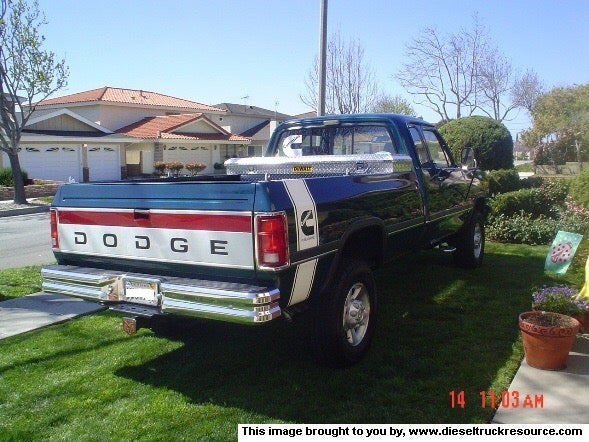
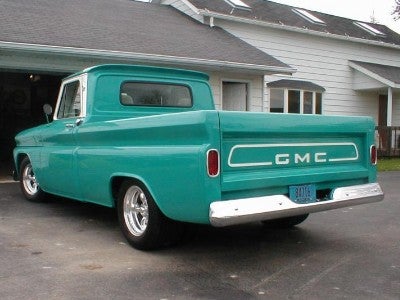
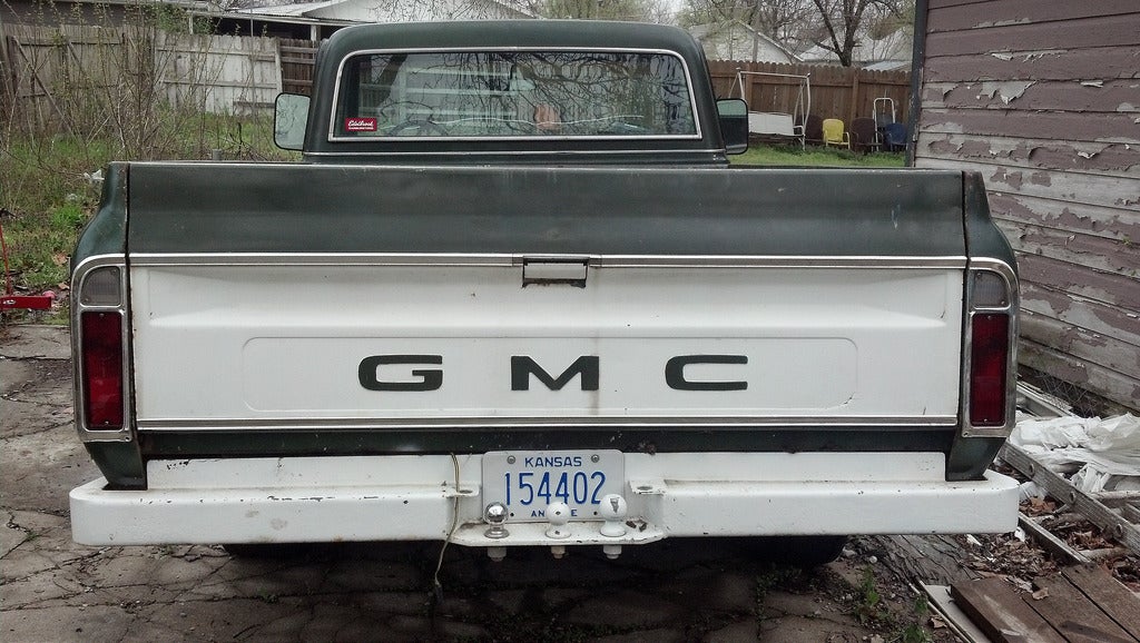
Might not be the subtle point of your image, but I don’t get all the hate people have for the lettering on the tailgate. I am not a huge fan myself, but I get what the designers were doing. It’s also not like it has not been done before.
 "OpposResidentLexusGuy - USE20, XF20, XU30 and Press Cars" (jakeauern)
01/31/2017 at 08:25, STARS: 1
All those fonts look nice and delicate, but also manly. Meanwhile, the RAM LOOKS LIKE IT’S YELLING AT YOU AND WANTS TO PUNCH YOU IN THE FACE. BRO. MY RAM WILL DRIVE OVER YOUR PRIUS. BRO.
Also the black lettering doesn’t help the bro look. White letters or get out.
 "The Ghost of Oppo" (gohstoklasa)
01/31/2017 at 08:30, STARS: 0
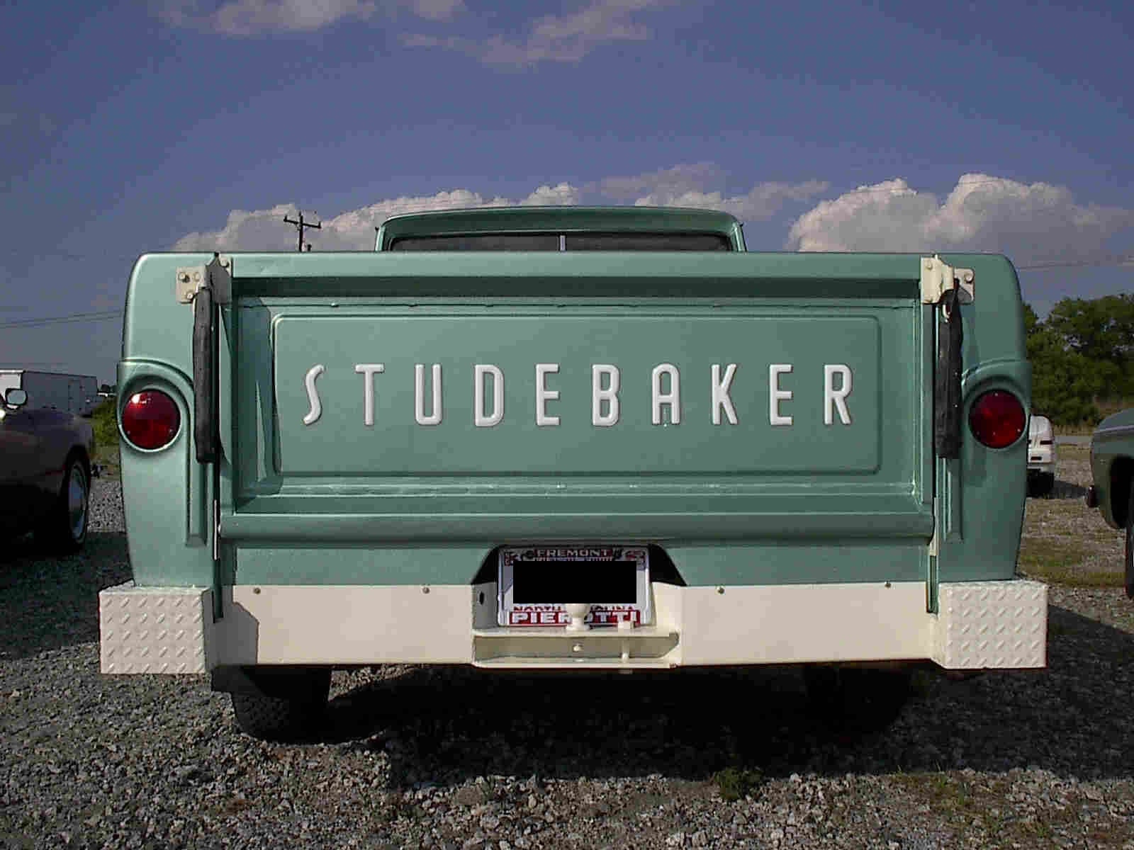
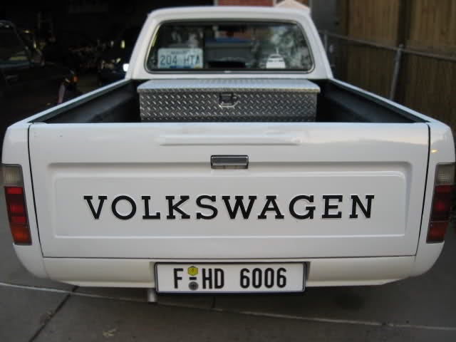
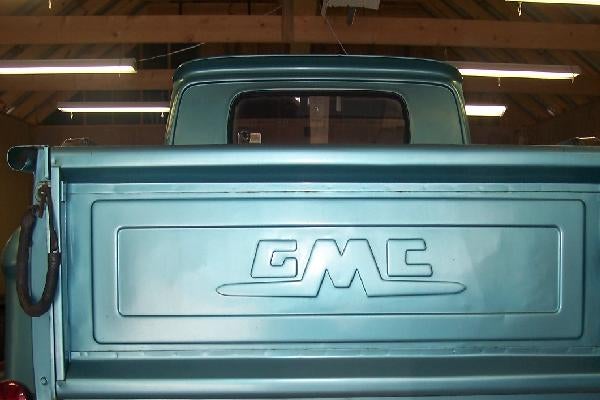
My personal favorite
"The Ghost of Oppo" (gohstoklasa)
01/31/2017 at 08:31, STARS: 0
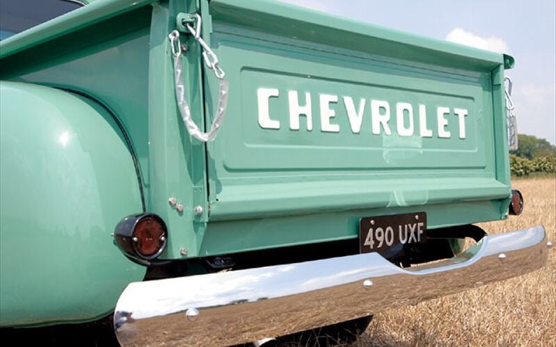
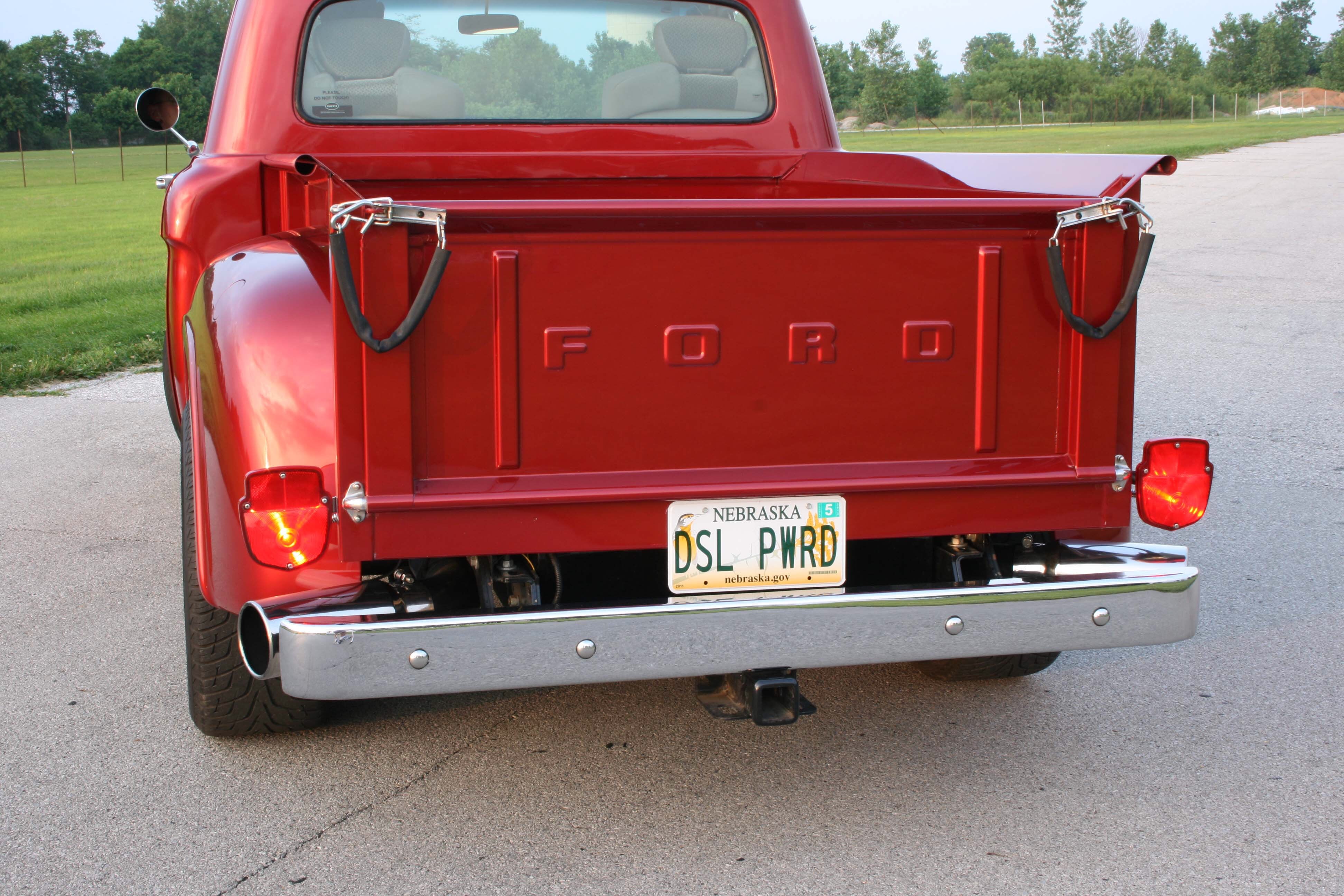
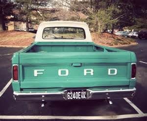
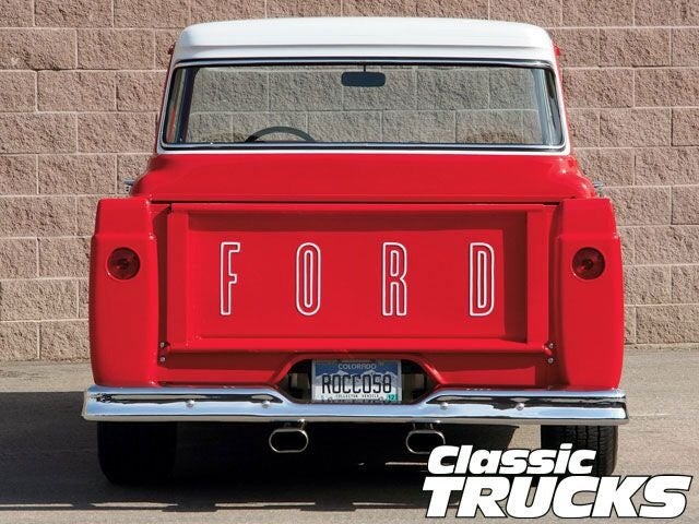
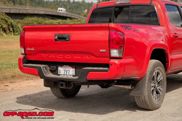
Yeah with only 3 letters it makes it awkward, but they should have done what Ford did and space the letters out more
"PWRandSPD" (Pwrandspd)
01/31/2017 at 08:35, STARS: 0
I agree with both, tone on tone color would probably be a nicer more subtle look, and a bit more space may have also worked, but may have been difficult with only 3 letters. They may have even grown larger with greater spacing.
 "Smallbear wants a modern Syclone, local Maple Leafs spammer" (smallbear94)
01/31/2017 at 08:35, STARS: 4
Those all have:
a) More than 3 letters
b) Extra styling that means the lettering has less space to fill up.
The Ram just looks like the designers “we’ve got a massive ass to fill, so make the font MOAR BIIGGGGEEERRRRRRR”
"PWRandSPD" (Pwrandspd)
01/31/2017 at 08:37, STARS: 1
The other big difference, there are no other contours to the tailgate. The letters are the only thing. Other contours or features may have helped as well. Just look at the other gates, they have more to them.
"OpposResidentLexusGuy - USE20, XF20, XU30 and Press Cars" (jakeauern)
01/31/2017 at 08:39, STARS: 0
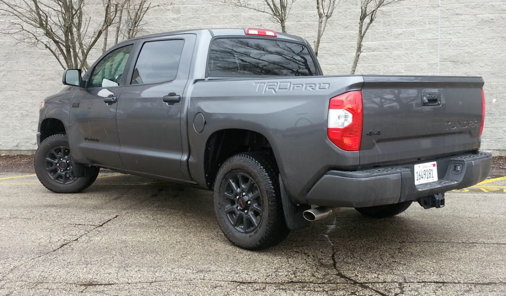
So it is possible to make the black look good. Good job Volkswagen. I think the biggest problem is just RAM made it very bro-ish and that was probably their goal. My personal favourite is still the Tundra and Tacoma though because of its subtlety.
 "LOREM IPSUM" (lorem---ipsum)
01/31/2017 at 08:43, STARS: 1
Chrysler, in script, would be classier.
Plymouth, even.
 "wiffleballtony" (wiffleballtony)
01/31/2017 at 08:55, STARS: 1
What is the latency and timing on it?
"FTTOHG Has Moved to https://opposite-lock.com" (alphaass)
01/31/2017 at 08:57, STARS: 1
I was more poking fun at how this same generation of truck has been facelifted to go from a small “RAM” badge to an enormous one. But I do think you can do 3 letters on the tailgate much better than Ram have done here...
"PWRandSPD" (Pwrandspd)
01/31/2017 at 10:05, STARS: 1
I completely agree with the treatment, and the “facelift” if you want to call it that. This body has been around since 2009 with only a slight facelift in 2013 and then the new badge and grilles around 2015. I would expect this body to stick around until about 2019 as Chrysler products like to have around a 10 year run on body styles before a significant change.